k-Nearest Neighbors Classification Method Example
Inputs
The example below illustrates’ the use of Analytic Solver Data Science’s k-Nearest Neighbors classification method using the well-known Iris dataset. This dataset was introduced by R. A. Fisher and reports four characteristics of three species of the Iris flower. A portion of the dataset is shown below.

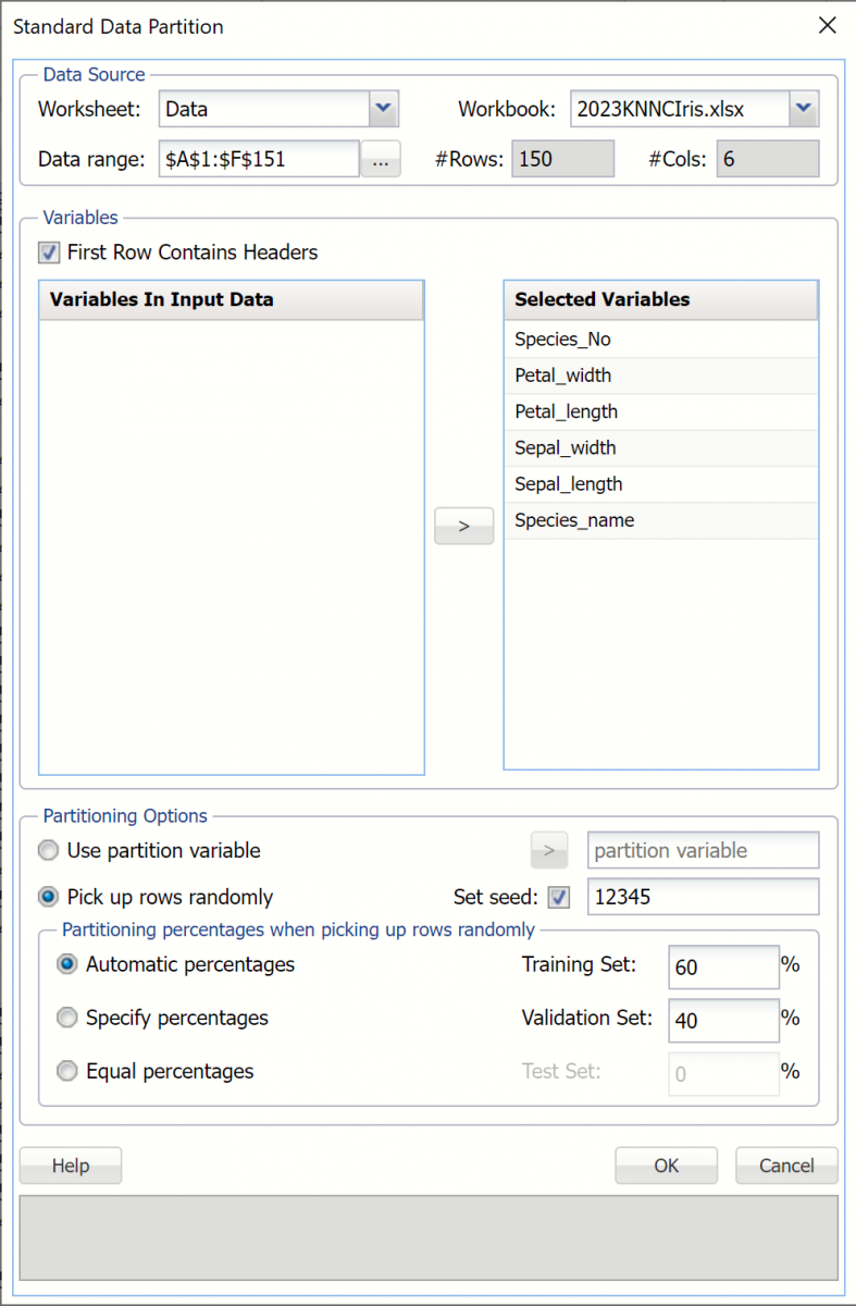
Partition the data using a standard partition with percentages of 60% training and 40% validation (the default settings for the Automatic choice). For more information on how to partition a dataset, please see the previous Data Science Partitioning chapter.
Click Classify – k-Nearest Neighbors to open the k-Nearest Neighbors Classification dialog.
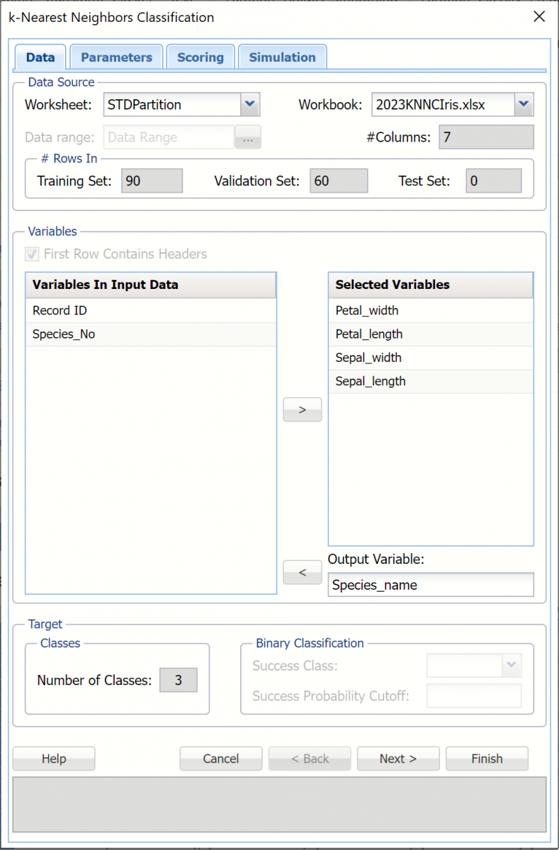
Select Petal_width, Petal_length, Sepal_width, and Sepal_length under Variables in Input Data then click > to select as Selected Variables. Select Species_name as the Output Variable.
Note: Since the variable Species_No is perfectly predictive of the output variable, Species_name, it will not be included in the model.
Once the Output Variable is selected, Number of Classes (3) will be filled automatically. Since our output variable contains more than 2 classes, Success Class and Success Probability Cutoff are disabled.
Click Next to advance to the Parameters dialog.
Analytic Solver Data Science includes the ability to partition a dataset from within a classification or prediction method by selecting Partition Data on the Parameters dialog. If this option is selected, Analytic Solver Data Science will partition your dataset (according to the partition options you set) immediately before running the classification method. If partitioning has already occurred on the dataset, this option will be disabled. For more information on partitioning, please see the Data Science Partitioning chapter.
Click Rescale Data, to open the Rescaling Dialog. Recall that the Euclidean distance measurement performs best when each variable is rescaled. Use Rescaling to normalize one or more features in your data during the data preprocessing stage. Analytic Solver Data Science provides the following methods for feature scaling: Standardization, Normalization, Adjusted Normalization and Unit Norm. For more information on this new feature, see the Rescale Continuous Data section within the Transform Continuous Data chapter that occurs earlier in this guide.
Click "Done" to close the dialog without rescaling the data.
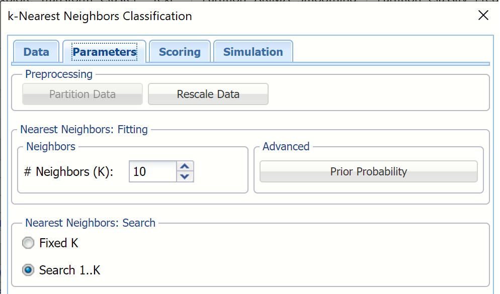
Enter 10 for # Neighbor. (This number is based on standard practice from the literature.) This is the parameter k in the k-Nearest Neighbor algorithm. If the number of observations (rows) is less than 50 then the value of k should be between 1 and the total number of observations (rows). If the number of rows is greater than 50, then the value of k should be between 1 and 50. Note that if k is chosen as the total number of observations in the training set, then for any new observation, all the observations in the training set become nearest neighbors. The default value for this option is 1.
Select Search 1..K under Nearest Neighbors Search. When this option is selected, Analytic Solver Data Science will display the output for the best k between 1 and the value entered for # Neighbors. If Fixed K is selected, the output will be displayed for the specified value of k.
Click Prior Probability to open the is selected. Analytic Solver Data Science will incorporate prior assumptions about how frequently the different classes occur and will assume that the probability of encountering a particular class in the data set is the same as the frequency with which it occurs in the training dataset.
- If Empirical is selected, Analytic Solver Data Science will assume that the probability of encountering a particular class in the dataset is the same as the frequency with which it occurs in the training data.
- If Uniform is selected, Analytic Solver Data Science will assume that all classes occur with equal probability.
- If Manual is selected, the user can enter the desired class and probability value.
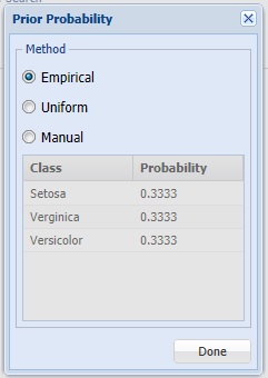
For this example, click Done to select the default of Empirical and close the dialog.
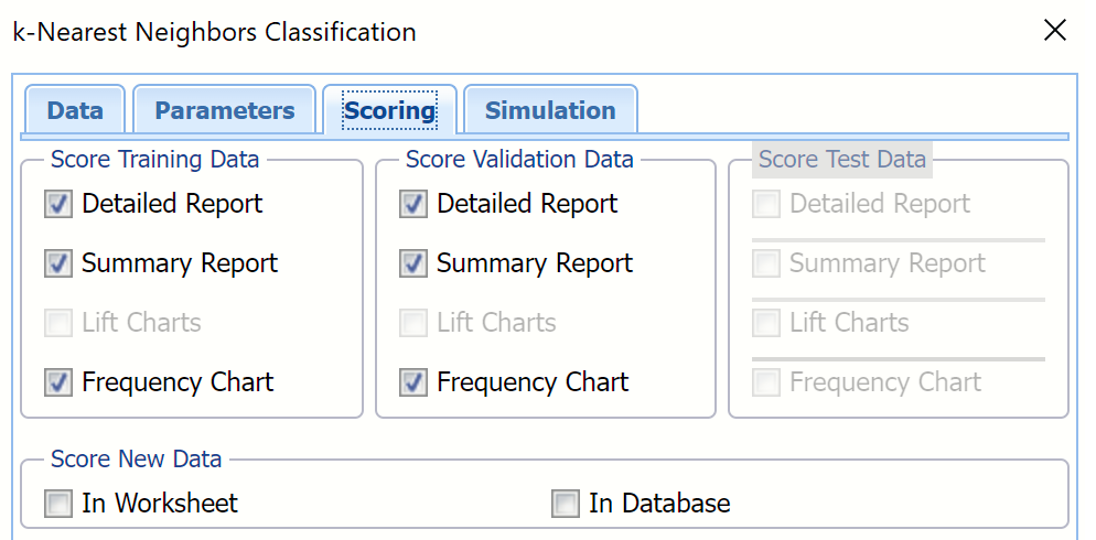
Click Next to advance to the Scoring dialog.
Summary Report under both Score Training Data and Score Validation Data is selected by default.
Select Detailed Report under both Score Training Data and Score Validation Data. Analytic Solver Data Science will create detailed and summary reports for both the training and validation sets.
New in V2023: When Frequency Chart is selected under both Score Training Data and Score Validation Data, a frequency chart will be displayed when the KNNC_TrainingScore and KNNC_ValidationScore worksheets are selected. This chart will display an interactive application similar to the Analyze Data feature, explained in detail in the Analyze Data chapter that appears earlier in this guide. This chart will include frequency distributions of the actual and predicted responses individually, or side-by-side, depending on the user’s preference, as well as basic and advanced statistics for variables, percentiles, six sigma indices.
Lift charts are disabled since there are more than 2 categories in our Output Variable, Species_name. Since we did not create a test partition, the options for Score test data are disabled. See the chapter “Data Science Partitioning” for information on how to create a test partition.
For more information on the Score new data options, please see the “Scoring New Data” chapter in the Analytic Solver Data Science User Guide.
Click Next to advance to the Simulation dialog.
Select Simulation Response Prediction to enable all options on the Simulation tab of the Discriminant Analysis dialog.
Simulation tab: All supervised algorithms in V2023 include a new Simulation tab. This tab uses the functionality from the Generate Data feature (described earlier in this guide) to generate synthetic data based on the training partition, and uses the fitted model to produce predictions for the synthetic data. The resulting report, _Simulation, will contain the synthetic data, the predicted values and the Excel-calculated Expression column, if present. In addition, frequency charts containing the Predicted, Training, and Expression (if present) sources or a combination of any pair may be viewed, if the charts are of the same type.
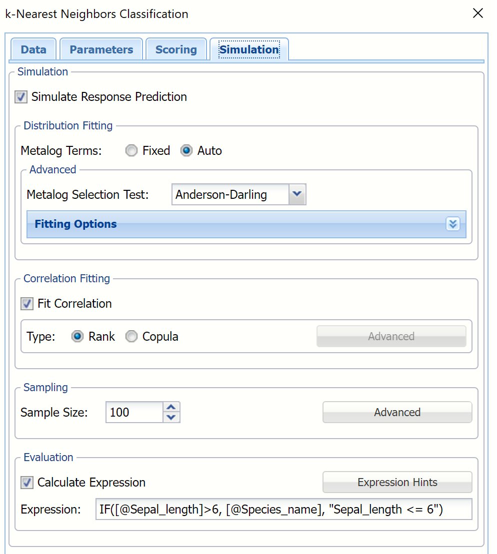
Evaluation: Select Calculate Expression to amend an Expression column onto the frequency chart displayed on the KNNC_Simulation output tab. Expression can be any valid Excel formula that references a variable and the response as [@COLUMN_NAME]. Click the Expression Hints button for more information on entering an expression.
For the purposes of this example, leave all options at their defaults in the Distribution Fitting, Correlation Fitting and Sampling sections of the dialog. For Expression, enter the following formula to display Species_name if Sepal_length is greater than 6.
IF([@Sepal_length] >6, [@Species_name], “Sepal <= 6”)
Note that variable names are case sensitive.
For more information on the remaining options shown on this dialog in the Distribution Fitting, Correlation Fitting and Sampling sections, see the Generate Data chapter that appears earlier in this guide.
Click Finish to run k-Nearest Neighbors on the example dataset.
Output Worksheets
Worksheets containing the results are inserted to the right of the STDPartition worksheet.
KNNC_Output
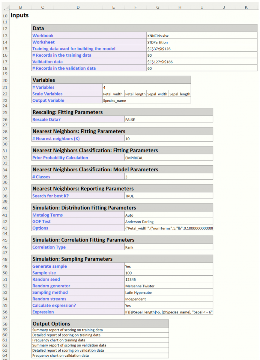
Double click the KNNC_Output sheet. The Output Navigator is included at the top of each output worksheet. The top part of this sheet contains all of our inputs. At the top of this sheet is the Output Navigator.

Navigate to any report in the output by clicking a link in the table.
Scroll down to the Inputs section to view all selected inputs to the k-Nearest Neighbor Classification method.
Scroll down a bit further to view the Search log. (This output is produced because we selected Seach 1..k on the Parameters tab. If this option had not been selected, this output would not be produced.)
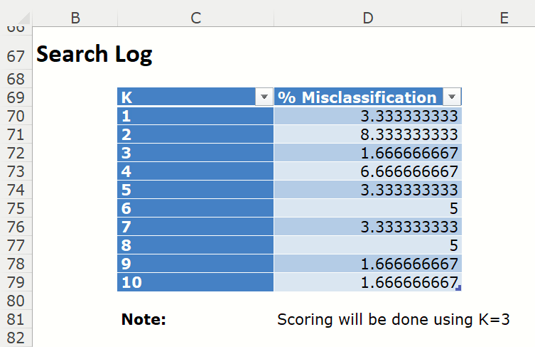
The Search Log for the different k's lists the % Misclassification errors for all values of k for the validation data set, if present. The k with the smallest % Misclassification is selected as the “Best k”. Scoring is performed later using this best value of k.
KNNC_TrainingScore
Click the KNNC_TrainingScore tab to view the newly added Output Variable frequency chart, the Training: Classification Summary and the Training: Classification Details report. All calculations, charts and predictions on this worksheet apply to the Training data.
Note: To view charts in the Cloud app, click the Charts icon on the Ribbon, select the desired worksheet under Worksheet and the desired chart under Chart.
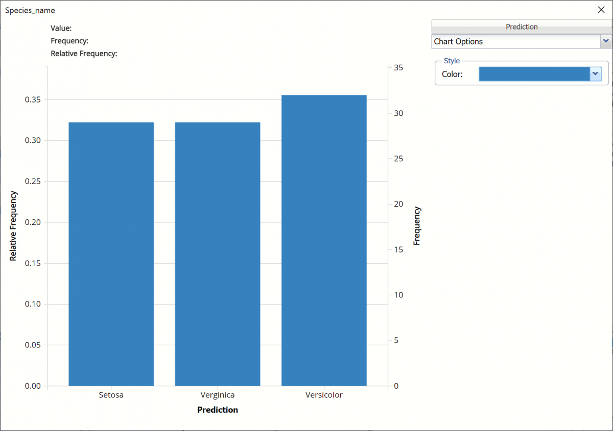
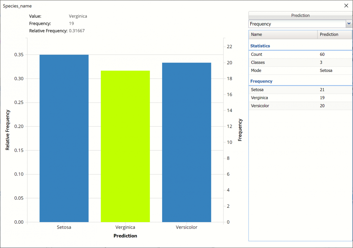
Frequency Charts: The output variable frequency chart opens automatically once the KNNC_TrainingScore worksheet is selected. To close this chart, click the “x” in the upper right hand corner of the chart. To reopen, click onto another tab and then click back to the KNnC_TrainingScore tab. To move the chart, grab the title bar and drag the chart to the desired location on the screen.
Frequency: This chart shows the frequency for both the predicted and actual values of the output variable, along with various statistics such as count, number of classes and the mode.
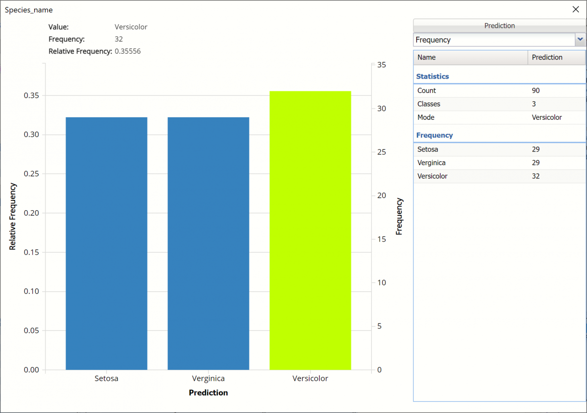
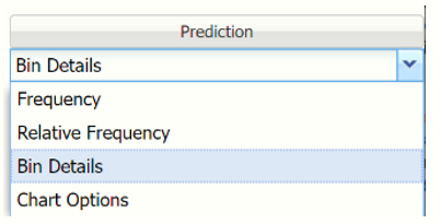
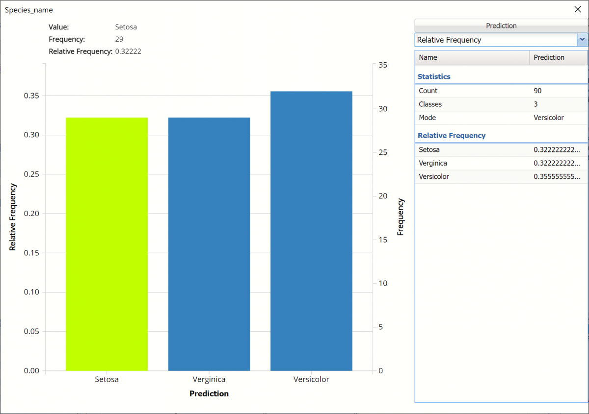
Click the down arrow next to Frequency to switch to Relative Frequency, Bin Details or Chart Options view.
Relative Frequency: Displays the relative frequency chart.
Bin Details: This view displays information pertaining to each bin in the chart.
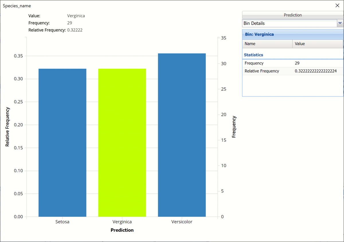
Chart Options: Use this view to change the color of the bars in the chart.
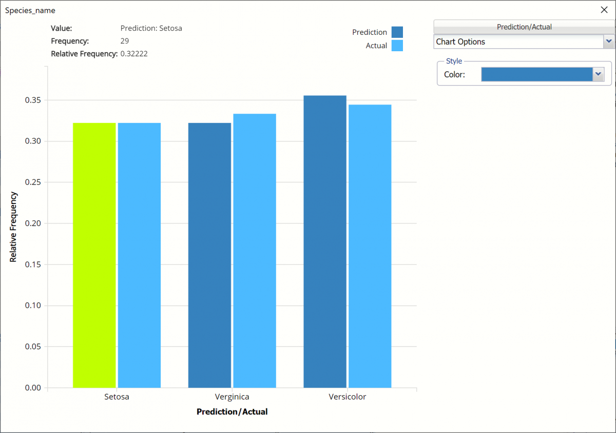
To see both the actual and predicted frequency, click Prediction and select Actual. This change will be reflected on all charts.
Classification Summary: In the Classification Summary report, a Confusion Matrix is used to evaluate the performance of the classification method.
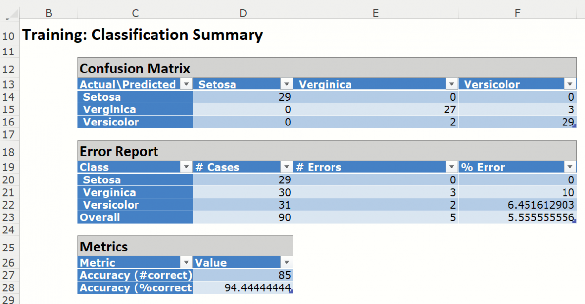
This Summary report tallies the actual and predicted classifications. (Predicted classifications were generated by applying the model to the validation data.) Correct classification counts are along the diagonal from the upper left to the lower right.
There were 5 records mislabeled in the Training partition:
Three records were assigned to the Versicolor class when they should have been assigned to the Verginica class
Two records were assigned to the Verginica class that should have been assigned to the Versicolor class.
The total misclassification error is 5.55% (5 misclassified records / 90 total records).
Any misclassified records will appear under Training: Classification Details in red.
Metrics
The following metrics are computed using the values in the confusion matrix.
Accuracy (#Correct = 85 and %Correct = 94.4%): Refers to the ability of the classifier to predict a class label correctly.
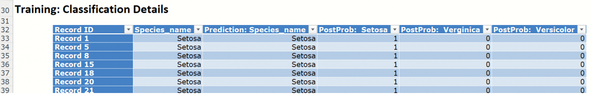
Classification Details: This table displays how each observation in the training data was classified. The probability values for success in each record are shown after the predicted class and actual class columns. Records assigned to a class other than what was predicted are highlighted in red.
KNNC_ValidationScore
Click the KNNC_ValidationScore tab to view the newly added Output Variable frequency chart, the Validation: Classification Summary and the Validation: Classification Details report. All calculations, charts and predictions on this worksheet apply to the Validation data.
Frequency Charts: The output variable frequency chart opens automatically once the KNNC_ValidationScore worksheet is selected. To close this chart, click the “x” in the upper right hand corner. To reopen, click onto another tab and then click back to the KNNC_ValidationScore tab.
Click the Frequency chart to display the frequency for both the predicted and actual values of the output variable, along with various statistics such as count, number of classes and the mode. Selective Relative Frequency from the drop down menu, on the right, to see the relative frequencies of the output variable for both actual and predicted. See above for more information on this chart.
Classification Summary: This report contains the confusion matrix for the validation data set.
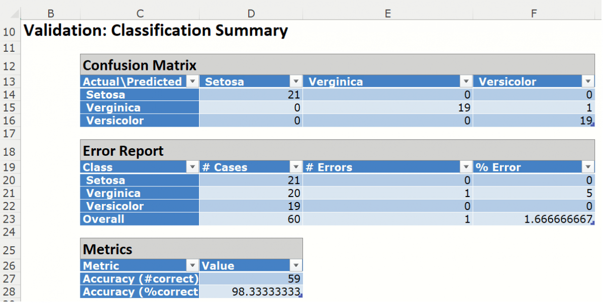
When the fitted model was applied to the Validation partition, 1 record was misclassified.
Metrics
The following metrics are computed using the values in the confusion matrix.
Accuracy (#Correct = 59/60 and %Correct = 98.3%): Refers to the ability of the classifier to predict a class label correctly.
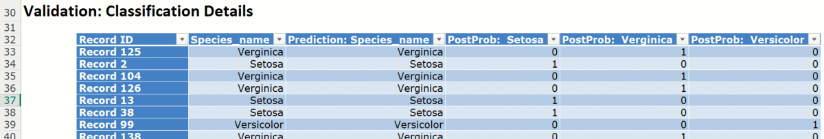
Classification Details: This table displays how each observation in the validation data was classified. The probability values for success in each record are shown after the predicted class and actual class columns. Note that the largest PostProb value depicts the predicted value.
KNNC_Simulation
As discussed above, Analytic Solver Data Science V2023 generates a new output worksheet, KNNC_Simulation, when Simulate Response Prediction is selected on the Simulation tab of the k-Nearest Neighbors dialog.
This report contains the synthetic data, the actual output variable values for the training partition and the Excel – calculated Expression column, if populated in the dialog. A chart is also displayed with the option to switch between the Synthetic, Training, and Expression sources or a combination of two, as long as they are of the same type.
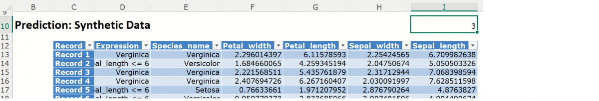
Note the first column in the output, Expression. This column was inserted into the Synthetic Data results because Calculate Expression was selected and an Excel function was entered into the Expression field, on the Simulation tab of the k-Nearest Neighbors dialog
IF([@Sepal_length]>6, [@Species_name], “Sepal_length <= 6”)
The results in this column are either Setosa, Verginica, Versicolor, if a record’s Sepal_width is greater than 6, or Sepal_length <= 6, if the record’s Sepal_width is less than or equal to 6.
The remainder of the data in this report is syntethic data, generated using the Generate Data feature described in the chapter with the same name, that appears earlier in this guide.
The chart that is displayed once this tab is selected, contains frequency information pertaining to the actual output variable in the training partition, the synthetic data and the expression, if it exists. In the screenshot below, the bars in the darker shade of blue are based on the synthetic data. The bars in the lighter shade of blue are based on the actual values in the training partition.
Note: Hover over a bar in the graph to display the frequency.
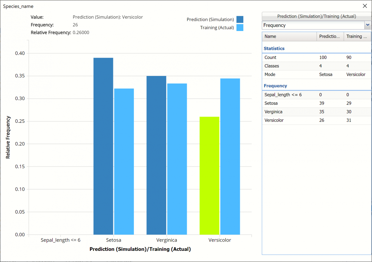
Click Prediction (Simulation) / Training (Actual) to change the chart view to Prediction (Simulation / Expression (Simulation).

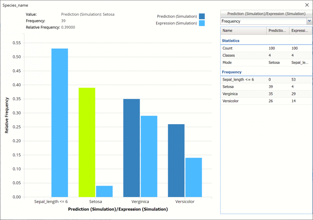
This chart compares the number of records in the synthetic data vs the result of the expression on the synthetic data. The dark blue columns represent the predictions in the synthetic data. In the 100 synthetic data records, 39 records are predicted to be classified as Setosa, 35 are predicted to be classified as Verginica and 26 are predicted to be classified as Versicolor. The light blue columns represent the result of the expression as applied to the synthetic data. In other words, out of 39 records in the synthetic data predicted to be classified as Setosa, only 4 are predicted to have sepal_lengths greater than 6.
Click the down arrow next to Frequency to change the chart view to Relative Frequency or to change the look by clicking Chart Options. Statistics on the right of the chart dialog are discussed earlier in this section. For more information on the generated synthetic data, see the Generate Data chapter that appears earlier in this guide.
For information on Stored Model Sheets, in this example DA_Stored, please refer to the “Scoring New Data” chapter within the Analytic Solver Data Science User Guide.