Multiple Linear Regression Example
The example fits a linear model to the Boston Housing dataset using Multiple Linear Regression to forecast the price of a house in the Boston area.
Inputs
Open or upload the Boston_Housing.xlsx example dataset. A portion of the dataset is shown below. The last variable, CAT.MEDV, is a discrete classification of the MEDV variable and will not be used in this example.

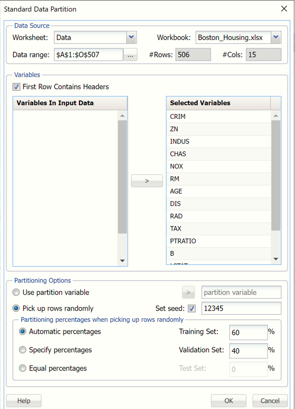
First, we partition the data into training and validation sets using the Standard Data Partition defaults with percentages of 60% of the data randomly allocated to the Training Set and 40% of the data randomly allocated to the Validation Set. For more information on partitioning a dataset, see the Data Science Partitioning chapter within the Analytic Solver Data Science Reference Guide.
Standard Data Partition Dialog
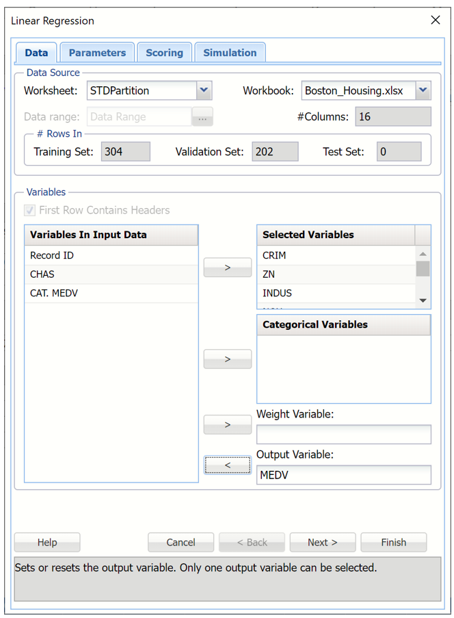
With the STDPartition worksheet selected, click Predict – Linear Regression to open the Linear Regression Data tab.
Select MEDV as the Output Variable, CHAS as a Categorical Variable and all remaining variables (except CAT. MEDV) as Selected variables.
Note:
All supervised algorithms include a new Simulation tab. This tab uses the functionality from the Generate Data feature (described in the What’s New section of this guide and then more in depth in the Analytic Solver Data Science Reference Guide) to generate synthetic data based on the training partition, and uses the fitted model to produce predictions for the synthetic data. The resulting report, LinReq_Simulation, will contain the synthetic data, the predicted values and the Excel-calculated Expression column, if presentSince this new functionality does not support categorical variables, these types of variables will not be present in the model, only continuous variables.
If the new Simulation feature is not invoked, the categorical variable, CHAS may be added to the model as a categorical variable. However, in this specific instance, since the CHAS variable is the only Categorical Variable selected and it's values are binary (0/1), the output results will be the same as if you selected this variable as a Selected (or scale) Variable. If either 1. there were more categorical variables, 2. the CHAS variable was non-binary, or 3, another algorithm besides Mulitple Linear Regression or Logistic Regression was selected, this would not be true.
Linear Regression Dialog, Data tab
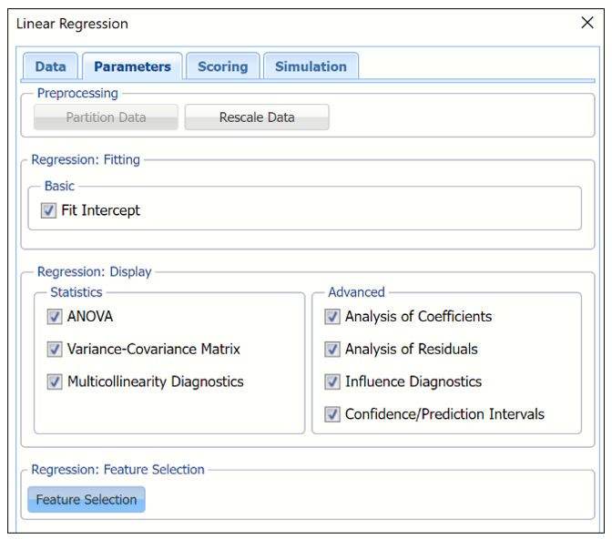
Click Next to advance to the Parameters tab.
If Fit Intercept is selected, the intercept term will be fitted, otherwise there will be no constant term in the equation. Leave this option selected for this example.
Under Regression: Display, select all 6 display options to display each in the output.
Under Statistics, select:
- ANOVA
- Variance-Covariance Matrix
- Multicollinearity Diagnostics
Under Advanced, select:
- Analysis of Coefficients
- Analysis of Residuals
- Influence Diagnostics
- Confidence/Prediction Intervals
When you have a large number of predictors and you would like to limit the model to only the significant variables, click Feature Selection to open the Feature Selection dialog and select Perform Feature Selection at the top of the dialog. The default setting for Maximum Subset Size is 12. This option can take on values of 1 up to N where N is the number of Selected Variables. The default setting is N.
Feature Selection Dialog
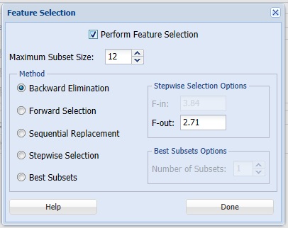
Analytic Solver Data Science offers five different selection procedures for selecting the best subset of variables.
- Backward Elimination in which variables are eliminated one at a time, starting with the least significant. If this procedure is selected, FOUT is enabled. A statistic is calculated when variables are eliminated. For a variable to leave the regression, the statistic’s value must be less than the value of FOUT (default = 2.71).
- Forward Selection in which variables are added one at a time, starting with the most significant. If this procedure is selected, FIN is enabled. On each iteration of the Forward Selection procedure, each variable is examined for the eligibility to enter the model. The significance of variables is measured as a partial F-statistic. Given a model at a current iteration, we perform an F Test, testing the null hypothesis stating that the regression coefficient would be zero if added to the existing set if variables and an alternative hypothesis stating otherwise. Each variable is examined to find the one with the largest partial F-Statistic. The decision rule for adding this variable into a model is: Reject the null hypothesis if the F-Statistic for this variable exceeds the critical value chosen as a threshold for the F Test (FIN value), or Accept the null hypothesis if the F-Statistic for this variable is less than a threshold. If the null hypothesis is rejected, the variable is added to the model and selection continues in the same fashion, otherwise the procedure is terminated.
- Sequential Replacement in which variables are sequentially replaced and replacements that improve performance are retained.
- Stepwise selection is similar to Forward selection except that at each stage, Analytic Solver Data Science considers dropping variables that are not statistically significant. When this procedure is selected, the Stepwise selection options FIN and FOUT are enabled. In the stepwise selection procedure a statistic is calculated when variables are added or eliminated. For a variable to come into the regression, the statistic’s value must be greater than the value for FIN (default = 3.84). For a variable to leave the regression, the statistic’s value must be less than the value of FOUT (default = 2.71). The value for FIN must be greater than the value for FOUT.
- Best Subsets where searches of all combinations of variables are performed to observe which combination has the best fit. (This option can become quite time consuming depending on the number of input variables.) If this procedure is selected, Number of best subsets is enabled.
Click Done to accept the default choice, Backward Elimination with a Maximum Subset Size of 3 and an F-out setting of 2.71, and return to the Parameters tab, then click Next to advance to the Scoring tab.
Linear Regression Dialog, Parameters tab
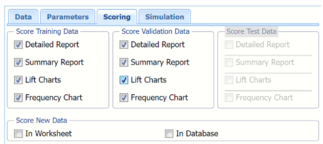
Click Next to proceed to the Scoring tab.
Select all four options for Score Training/Validation data.
When Detailed report is selected, Analytic Solver Data Science will create a detailed report of the Discriminant Analysis output.
When Summary report is selected (the default), Analytic Solver Data Science will create a report summarizing the Discriminant Analysis output.
When Lift Charts is selected, Analytic Solver Data Science will include Lift Chart and ROC Curve plots in the output.
When Frequency Chart is selected, a frequency chart will be displayed when the LinReg_TrainingScore and LinReg_ValidationScore worksheets are selected. This chart will display an interactive application similar to the Analyze Data feature, explained in detail in the Analyze Data chapter that appears earlier in this guide. This chart will include frequency distributions of the actual and predicted responses individually, or side-by-side, depending on the user’s preference, as well as basic and advanced statistics for variables, percentiles, six sigma indices.
Since we did not create a test partition, the options for Score test data are disabled. See the chapter “Data Science Partitioning” for information on how to create a test partition.
See the Scoring New Data chapter within the Analytic Solver Data Science User Guide for more information on Score New Data in options.
LinReg dialog, Scoring tab
12. Click Next to advance to the Simulation tab.
13. Select Simulation Response Prediction to enable all options on the Simulation tab of the Linear Regression dialog.
Simulation tab: All supervised algorithms include a new Simulation tab. This tab uses the functionality from the Generate Data feature (described earlier in this guide) to generate synthetic data based on the training partition, and uses the fitted model to produce predictions for the synthetic data. The resulting report, LinReg_Simulation, will contain the synthetic data, the predicted values and the Excel-calculated Expression column, if present. In addition, frequency charts containing the Predicted, Training, and Expression (if present) sources or a combination of any pair may be viewed, if the charts are of the same type.
Linear Regression dialog, Simulation tab
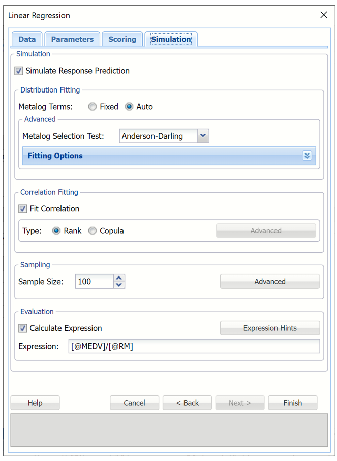
Evaluation: Select Calculate Expression to amend an Expression column onto the frequency chart displayed on the LinReg_Simulation output sheet. Expression can be any valid Excel formula that references a variable and the response as [@COLUMN_NAME]. Click the Expression Hints button for more information on entering an expression.
For the purposes of this example, leave all options at their defaults in the Distribution Fitting, Correlation Fitting and Sampling sections of the dialog. For Expression, enter the following formula to display the price per room of each record.
Note that variable names are case sensitive.
For more information on the remaining options shown on this dialog in the Distribution Fitting, Correlation Fitting and Sampling sections, see the Generate Data chapter that appears earlier in this guide.
Click Finish to run Linear Regression on the example dataset.
Output
This result worksheet includes 8 segments: Output Navigator, Inputs, Regression Summary, Predictor Screening, Coefficients, ANOVA, Variance-Covariance Matrix of Coefficients and Multicollinarity Diagnostics.
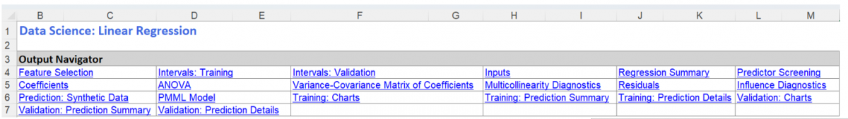
Output Navigator: The Output Navigator appears at the top of all result worksheets. Use this feature to quickly navigate to all reports included in the output.
LinReg_Output: Output Navigator
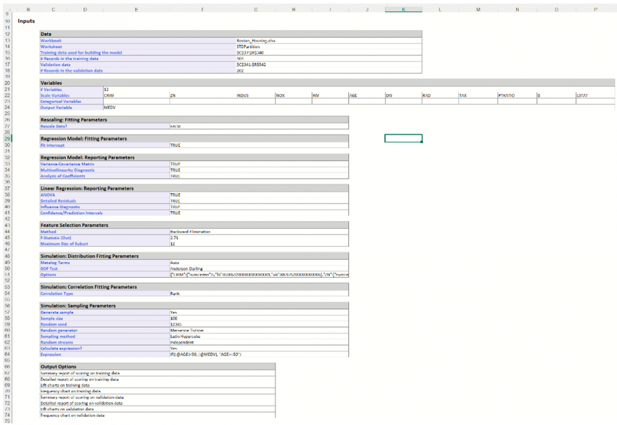
Inputs: Scroll down to the Inputs section to find all inputs entered or selected on all tabs of the Discriminant Analysis dialog.
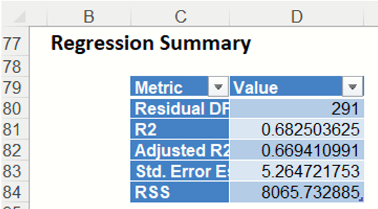
Regression Summary: Summary Statistics, in the Regression Summary table, show the residual degrees of freedom (#observations - #predictors), the R-squared value, a standard deviation type measure for the model (which typically has a chi-square distribution), and the Residual Sum of Squares error.
The R-squared value shown here is the r-squared value for a logistic regression model , defined as -
R2 = (D0-D)/D0 ,
where D is the Deviance based on the fitted model and D0 is the deviance based on the null model. The null model is defined as the model containing no predictor variables apart from the constant.
Predictor Screening: In Analytic Solver Data Science, a new preprocessing feature selection step was added in V2015 to take advantage of automatic variable screening and elimination, using Rank-Revealing QR Decomposition. This allows Analytic Solver Data Science to identify the variables causing multicollinearity, rank deficiencies, and other problems that would otherwise cause the algorithm to fail. Information about “bad” variables is used in Variable Selection and Multicollinearity Diagnostics, and in computing other reported statistics. Included and excluded predictors are shown in the Model Predictors table. In this model, all predictors were included in the model; all predictors were eligible to enter the model passing the tolerance threshold. This denotes a tolerance beyond which a variance – covariance matrix is not exactly singular to within machine precision. The test is based on the diagonal elements of the triangular factor R resulting from Rank-Revealing QR Decomposition. Predictors that do not pass the test are excluded.
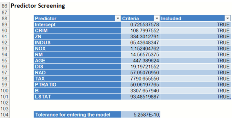
Note: If a predictor is excluded, the corresponding coefficient estimates will be 0 in the regression model and the variable – covariance matrix would contain all zeros in the rows and columns that correspond to the excluded predictor. Multicollinearity diagnostics, variable selection and other remaining output will be calculated for the reduced model.
The design matrix may be rank-deficient for several reasons. The most common cause of an ill-conditioned regression problem is the presence of feature(s) that can be exactly or approximately represented by a linear combination of other feature(s). For example, assume that among predictors you have 3 input variables X, Y, and Z where Z = a * X + b * Y and a and b are constants. This will cause the design matrix to not have a full rank. Therefore, one of these 3 variables will not pass the threshold for entrance and will be excluded from the final regression model.
Coefficients: The Regression Model table contains the estimate, the standard error of the coefficient, the p-value and confidence intervals for each variable included in the model.

Note: If a variable has been eliminated by Rank-Revealing QR Decomposition, the variable will appear in red in the Coefficients table with a 0 for Estimate, CI Lower, CI Upper, Standard Error and N/A for T-Statistic and P-Value.
The Standard Error is calculated as each variable is introduced into the model beginning with the constant term and continuing with each variable as it appears in the dataset.
Analytic Solver Data Science produces 95% Confidence Intervals for the estimated values. For a given record, the Confidence Interval gives the mean value estimation with 95% probability. This means that with 95% probability, the regression line will pass through this interval.
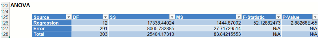
ANOVA: The ANOVA table includes the degrees of freedom (DF), sum of squares (SS), mean squares (MS), F-Statistic and P-Value.
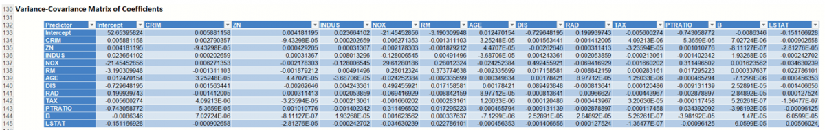
Variance-Covariance Matrix of Coefficients: Entries in the matrix are the covariances between the indicated coefficients. The “on-diagonal” values are the estimated variances of the corresponding coefficients.
Multicollinearity Diagnostics: This table helps assess whether two or more variables so closely track one another as to provide essentially the same information.
The columns represent the variance components (related to principal components in multivariate analysis), while the rows represent the variance proportion decomposition explained by each variable in the model. The eigenvalues are those associated with the singular value decomposition of the variance-covariance matrix of the coefficients, while the condition numbers are the ratios of the square root of the largest eigenvalue to all the rest. In general, multicollinearity is likely to be a problem with a high condition number (more than 20 or 30), and high variance decomposition proportions (say more than 0.5) for two or more variables.
LinReg_FS
Select the Feature Selection link on the Output Navigator to display the Variable Selection table. This table displays a list of different models generated using the selections made on the Feature Selection dialog. When Backward elimination is used, Linear Regression may stop early when there is no variable eligible for elimination as evidenced in the table below (i.e. there are no subsets with less than 12 coefficients). Since Fit Intercept was selected on the Parameters tab, each subset includes an intercept.

The error values for the Best Subsets are:
- RSS: The residual sum of squares, or the sum of squared deviations between the predicted probability of success and the actual value (1 or 0)
- Cp: Mallows Cp (Total squared error) is a measure of the error in the best subset model, relative to the error incorporating all variables. Adequate models are those for which Cp is roughly equal to the number of parameters in the model (including the constant), and/or Cp is at a minimum
- R-Squared: R-squared Goodness-of-fit
- Adj. R-Squared: Adjusted R-Squared values.
- "Probability" is a quasi hypothesis test of the proposition that a given subset is acceptable; if Probability < .05 we can rule out that subset.
Compare the RSS value as the number of coefficients in the subset increases from 13 to 12 (7794.742 to 7801.43). The RSS for 12 coefficients is just slightly higher than the RSS for 13 coefficients suggesting that a model with 12 coefficients may be sufficient to fit a regression.
LinReg_ResidInfluence
This output sheet includes two output tables: Residuals and Influence Diagnostics.
Residuals: Click the Residuals link in the Output Navigator to open the Residuals table. This table displays the Raw Residuals, Standarized Residuals, Studentized Residuals and Deleted Residuals.
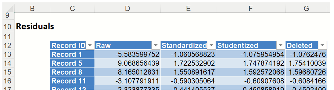
Studentized residuals are computed by dividing the unstandardized residuals by quantities related to the diagonal elements of the hat matrix, using a common scale estimate computed without the ith case in the model. These residuals have t - distributions with ( n-k-1) degrees of freedom. As a result, any residual with absolute value exceeding 3 usually requires attention.
The Deleted residual is computed for the ith observation by first fitting a model without the ith observation, then using this model to predict the ith observation. Afterwards the difference is taken between the predicted observation and the actual observation.
Influence Diagnostics: Click the Influence Diagnositics link on the Output Navigator to display the Influence Diagnostics data table. This table contains various statistics computed by Analytic Solver Data Science.
The Cooks Distance for each observation is displayed in this table. This is an overall measure of the impact of the ith datapoint on the estimated regression coefficient. In linear models Cooks Distance has, approximately, an F distribution with k and (n-k) degrees of freedom.
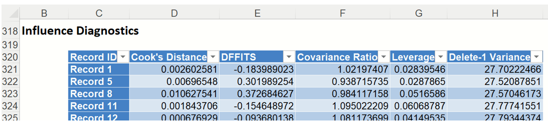
The DF fits for each observation is displayed in the output. DFFits gives information on how the fitted model would change if a point was not included in the model.
Analytic Solver Data Science computes DFFits using the following computation.
where
y_hat_i = i-th fitted value from full model
y_hat_i(-i) = i-th fitted value from model not including i-th observation
sigma(-i) = estimated error variance of model not including i-th observation
h_i = leverage of i-th point (i.e. {i,i}-th element of Hat Matrix)
e_i = i-th residual from full model
e_i^stud = i-th Studentized residual
The covariance ratios are displayed in the output. This measure reflects the change in the variance-covariance matrix of the estimated coefficients when the ith observation is deleted.
The diagonal elements of the hat matrix are displayed under the Leverage column. This measure is also known as the Leverage of the ith observation.
LinReg_Intervals
Click either the Intervals: Training or Intervals: Validation links in the Output Navigator to view the Intervals report for both the Training and Validation partitions. Of primary interest in a data-science context will be the predicted and actual values for each record, along with the residual (difference) and Confidence and Prediction Intervals for each predicted value.
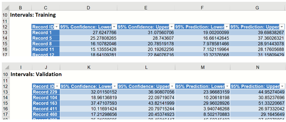
Analytic Solver Data Science produces 95% Confidence and Prediction Intervals for the predicted values. Typically, Prediction Intervals are more widely utilized as they are a more robust range for the predicted value. For a given record, the Confidence Interval gives the mean value estimation with 95% probability. This means that with 95% probability, the regression line will pass through this interval. The Prediction Interval takes into account possible future deviations of the predicted response from the mean. There is a 95% chance that the predicted value will lie within the Prediction interval.
LinReg_TrainingScore
Of primary interest in a data-science context will be the predicted and actual values for the MEDV variable along with the residual (difference) for each predicted value in the Training partition.
LinReg_TrainingScore displays the newly added Output Variable frequency chart, the Training: Prediction Summary and the Training: Prediction Details report. All calculations, charts and predictions on the LinReg_TrainingScore output sheet apply to the Training partition.
Note: To view charts in the Cloud app, click the Charts icon on the Ribbon, select a worksheet under Worksheet and a chart under Chart.
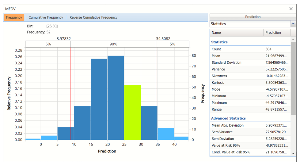
Frequency Charts: The output variable frequency chart for the training partition opens automatically once the LinReg_TrainingScore worksheet is selected. To close this chart, click the “x” in the upper right hand corner of the chart. To reopen, click onto another tab and then click back to the LinReg_TrainingScore tab. To move the dialog to a new location on the screen, simply grab the title bar and drag the dialog to the desired location. This chart displays a detailed, interactive frequency chart for the predicted values in the simulated, or synthetic data, and for the predicted values in the training partition.
Training (Actual) data, MEDV variable
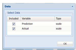
To display the predicted values in the synthetic and training data, click Prediction in the upper right hand corner and select both checkboxes in the Data dialog.
Click Actual to add Prediction data to the interactive chart
Data Dialog
Actual vs Predicted for Training Partition, MEDV variable
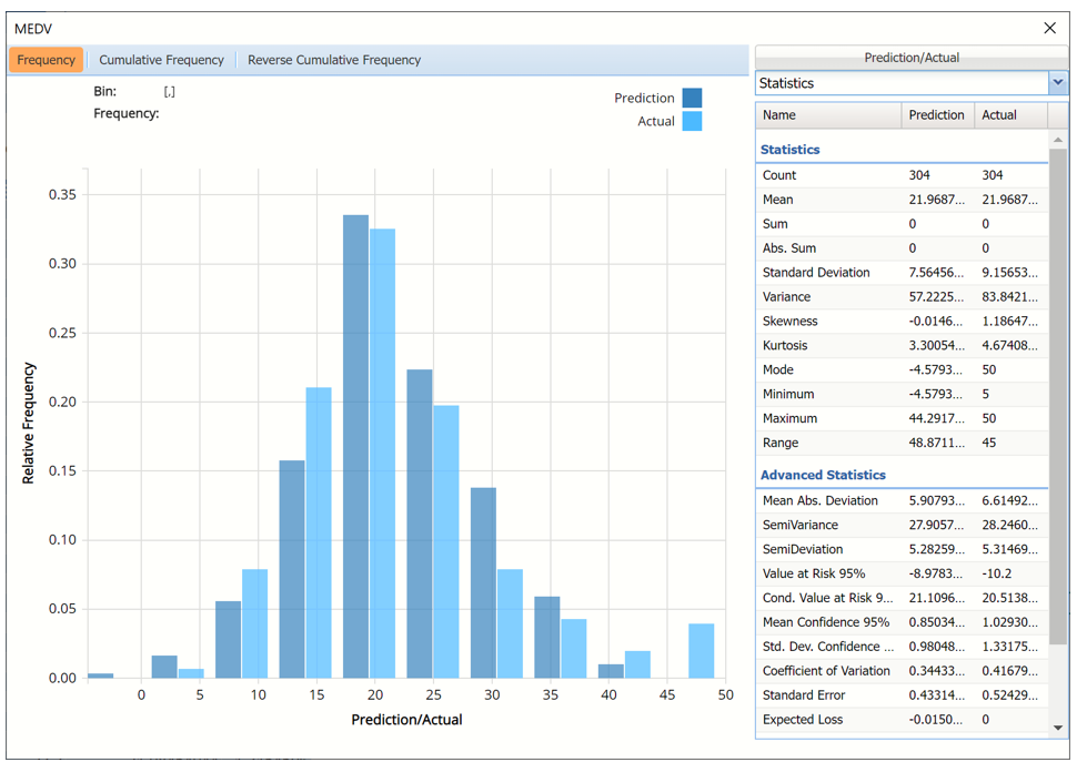
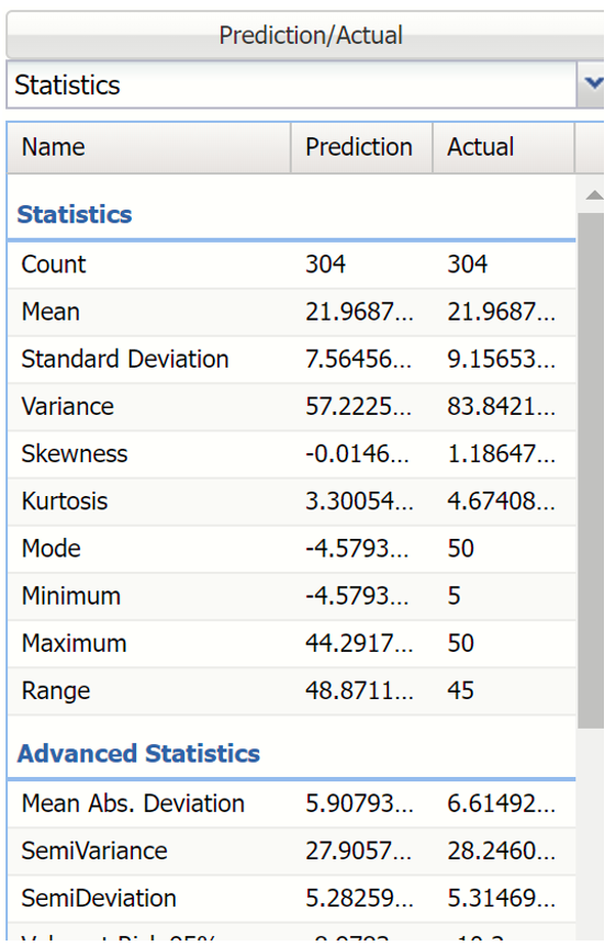
Notice in the screenshot below that both the Actual and Prediction data appear in the chart together, and statistics for both data appear on the right.
To remove either the Actual or Prediction data from the chart, click Prediction/Actual in the top right and then uncheck the data type to be removed.
This chart behaves the same as the interactive chart in the Analyze Data feature found on the Explore menu (and explained in depth in the Data Science Reference Guide).
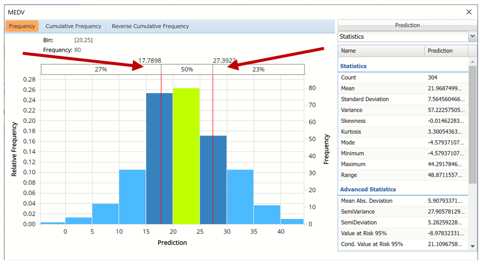
- Use the mouse to hover over any of the bars in the graph to populate the Bin and Frequency headings at the top of the chart.
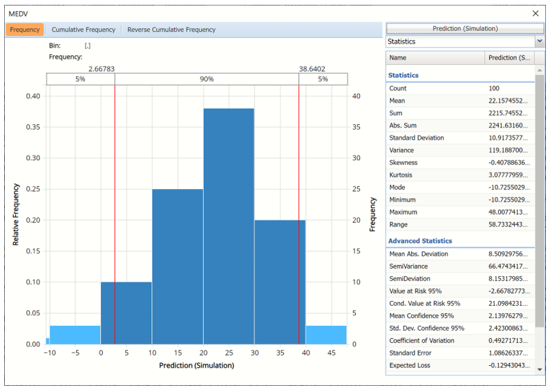
- When displaying either Original or Synthetic data (not both), red vertical lines will appear at the 5% and 95% percentile values in all three charts (Frequency, Cumulative Frequency and Reverse Cumulative Frequency) effectively displaying the 90th confidence interval. The middle percentage is the percentage of all the variable values that lie within the ‘included’ area, i.e. the darker shaded area. The two percentages on each end are the percentage of all variable values that lie outside of the ‘included’ area or the “tails”. i.e. the lighter shaded area. Percentile values can be altered by moving either red vertical line to the left or right.
Frequency Chart for MEDV Prediction with red percentile lines moved
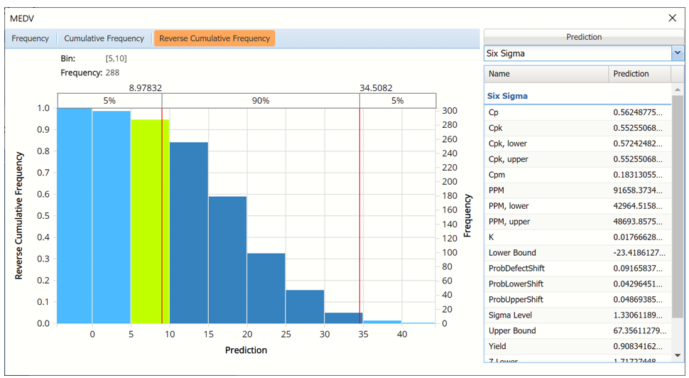
- Click Cumulative Frequency and Reverse Cumulative Frequency tabs to see the Cumulative Frequency and Reverse Cumulative Frequency charts, respectively.
Cumulative Frequency chart with Percentiles displayed
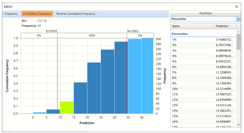
Click the down arrow next to Statistics to view Percentiles for each type of data along with Six Sigma indices. Use the Chart Options view to manually select the number of bins to use in the chart, as well as to set personalization options.
Reverse Cumulative Frequency chart with Six Sigma indices displayed
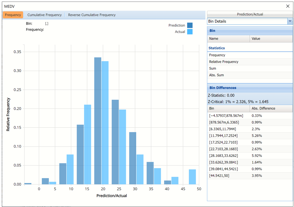
Click the down arrow next to Statistics to view Bin Details for each bin in the chart. If both datasets are included in the chart, the Bin Differences are added to the pane.
Frequency chart with Bin Details displayed
As discussed above, see the Analyze Data section of the Exploring Data chapter in the Data Science Reference Guide for an in-depth discussion of this chart as well as descriptions of all statistics, percentiles, bin details and six sigma indices.
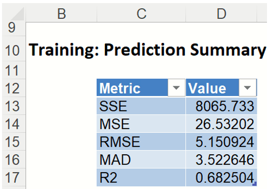
Prediction Summary: In the Prediction Summary report, Analytic Solver Data Science displays the total sum of squared errors summaries for the training partition. The total sum of squared errors is the sum of the squared errors (deviations between predicted and actual values) and the root mean square error (square root of the average squared error). The average error is typically very small, because positive prediction errors tend to be counterbalanced by negative ones.
Training Prediction Summary

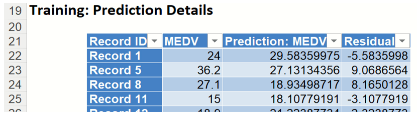
Prediction Details: Scroll down to the Training: Prediction Details report to find the Prediction value for the MEDV variable for each record, as well as the Residual value.
Training Prediction Details

LinReg_ValidationLiftChart
Another interest in a data-science context will be the predicted and actual values for the MEDV variable along with the residual (difference) for each predicted value in the Validation partition.
LinReg_ValidationScore displays the newly added Output Variable frequency chart, the Training: Prediction Summary and the Training: Prediction Details report. All calculations, charts and predictions on the LinReg_ValidationScore output sheet apply to the Validation partition.
Frequency Charts: The output variable frequency chart for the validation partition opens automatically once the LinReg_ValidationScore worksheet is selected. This chart displays a detailed, interactive frequency chart for the Actual variable data and the Predicted data, for the validation partition. For more information on this chart, see the LinReg_TrainingLiftChart explanation above.
Prediction Summary: In the Prediction Summary report, Analytic Solver Data Science displays the total sum of squared errors summaries for the Validation partition.
Prediction Details: Scroll down to the Training: Prediction Details report to find the Prediction value for the MEDV variable for each record, as well as the Residual value.
LinReg_TrainingLiftChart & LinReg_ValidationLiftChart
Lift charts and RROC Curves (on the LinReg_TrainingLiftChart and LinReg_ValidationLiftChart tabs, respectively) are visual aids for measuring model performance. Lift Charts consist of a lift curve and a baseline. The greater the area between the lift curve and the baseline, the better the model. RROC (regression receiver operating characteristic) curves plot the performance of regressors by graphing over-estimations (or predicted values that are too high) versus underestimations (or predicted values that are too low.) The closer the curve is to the top left corner of the graph (in other words, the smaller the area above the curve), the better the performance of the model.
After the model is built using the training data set, the model is used to score on the training data set and the validation data set (if one exists). Then the data set(s) are sorted using the predicted output variable value. After sorting, the actual outcome values of the output variable are cumulated and the lift curve is drawn as the number of cases versus the cumulated value. The baseline (red line connecting the origin to the end point of the blue line) is drawn as the number of cases versus the average of actual output variable values multiplied by the number of cases. The decilewise lift curve is drawn as the decile number versus the cumulative actual output variable value divided by the decile's mean output variable value. The bars in this chart indicate the factor by which the MLR model outperforms a random assignment, one decile at a time. Refer to the validation graph below. In the first decile in the validation dataset, taking the most expensive predicted housing prices in the dataset, the predictive performance of the model is about 1.8 times better as simply assigning a random predicted value.
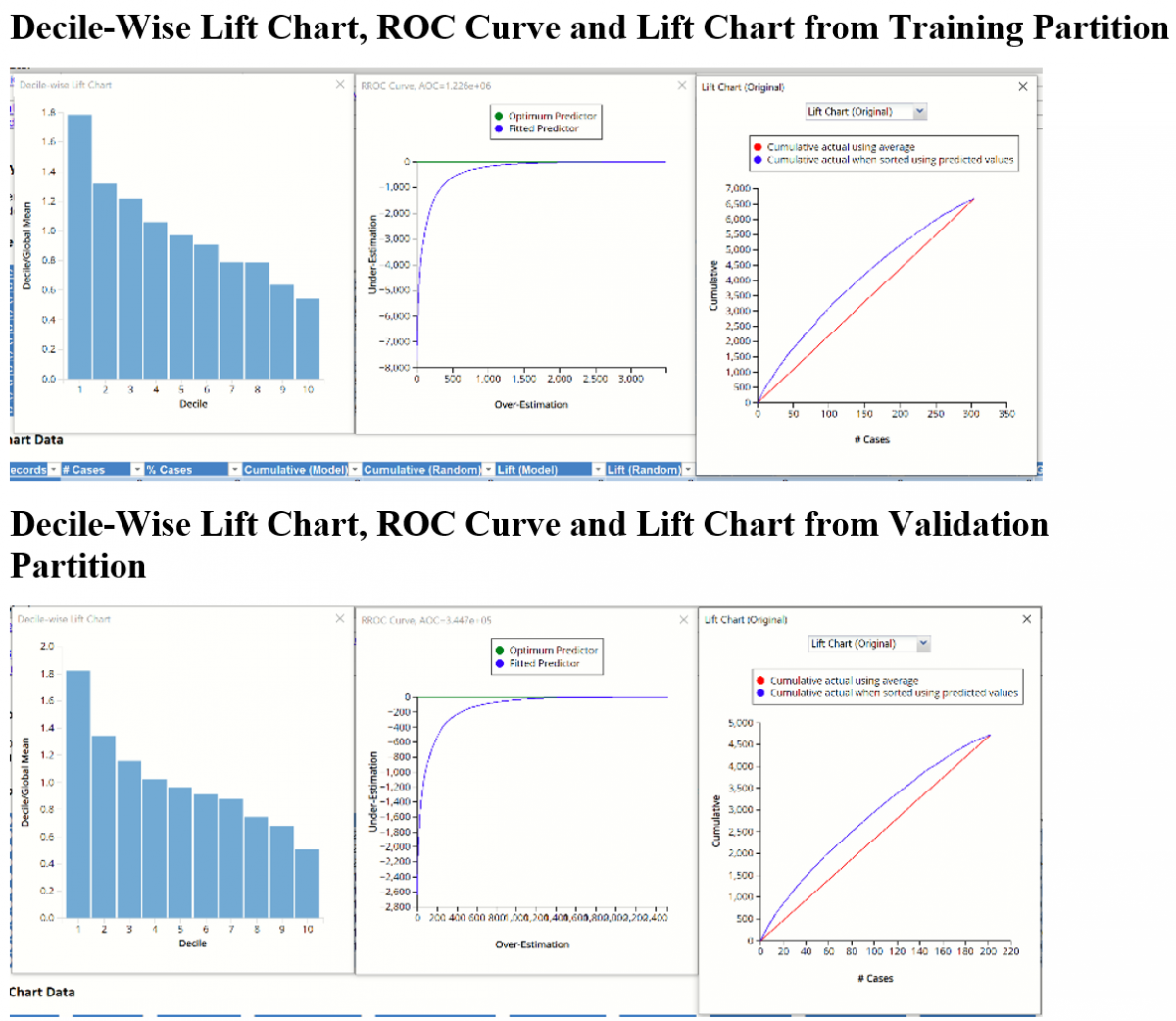
In an RROC curve, we can compare the performance of a regressor with that of a random guess (red line) for which under estimations are equal to over-estimations shifted to the minimum under estimate. Anything to the left of this line signifies a better prediction and anything to the right signifies a worse prediction. The best possible prediction performance would be denoted by a point at the top left of the graph at the intersection of the x and y axis. This point is sometimes referred to as the “perfect classification”. Area Over the Curve (AOC) is the space in the graph that appears above the ROC curve and is calculated using the formula: sigma2 * n2/2 where n is the number of records The smaller the AOC, the better the performance of the model. In this example we see that the area above the curve in both datasets, or the AOC, is fairly large which indicates that this model might not be the best fit to the data.
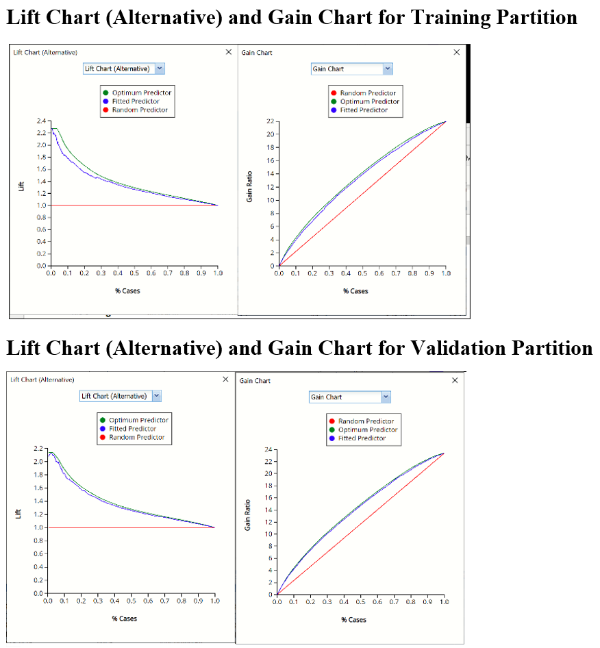
Two new charts were introduced in V2017: a new Lift Chart and the Gain Chart. To display these new charts, click the down arrow next to Lift Chart (Original), in the Original Lift Chart, then select the desired chart.

Select Lift Chart to display Analytic Solver Data Science's new Lift Chart. Each of these charts consists of an Optimum Predictor curve, a Fitted Predictor curve, and a Random Predictor curve. The Optimum Predictor curve plots a hypothetical model that would provide perfect classification for our data. The Fitted Predictor curve plots the fitted model and the Random Predictor curve plots the results from using no model or by using a random guess (i.e. for x% of selected observations, x% of the total number of positive observations are expected to be correctly classified).
The Alternative Lift Chart plots Lift against % Cases. The Gain chart plots Gain Ratio against % Cases.
LinReg_Simulation
As discussed above, Analytic Solver Data Science generates a new output worksheet, LinReg_Simulation, when Simulate Response Prediction is selected on the Simulation tab of the Linear Regression dialog.
This report contains the synthetic data, the predicted values for the simulation, or synthetic, data, the predicted values for the training partition (using the fitted model) and the Excel – calculated Expression column, if populated in the dialog. A dialog may be opened to switch between the synthetic data, training data and the expression results, or a combination of two, as long as they are of the same type.
Synthetic Data
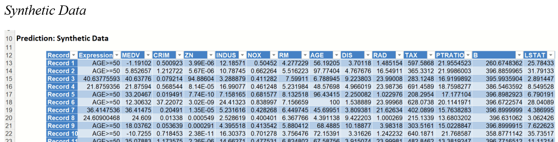
Note the first column in the output, Expression. This column was inserted into the Synthetic Data results because Calculate Expression was selected and an Excel function was entered into the Expression field, on the Simulation tab of the Linear Regression dialog
[@MEDV]/[@RM]
As a result, the values in this column will be equal to the MEDV variable value divided by the number of rooms.
The remainder of the data in this report is synthetic data, generated using the Generate Data feature described in the chapter with the same name, that appears in the Data Science Reference Guide.
The chart that is displayed once this tab is selected, contains frequency information pertaining to the predicted value for the MEDV variable in the synthetic data.
Frequency Chart for Prediction (Simulation) data
Click Prediction (Simulation) to add the Actual data to the chart.
Data dialog

Prediction (Simulation) and Prediction (Training) for MEDV variable

The Relative Bin Differences curve gives the absolute difference between the bins for each dataset. (Click the down arrow next to Frequency and select Bin Details to view.)
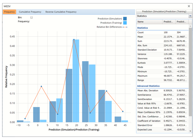
Click the down arrow next to Frequency to change the chart view to Relative Frequency or to change the look by clicking Chart Options. Statistics on the right of the chart dialog are discussed earlier in this section. For more information on the generated synthetic data, see the Generate Data chapter that appears earlier in this guide.
Click the Prediction (Simulation)/Prediction(Training) button to reopen the Data dialog. This time, select Expression (Simulation) and Expression (Training).
Expression Simulation vs Expression Training results
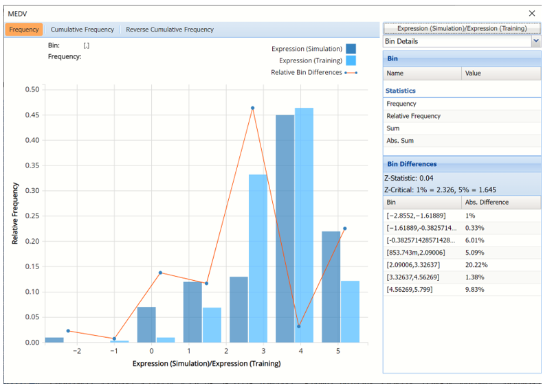
This chart displays the predicted cost per room (MEDV/RM) for the Training partition as well as the synthetic data.
LinReg_Stored
For information on Stored Model Sheets, in this example LinReg_Stored, please refer to the “Scoring New Data” chapter that apperas later in this guide.