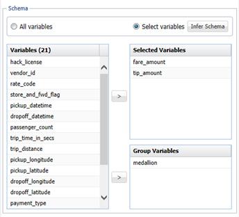
The NYC Taxi dataset holds information about the trips of 14,144 distinct taxi cabs, identifed by their medallions – which are permits to operate a taxi cab in New York City, and hence unique identifiers. Let’s see how fare and tip distributions look when grouped by medallion. We can retrieve the data across all 170 million rows with the XLMiner menu option Get Data - Big Data - Summarize:

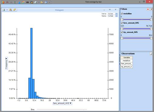
Again this takes just a few seconds, but this time we retrieve 14,144 rows from the Apache Spark cluster, instead of just a few. Let’s visualize fare and tip distributions by medallion, using XLMiner's Chart Wizard to draw the histograms. Here's the distribution of fares:

We see that fares peak around $10. We assume that the distribution of tips is similiar.
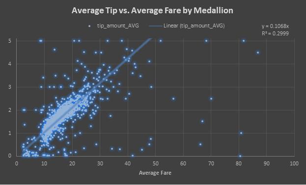
So let's hypothesize a linear relationship between fares and tips, visualize the data as a scatter plot, and draw a linear regression line through the data. Again this is all point-and-click in Excel -- no R or Python programming is required.

The linear regression yields a rather low R-squared, since there are many outliers. But we see there is a strong linear trend, with a tip percentage around 10%. Therefore, any univariate linear model will do a good job predicting the average tip given the average fare for the trip.
But we want to do better. Later, we'll fit a predictive model that uses other data, present in the NYC Taxi dataset, to predict -- with 78% accuracy -- fares that yield higher tips (20% or more) -- something a taxi driver would like to know!