Single Tree - Regression Tree Example
Analytic Solver Data Science includes four different methods for creating regression trees: boosting, bagging, random trees, and single tree. The first three (boosting, bagging, and random trees) are ensemble methods that are used to generate one powerful model by combining several “weaker” tree models. For information on these methods, see Ensemble Methods.
This example illustrates how to use the Regression Tree algorithm using a single tree. We will use the Boston_Housing.xlsx dataset to illustrate this method. See below for examples using bagging, random trees and single trees.
Inputs
Click Help – Example Models, then Forecasting/Data Science Examples to open the Boston_Housing.xlsx dataset. This dataset includes fourteen variables pertaining to housing prices from census tracts in the Boston area. This dataset was collected by the US Census Bureau in the 1940’s. See the Data sheet, within the example worksheet, for a description of all variables.
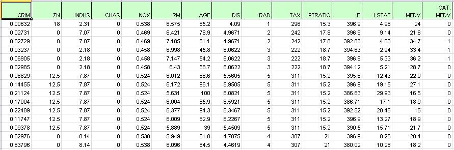
The figure below displays a portion of the data; observe the last column (CAT. MEDV). This variable has been derived from the MEDV variable by assigning a 1 for MEDV levels above 30 (>= 30) and a 0 for levels below 30 (<30) and will not be used in these examples. The variable will not be used in this example.
Boston Housing example dataset
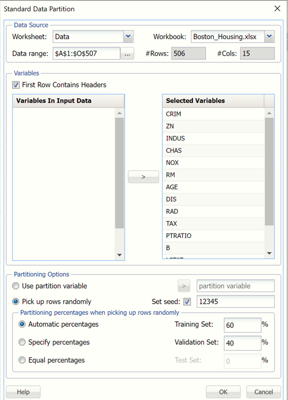
Partition the data into training and validation sets using the Standard Data Partition defaults of 60% of the data randomly allocated to the Training Set and 40% of the data randomly allocated to the Validation Set. For more information on partitioning a dataset, see the Data Science Partitioning chapter.
Standard Data Partition dialog
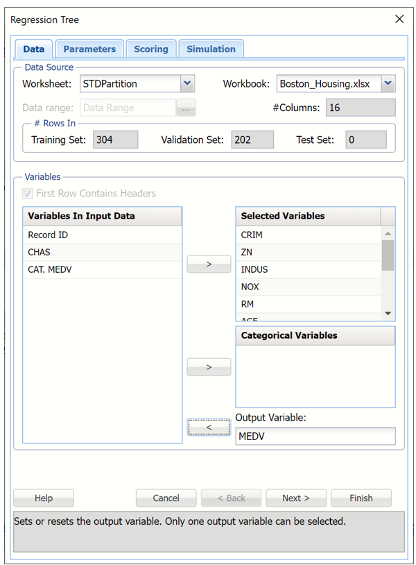
Click Predict – Regression Tree - Single Tree to open the Regression Tree – Data tab.
Select MEDV as the Output Variable, then select the remaining variables (except CAT.MEDV, RecordID, and CHAS) as Selected Variables.
All supervised algorithms include a new Simulation tab. This tab uses the functionality from the Generate Data feature (described in the What’s New section of th Data Science User Guide and then more in depth earlier in this guide) to generate synthetic data based on the training partition, and uses the fitted model to produce predictions for the synthetic data. The resulting report will contain the synthetic data, the predicted values and the Excel-calculated Expression column, if present. Since this new functionality does not support categorical variables, the CHAS variable will not be included in the model.
Regression Tree dialog, Data tab
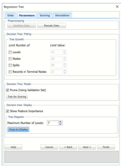
Click Next to advance to the Regression Tree – Parameters tab.
As discussed in previous sections, Analytic Solver Data Science includes the ability to partition and rescale a dataset “on-the-fly” from within a classification or prediction method by clicking Partition Data and/or Rescale Data on the Parameters tab. Analytic Solver Data Science will partition or rescale your dataset (according to the partition and rescaling options you set) immediately before running the regression method. If partitioning or rescaling has already occurred on the dataset, these options will be disabled. For more information on partitioning, please see the Data Science Partitioning chapter. For more information on rescaling your data, please see the Transform Continuous Data chapter.
In the Tree Growth section, leave all selections at their default settings. Values entered for these options limit tree growth, i.e. if 10 is entered for Levels, the tree will be limited to 10 levels.
Select Prune (Using Validation Set). (This option is enabled when a Validation Dataset exists.) Analytic Solver Data Science will prune the tree using the validation set when this option is selected. (Pruning the tree using the validation set reduces the error from over-fitting the tree to the training data.)
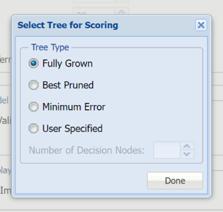
Click Tree for Scoring and select Fully Grown.
Select the tree used for scoring (enabled when a validation partition exists)
Select Show Feature Importance. This table shows the relative importance of the feature measured as the reduction of the error criterion during the tree growth.
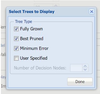
Leave Maximum Number of Levels at the default setting of 7. This option specifies the maximum number of levels in the tree to be displayed in the output. Select Trees to Display to select the types of trees to display: Fully Grown, Best Pruned, Minimum Error or User Specified.
- Select Fully Grown to “grow” a complete tree using the training data.
- Select Best Pruned to create a tree with the fewest number of nodes, subject to the constraint that the error be kept below a specified level (minimum error rate plus the standard error of that error rate).
- Select Minimum error to produce a tree that yields the minimum classification error rate when tested on the validation data.
- To create a tree with a specified number of decision nodes select User Specified and enter the desired number of nodes.
Select Fully Grown, Best Pruned, and Minimum Error.
Select the tree(s) to display in the output.
Regression Tree dialog, Parameters tab

Select Next to advance to the Scoring tab.
Select all four options for Score Training/Validation data.
When Detailed report is selected, Analytic Solver Data Science will create a detailed report of the Regression Trees output.
When Summary report is selected, Analytic Solver Data Science will create a report summarizing the Regression Trees output.
When Lift Charts is selected, Analytic Solver Data Science will include Lift Chart and RROC Curve plots in the output.
When Frequency Chart is selected, a frequency chart will be displayed when the RT_TrainingScore and RT_ValidationScore worksheets are selected. This chart will display an interactive application similar to the Analyze Data feature, explained in detail in the Analyze Data chapter that appears earlier in this guide. This chart will include frequency distributions of the actual and predicted responses individually, or side-by-side, depending on the user’s preference, as well as basic and advanced statistics for variables, percentiles, six sigma indices.
Since we did not create a test partition, the options for Score test data are disabled. See the chapter “Data Science Partitioning” for information on how to create a test partition.
See the Scoring New Data chapter within the Analytic Solver Data Science User Guide for more information on Score New Data in options.
Regression Tree dialog, Scoring tab
Click Next to advance to the Simulation tab.
Select Simulation Response Prediction to enable all options on the Simulation tab of the Regression Tree dialog.
Simulation tab: All supervised algorithms include a new Simulation tab. This tab uses the functionality from the Generate Data feature (described earlier in this guide) to generate synthetic data based on the training partition, and uses the fitted model to produce predictions for the synthetic data. The resulting report, RT_Simulation, will contain the synthetic data, the predicted values and the Excel-calculated Expression column, if present. In addition, frequency charts containing the Predicted, Training, and Expression (if present) sources or a combination of any pair may be viewed, if the charts are of the same type.
Regression Tree dialog, Simulation tab
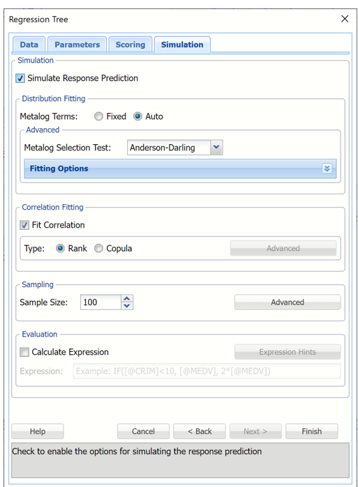
Evaluation: Select Calculate Expression to amend an Expression column onto the frequency chart displayed on the RT_Simulation output tab. Expression can be any valid Excel formula that references a variable and the response as [@COLUMN_NAME]. Click the Expression Hints button for more information on entering an expression. Note that variable names are case sensitive. See any of the prediction methods to see the Expressison field in use.
For more information on the remaining options shown on this dialog in the Distribution Fitting, Correlation Fitting and Sampling sections, see the Generate Data chapter that appears earlier in this guide.
Click Finish to run Regression Tree on the example dataset.
Output Worksheets
Output sheets containing the results for Regression Tree will be inserted into your active workbook to the right of the STDPartition worksheet.
RT_Output
Output from prediction method will be inserted to the right of the workbook. RT_Output includes 4 segments: Output Navigator, Inputs, Training Log and Feature Importance.
Output Navigator: The Output Navigator appears at the top of each output worksheet. Use this feature to quickly navigate to all reports included in the output.
Regression Trees Output Navigator

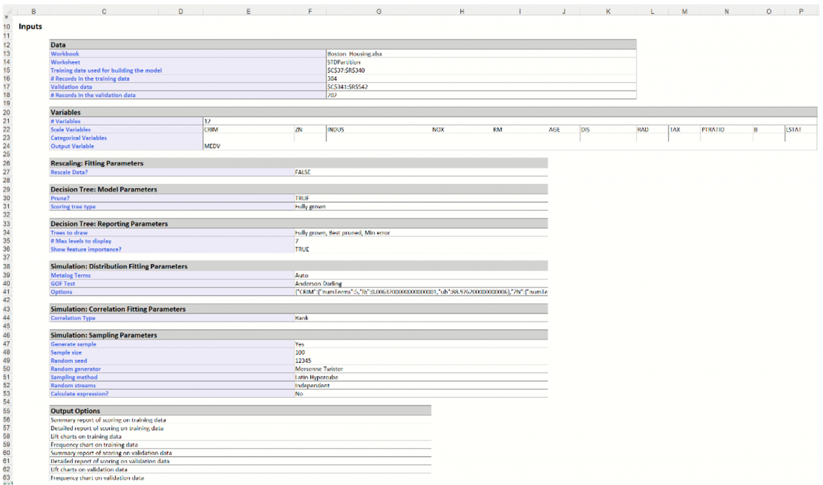
Inputs: Scroll down to the Inputs section to find all inputs entered or selected on all tabs of the Regression Tree dialog.
Regression Tree Inputs
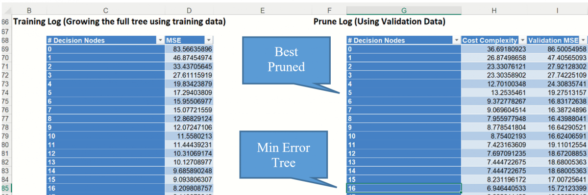
Training Log: Scroll down to the Training log (shown below) to see the mean-square error (MSE) at each stage of the tree for both the training and validation data sets. The MSE value is the average of the squares of the errors between the predicted and observed values in the sample. The training log shows that the training MSE continues reducing as the tree continues to split.
Analytic Solver Data Science chooses the number of decision nodes for the pruned tree and the minimum error tree from the values of Validation MSE. In the Prune log shown below, the smallest Validation MSE error belongs to the tree with 16 decision nodes (MSE=15.72). This is the Minimum Error Tree – the tree with the smallest misclassification error in the validation dataset. The Best Pruned Tree is the smallest tree with an error within one standard error of the minimum error tree.
In this example, the Minimum Error Tree has a Cost Complexity = 6.95 and a Validation MSE = 15.72 while the Best Pruned Tree has 5 decision nodes.
Training Log and Prune Log
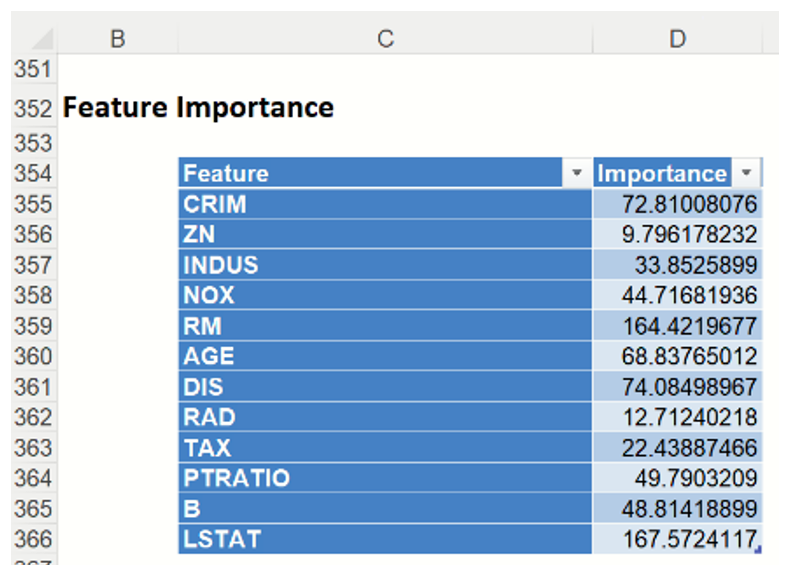
Feature Importance: This table displays the variables that are included in the model along with their Importance value. The larger the Importance value, the bigger the influence the variable has on the predicted classification. In this instance, the census tracts with homes with many rooms will be predicted as having a larger selling price.
Feature Importance
RT_FullTree
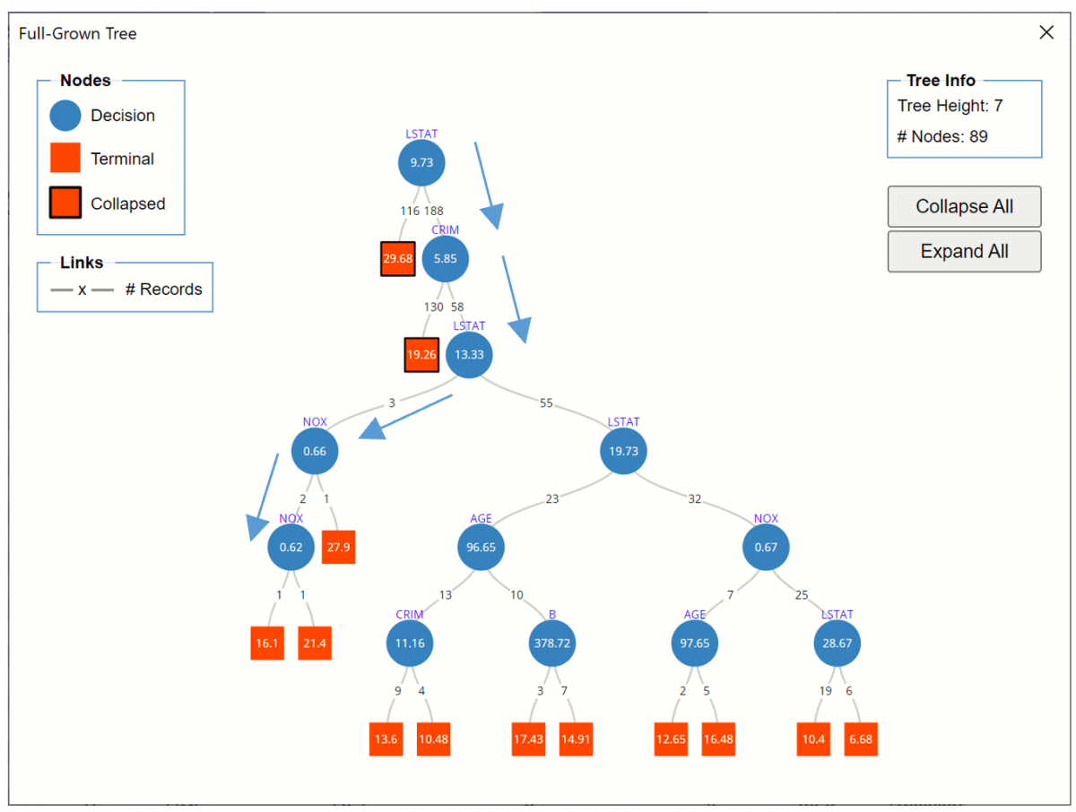
To view the Full Grown Tree, either click the Fully Grown Tree link in the Output Navigator or click the RT_FullTree worksheet tab. Recall that the Fully Grown Tree is the tree used to fit the Regression Tree model (using the Training data) and the tree used to score the validation partition.
Regression Tree Full Tree
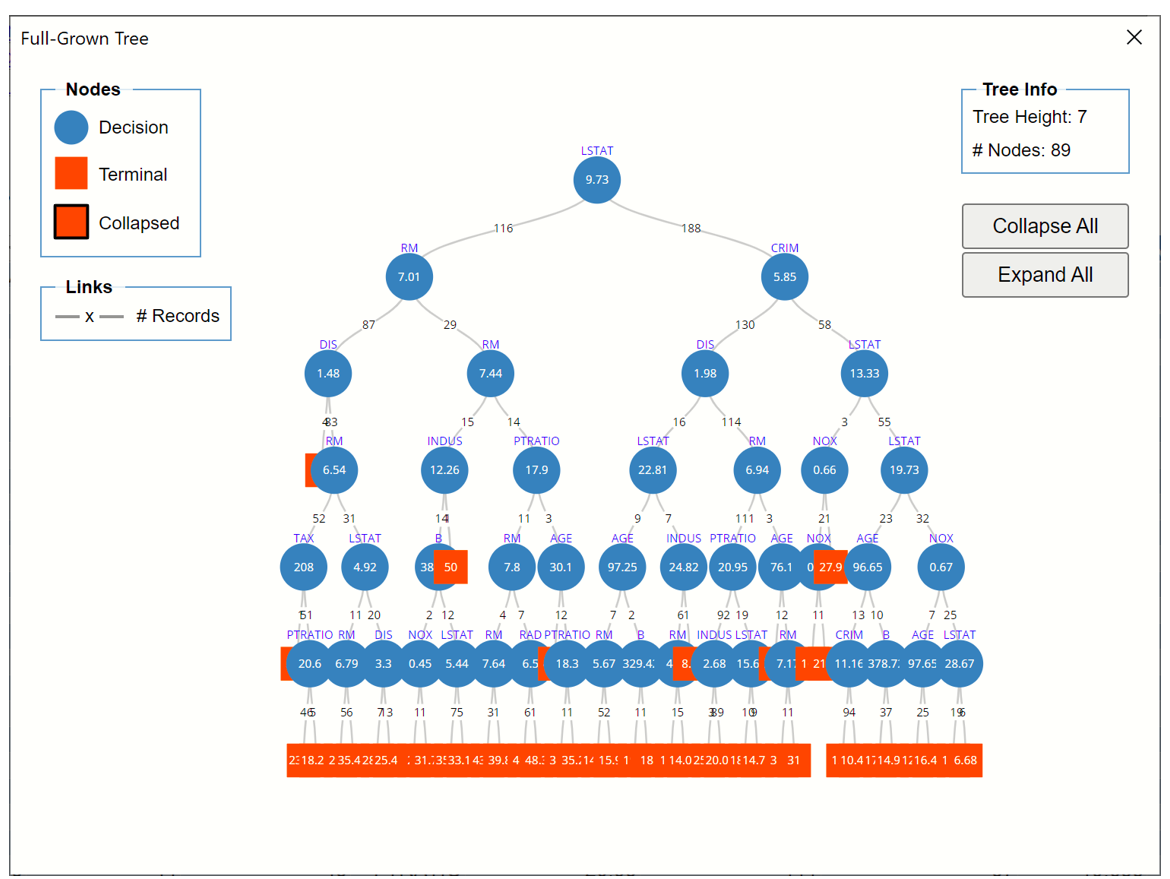
Nodes may be collapsed for easier reading.
Here is an example of a path down the Fully Grown Tree fitted on the Training partition.
- LSTAT (% Lower Status of the Population) is chosen as the first splitting variable; if this value is >= 9.73 (188 cases), then CRIM (crime rate per capita) is chosen for splitting.
- If CRIM >= 5.85 (58 cases) then the LSTAT variable is again selected for splitting.
- If LSTAT < 13.33 (3 cases), then the NOX variable (concentration of nitric oxide) is selected as the splitting variable.
- If NOX is less than .66 (2 cases), then NOX is again selected for splitting. One record (record #433) in the training partition has a NOX variable value < 0.62 with an MEDV value = 16.1 and the other training partition record has a NOX variable value >= 0.62 with an MEDV variable = 21.4 (record #126). (Note record IDs found by looking up MEDV values of 16.1 and 21.4, respectively in STDPartition.)
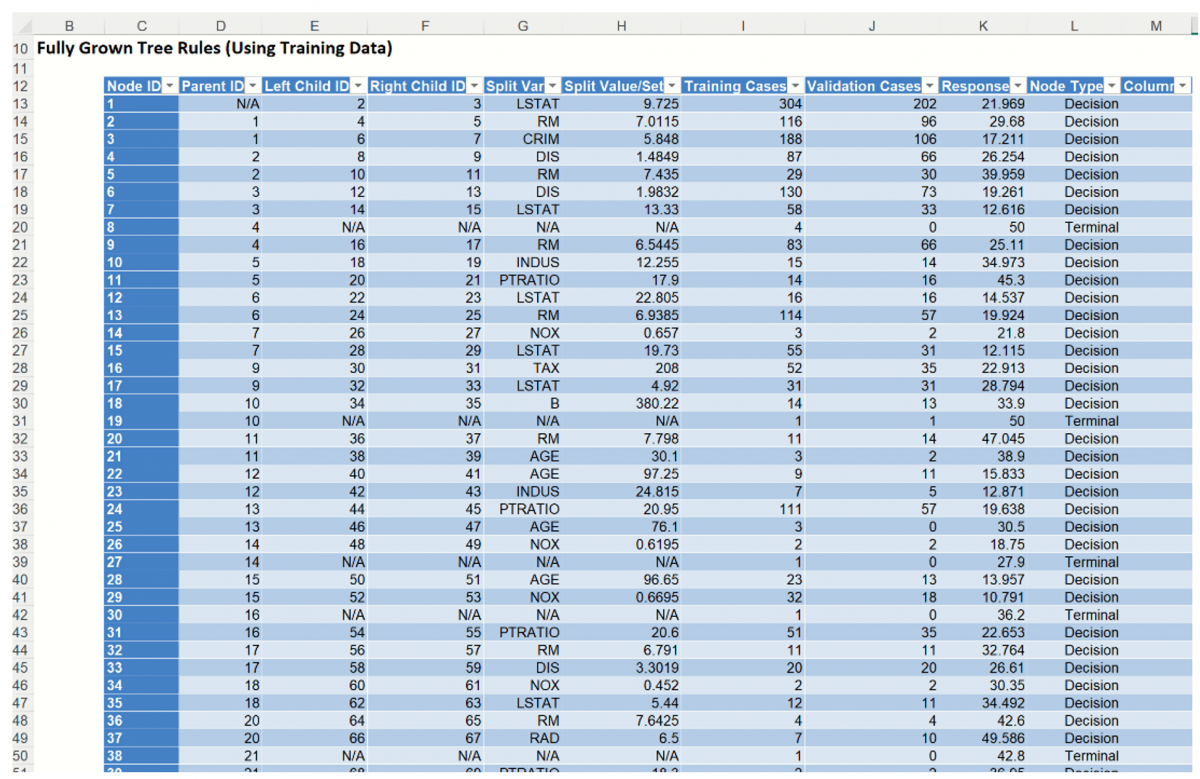
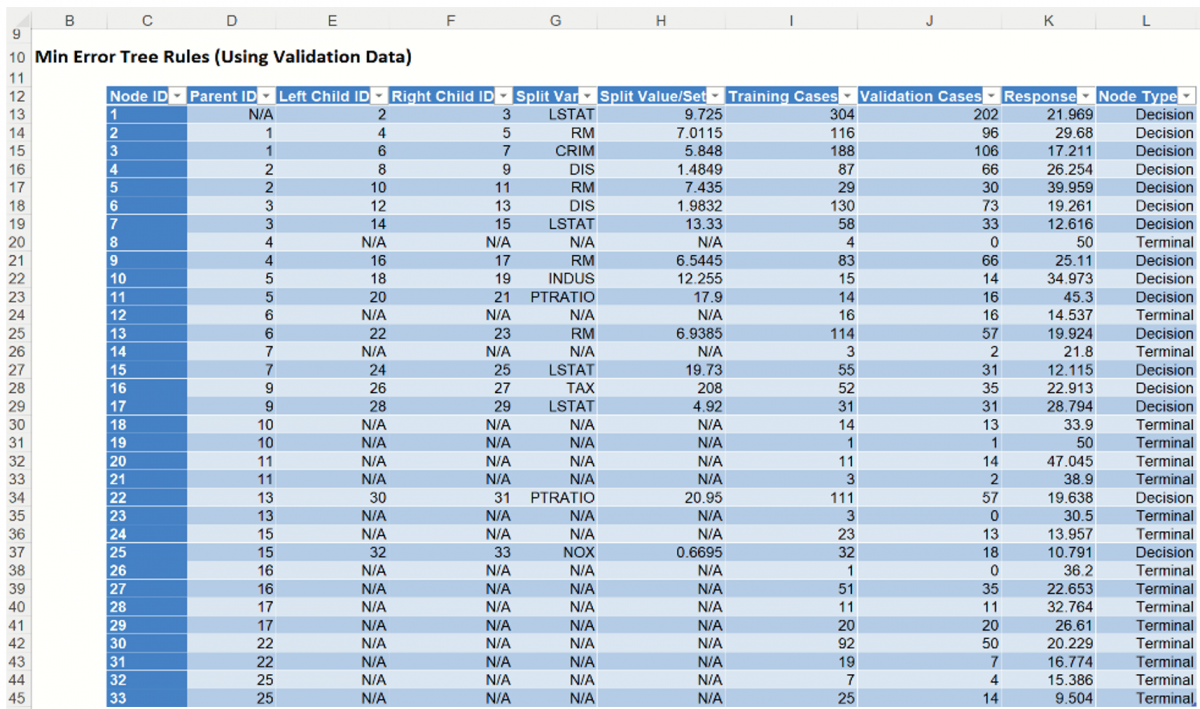
This same path can be followed in the Tree Rules using the records under Training Cases.
Node 1: All 304 cases in the training partition were split on the LSTAT variable using a splitting value of 9.725. The average value of the response variable (MEDV) for all 304 records is 21.969. From here, 116 cases were assigned to Node 2 and 188 cases were assigned to Node 3.
Node 3: 188 cases were assigned from Node 1. These cases were split on the CRIM variable using a splitting value of 5.848. The average value of the response variable for these 188 cases is 17.211 From here, 130 cases were assigned Node 6 and 58 cases were assigned Node 7.
Node 7: 58 cases were assigned to Node 7 from Node 3. These cases were split on the LSTAT variable (again) using a splitting value of 13.33. The average value of the response variable for these 58 cases is 12.616. From here, 3 cases were assigned to Node 14 and 55 were assigned to Node 15.
Node 14: 3 cases were assigned to Node 14 from Node 7. These cases were split on the NOX variable using a splitting value of 0.657. The average value of the response variable for these 3 cases is 21.8 From here, 2 records were assigned to Node 26 and 1 record was assigned to Node 27.
Node 26. 2 cases were assigned to Node 26 from Node 14. These cases were split on the NOX variable (again) using a splitting value of 0.6195. Both records assigned to this node have a tentative predicted value of 18.75.
Now these rules are used to score on the validation partition.
Node 1: All 202 cases in the training partition were split on the LSTAT variable using a splitting value of 9.725. From here, 96 cases were assigned to Node 2 and 106 cases were assigned to Node 3.
Node 3: 106 cases were assigned to Node 3 from Node 1. These cases were split on the CRIM variable using a splitting value of 5.848. From here, 73 cases were assigned to Node 6 and 33 cases were assigned Node 7.
Node 7: 33 cases were assigned to Node 7 from Node 3. These cases were split on the LSTAT variable (again) using a splitting value of 13.33. From here, 2 cases were assigned to Node 14 and 31 were assigned to Node 15.
Node 14: 2 cases were assigned to Node 14 from Node 7. These cases were split on the NOX variable using a splitting value of 0.657. From here, 2 records were assigned to Node 26 and 1 record was assigned to Node 27.
Node 26. 2 cases were assigned to Node 26 from Node 14. These cases were split on the NOX variable (again) using a splitting value of 0.6195. Both cases were assigned to Node 48.
Node 48: This is a terminal node; no other splitting occurs.
RT_BestTree
To view the Best Pruned Tree, either click the Best Pruned Tree link in the Output Navigator or click the RT_BestTree worksheet tab. Recall that the Best Pruned Tree is the smallest tree that has an error within one standard error of the minimum error tree.
Regression Tree Best Pruned Tree
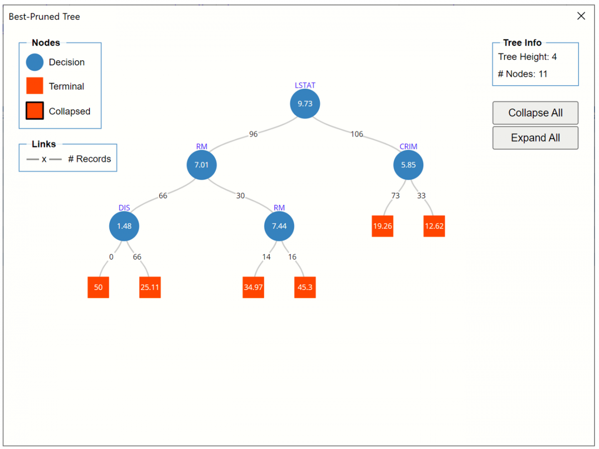
LSTAT (% Lower Status of the Population) is chosen as the first splitting variable; if this value is >= 9.73 (106 cases), then CRIM (crime rate per capita) is chosen for splitting; if CRIM is >= 5.85 (33 cases) then the predicted value equals 12.62. If CRIM is < 5.85 (73 cases) then the predicted value equals 19.26.
Regression Tree Best Pruned Tree Rules
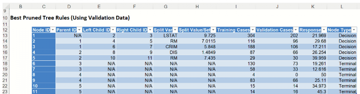
The path from above can be followed through the Best Pruned Tree Rules table.
Node 1: 202 cases from the validation partition are assigned to nodes 2 (96 cases) and 3 (106 cases) using the LSTAT variable with a split value of 9.725.
Node 3: 106 cases from the validation partition are assigned to nodes 6 (66 cases) and 7 (30 cases) using the RM variable with a split value of 7.011.
Node 6: 73 cases from the validation partition are assigned to this terminal node. The predicted response is equal to 19.261.
Node 7: 33 cases from the validation partition are assigned to this termional node. The predicted response is equal to 12.616.
RT_MinErrorTree
To view the Min-Error Tree, either click the Min-Error Rules (Using Validation Data link in the Output Navigator or click the RT_MinErrorTree worksheet tab. Recall that the Minimum Error tree is the tree with the minimum error on the validation dataset.
An example of a path down the tree is shown below.
Regression Tree Min-Error Tree
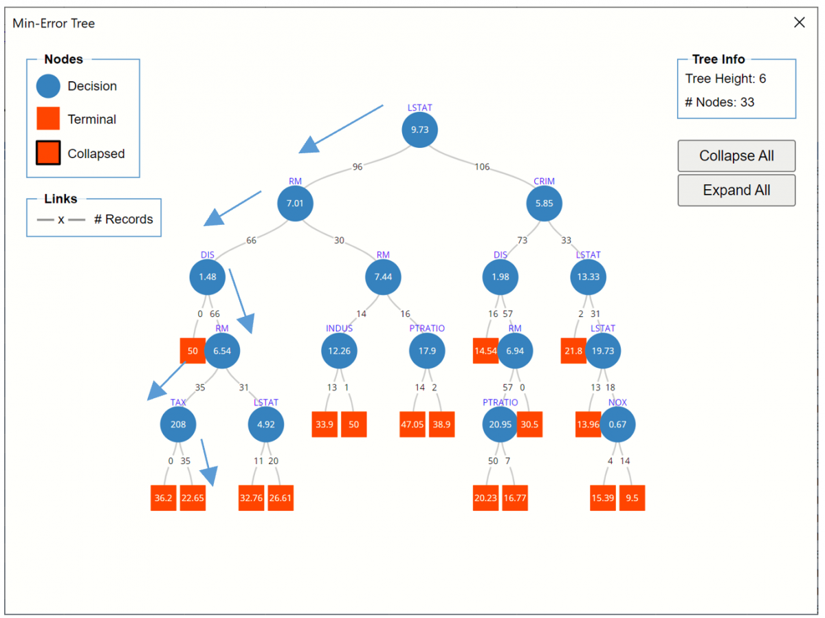
LSTAT (% Lower Status of the Population) is chosen as the first splitting variable; if this value is < 9.73 (96 cases), then RM (# of Rooms) is chosen for splitting; if RM <7.01 (66 cases) then DIS (weighted distances to 5 employment centers) is chosen for splitting. If DIS is >=1.48 (66 cases) then the RM variable is (again) chosen as the next divider. If RM <6.54 (35 cases), then TAX is chosen for splitting. All 35 cases assigned to this node have a TAX value >=208. The predicted value for all 35 cases is 22.65. No cases are assigned a predicted value of 36.2.
Click the Min- Error Tree Rules link to navigate to Tree rules for the Min-Error tree. The path from above can be followed through the table.
Node 1: 202 cases from the validation partition are assigned to nodes 2 (96 cases) and 3 (106 cases) using the LSTAT variable with a split value of 9.725.
Node 2: 96 cases from the validation partition are assigned to nodes 4 (66 cases) and 5 (30 cases) using the RM variable with a split value of 7.011.
Node 4: 66 cases from the validation partition are assigned to nodes 8 (0 cases) and 9 (66 cases) using the DIS variable with a split value of 1.49.
Node 9: 66 cases from the validation partition are assigned to nodes 16 (35 cases) and 17 (31 cases) using the RM variable with a split value of 6.54.
Node 16: 35 cases from the validation partition are assigned to nodes 26 (0 cases) and 27 (35 cases) using the TAX variable with a split value of 208.
Node 27: 35 cases from the validation partition are assigned to this terminal node. All are assigned a predicted value of 22.653.
Regression Tree Min Error Tree Rules
RT_TrainingScore
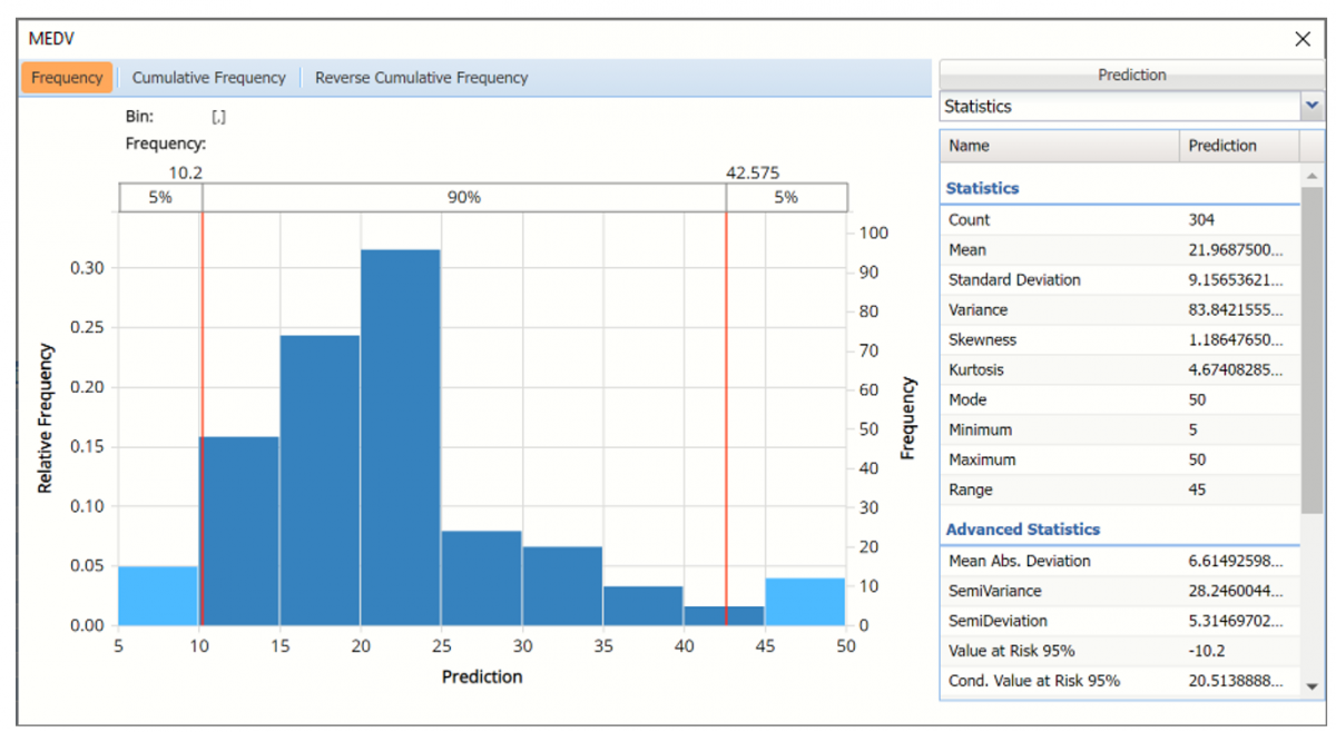
Click the RT_TrainingScore tab to view the newly added Output Variable frequency chart, the Training: Prediction Summary and the Training: Prediction Details report. All calculations, charts and predictions on this worksheet apply to the Training data.
Note: To view charts in the Cloud app, click the Charts icon on the Ribbon, select a worksheet under Worksheet and a chart under Chart.
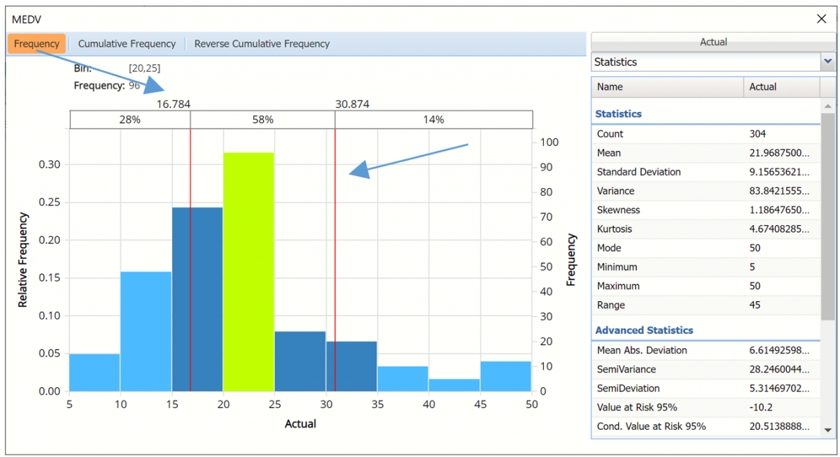
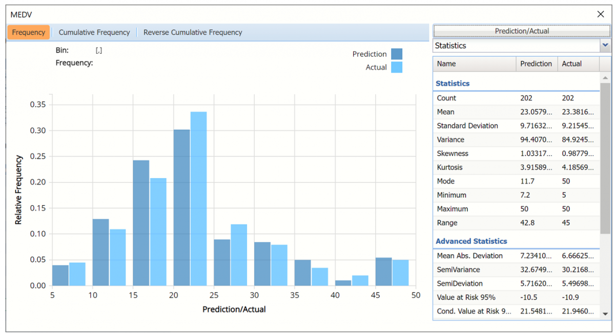
Frequency Charts: The output variable frequency chart opens automatically once the CT_TrainingScore worksheet is selected. To close this chart, click the “x” in the upper right hand corner of the chart. To reopen, click onto another tab and then click back to the CT_TrainingScore tab. To move this chart to another location on the screen, grab the title bar of the dialog and then drag.
Frequency Chart for Prediction data
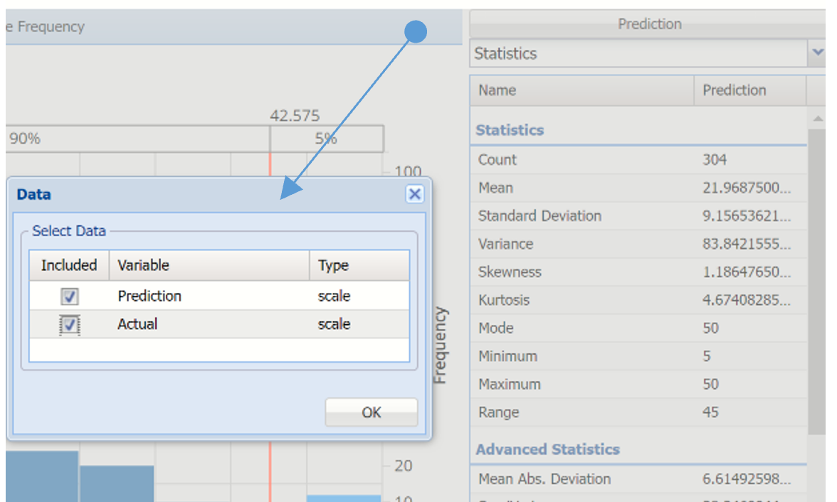
To add the actual data, click Prediction, then select both Prediction and Actual.
Click to add Actual data
Prediction and Actual Frequency Chart
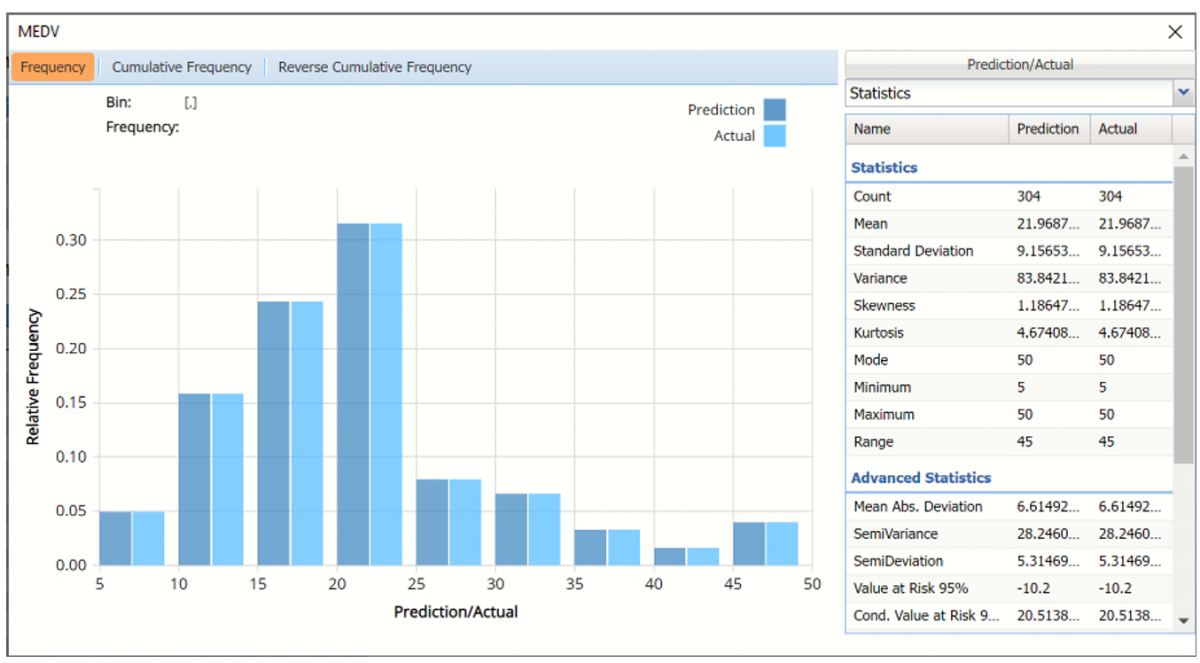
Notice in the screenshot below that both the Original and Synthetic data appear in the chart together, and statistics for both data appear on the right. As you can see from this chart, the fitted regression model perfectly predicted the values for the output variable, MEDV, in the training partition.
To remove either the Prediction or Actual data from the chart, click Prediction/Actual in the top right and then uncheck the data type to be removed.
This chart behaves the same as the interactive chart in the Analyze Data feature found on the Explore menu (described in the Analyze Data chapter that appears earlier in this guide).
- Use the mouse to hover over any of the bars in the graph to populate the Bin and Frequency headings at the top of the chart.
- When displaying either Prediction or Actual data (not both), red vertical lines will appear at the 5% and 95% percentile values in all three charts (Frequency, Cumulative Frequency and Reverse Cumulative Frequency) effectively displaying the 90th confidence interval. The middle percentage is the percentage of all the variable values that lie within the ‘included’ area, i.e. the darker shaded area. The two percentages on each end are the percentage of all variable values that lie outside of the ‘included’ area or the “tails”. i.e. the lighter shaded area. Percentile values can be altered by moving either red vertical line to the left or right.
Frequency Chart, confidence intervals modified
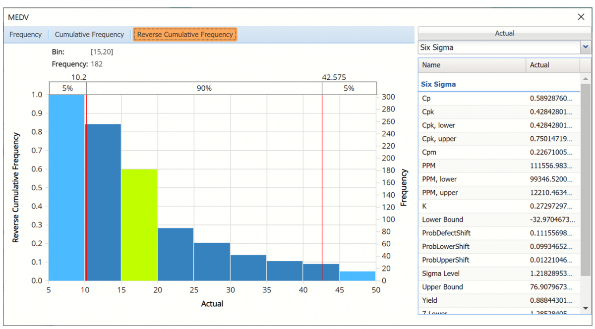
Click Cumulative Frequency and Reverse Cumulative Frequency tabs to see the Cumulative Frequency and Reverse Cumulative Frequency charts, respectively.
Cumulative Frequency chart with Percentiles displayed
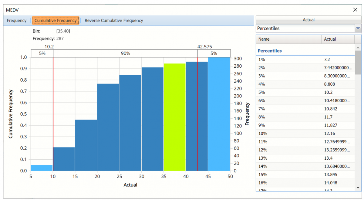
Click the down arrow next to Statistics to view Percentiles for each type of data along with Six Sigma indices.
Reverse Cumulative Frequency chart and Six Sigma indices displayed.
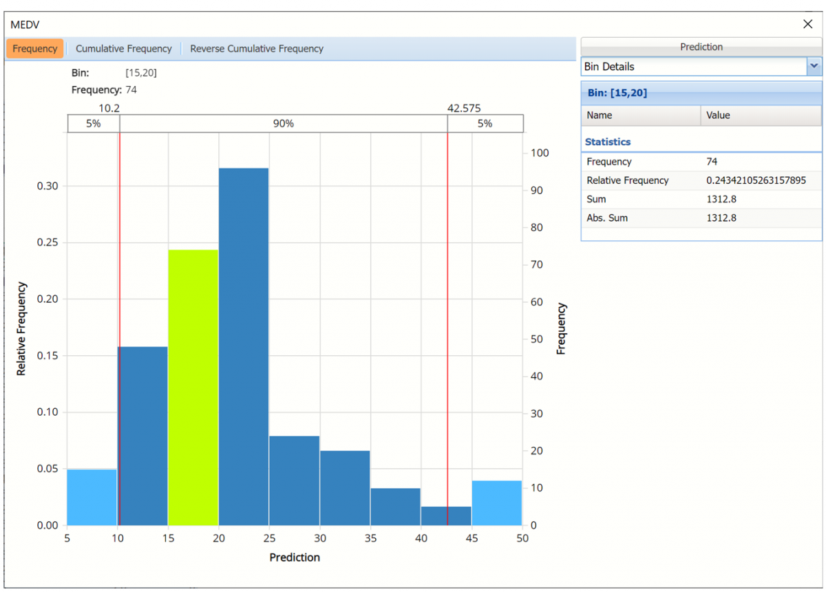
Click the down arrow next to Statistics to view Bin Details to find information pertaining to each bin in the chart.
Use the Chart Options view to manually select the number of bins to use in the chart, as well as to set personalization options.
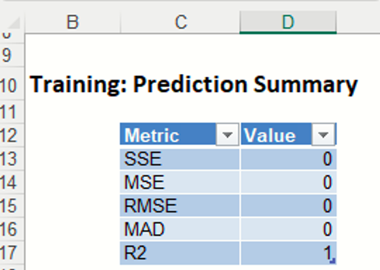
Training: Prediction Summary: The Prediction Summary tables contain summary information for the training partition. These reports contain the total sum of squared errors, the mean squared error, the root mean square error (RMS error, or the square root of the mean squared error), and also the average error (which is much smaller, since errors fall roughly into negative and positive errors and tend to cancel each other out unless squared first.). Small error values in both datasets suggest that the Single Tree method has created a very accurate predictor. However, in general, these errors are not great measures. RROC curves (discussed below) are much more sophisticated and provide more precise information about the accuracy of the predictor.
In this example, we see that the fitted model perfectly predicted the value for the output variable in all training partition records.
Regression Tree Training: Prediction Summary
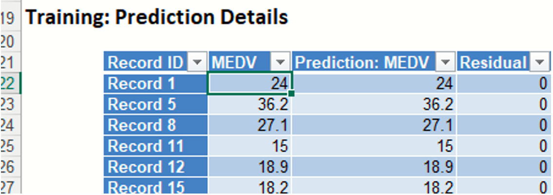
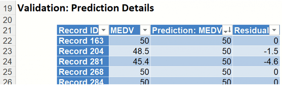
Training: Prediction Details: The Prediction Details table displays the predicted value for each record along with the actual value and the residuals for each record.
RT_ValidationScore
Another key interest in a data-mining context will be the predicted and actual values for the MEDV variable along with the residual (difference) for each predicted value in the Validation partition.
RT_ValidationScore displays the newly added Output Variable frequency chart, the Training: Prediction Summary and the Training: Prediction Details report. All calculations, charts and predictions on the RT_ValidationScore output sheet apply to the Validation partition.
Frequency Charts: The output variable frequency chart for the validation partition opens automatically once the RT_ValidationScore worksheet is selected. This chart displays a detailed, interactive frequency chart for the Actual variable data and the Predicted data, for the validation partition. For more information on this chart, see the RT_TrainingLiftChart explanation above.
Frequency Chart
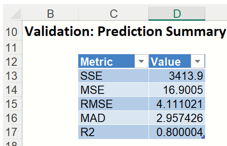
Prediction Summary: In the Prediction Summary report, Analytic Solver Data Science displays the total sum of squared errors summaries for the Validation partition.
Prediction Details: Scroll down to the Training: Prediction Details report to find the Prediction value for the MEDV variable for each record, as well as the Residual value.
RT_TrainingLiftchart and RT_ValidationLiftChart
Click the RT_TrainingLiftChart and RT_ValidationLiftChart tabs top display the lift charts and regression ROC curves. These are visual aids for measuring model performance. Lift Charts consist of a lift curve and a baseline. The greater the area between the lift curve and the baseline, the better the model. RROC (regression receiver operating characteristic) curves plot the performance of regressors by graphing over-estimations (or predicted values that are too high) versus underestimations (or predicted values that are too low.) The closer the curve is to the top left corner of the graph (in other words, the smaller the area above the curve), the better the performance of the model.
Note: To view these charts in the Cloud app, click the Charts icon on the Ribbon, select RT_TrainingLiftChart or RT_ValidationLiftChart for Worksheet and Decile Chart, ROC Chart or Gain Chart for Chart.
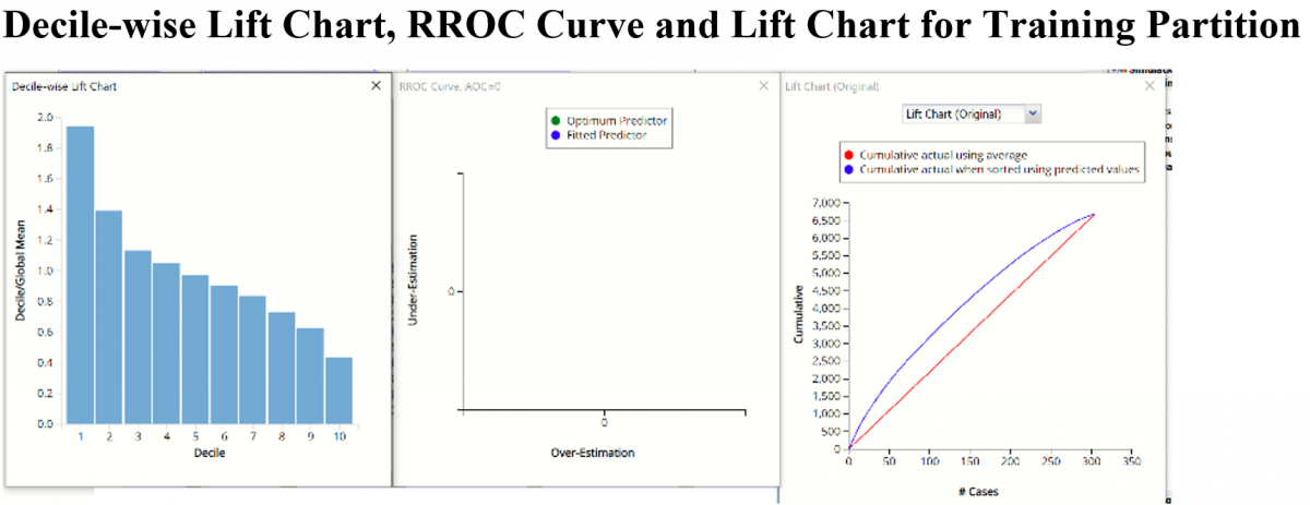
After the model is built using the training data set, the model is used to score on the training data set and the validation data set (if one exists). Then the data set(s) are sorted in descending order using the predicted output variable value. After sorting, the actual outcome values of the output variable are cumulated and the lift curve is drawn as the number of cases versus the cumulated value. The baseline (red line connecting the origin to the end point of the blue line) is drawn as the number of cases versus the average of actual output variable values multiplied by the number of cases. The decilewise lift curve is drawn as the decile number versus the cumulative actual output variable value divided by the decile's mean output variable value. This bars in this chart indicate the factor by which the CT model outperforms a random assignment, one decile at a time. Refer to the validation graph below. In the first decile, taking the most expensive predicted housing prices in the dataset, the predictive performance of the model is almost 2 times better as simply assigning a random predicted value.
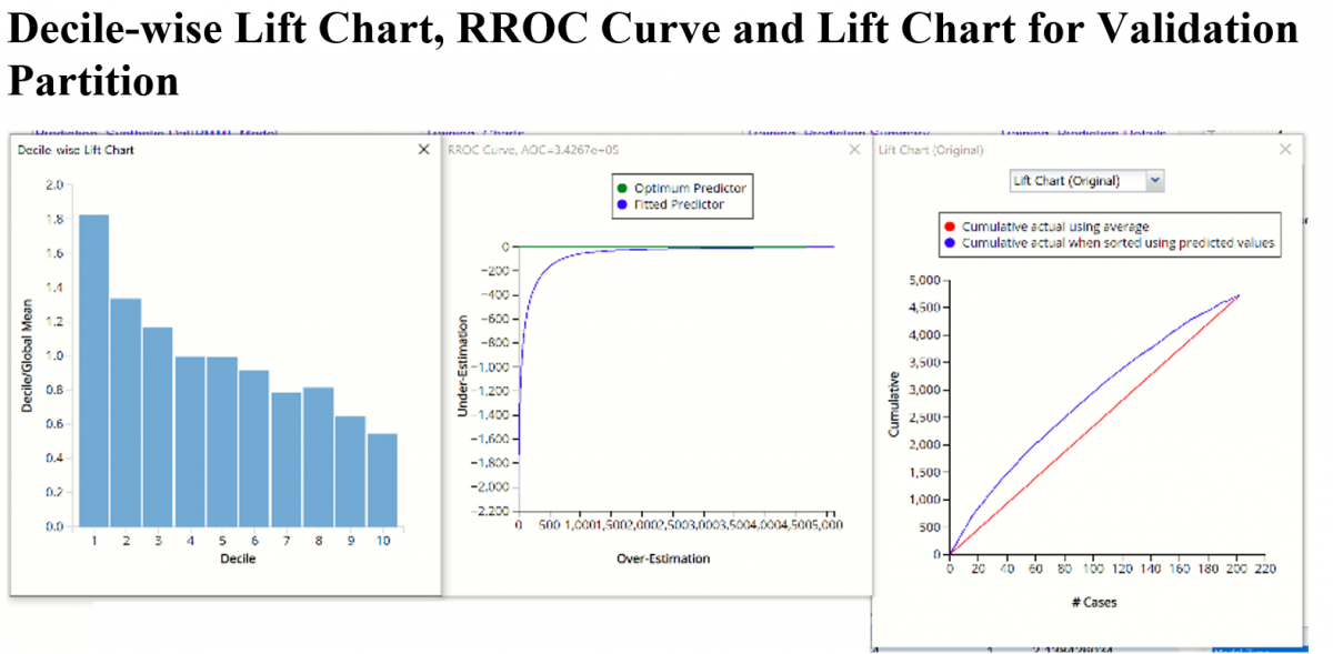
In an Regression ROC curve, we can compare the performance of a regressor with that of a random guess (red line) for which under estimations are equal to over-estimations shifted to the minimum under estimate. Anything to the left of this line signifies a better prediction and anything to the right signifies a worse prediction. The best possible prediction performance would be denoted by a point at the top left of the graph at the intersection of the x and y axis. This point is sometimes referred to as the “perfect prediction”. Area Over the Curve (AOC) is the space in the graph that appears above the ROC curve and is calculated using the formula: sigma2 * n2/2 where n is the number of records The smaller the AOC, the better the performance of the model.
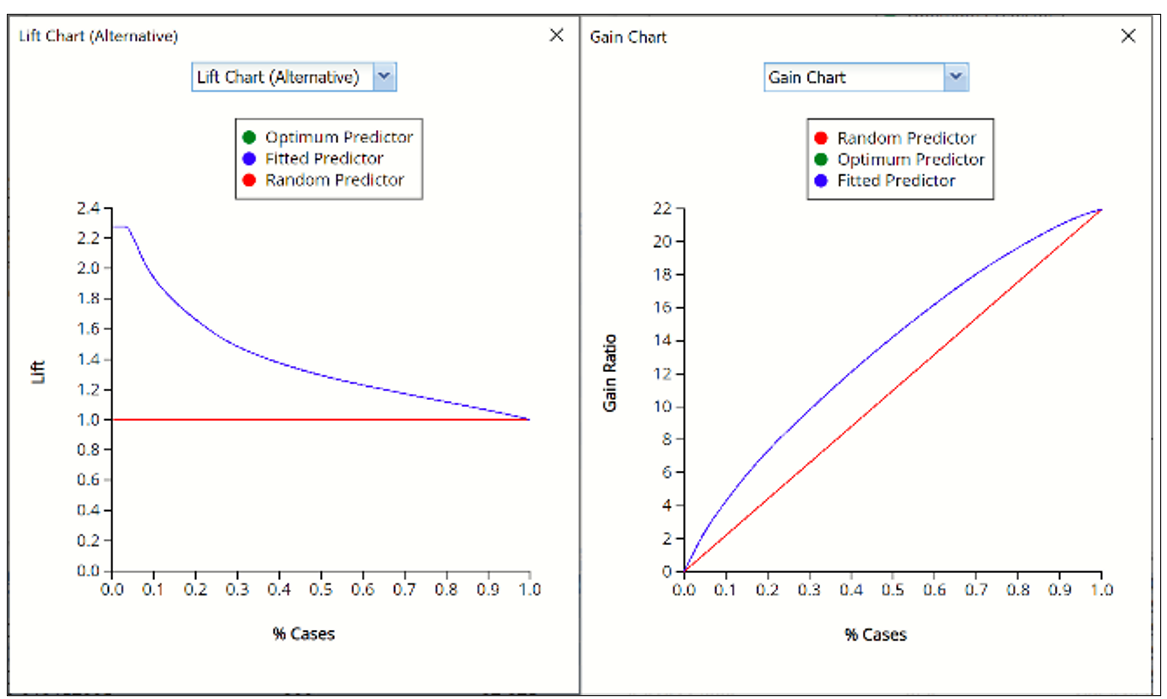
In V2017, two new charts were introduced: a new Lift Chart and the Gain Chart. To display these new charts, click the down arrow next to Lift Chart (Original), in the Original Lift Chart, then select the desired chart.
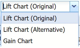
Select Lift Chart (Alternative) to display Analytic Solver Data Science's new Lift Chart. Each of these charts consists of an Optimum Classifier curve, a Fitted Classifier curve, and a Random Classifier curve. The Optimum Classifier curve plots a hypothetical model that would provide perfect classification for our data. The Fitted Classifier curve plots the fitted model and the Random Classifier curve plots the results from using no model or by using a random guess (i.e. for x% of selected observations, x% of the total number of positive observations are expected to be correctly classified).
The Alternative Lift Chart plots Lift against % Cases.
Lift Chart (Alternative) and Gain Chart for Training Partition
Lift Chart (Alternative) and Gain Chart for Validation Partition
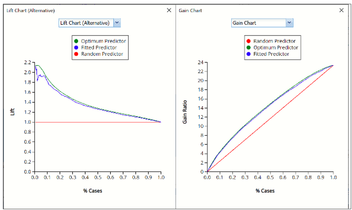
Click the down arrow and select Gain Chart from the menu. In this chart, the Gain Ratio is plotted against the % Cases.
RT_Simulation
As discussed above, Analytic Solver Data Science generates a new output worksheet, RT_Simulation, when Simulate Response Prediction is selected on the Simulation tab of the Regression Tree dialog.
This report contains the synthetic data, the predicted values for the training data (using the fitted model) and the Excel – calculated Expression column, if populated in the dialog. Users can switch between the Predicted, Training, and Expression sources or a combination of two, as long as they are of the same type.
Synthetic Data
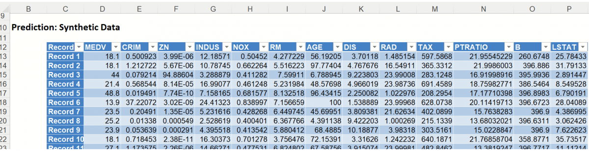
The data contained in the Synthetic Data report is syntethic data, generated using the Generate Data feature described in the chapter with the same name, that appears earlier in this guide.
The chart that is displayed once this tab is selected, contains frequency information pertaining to the output variable in the training data, the synthetic data and the expression, if it exists. (Recall that no expression was entered in this example.)
Frequency Chart for Prediction (Simulation) data
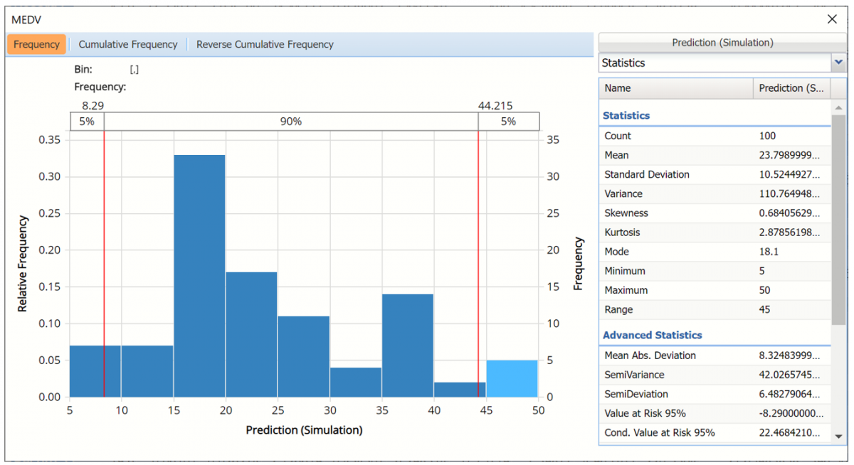
Click Prediction (Simulation) to add the training data to the chart.
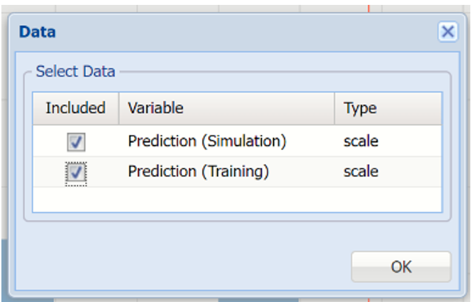
Click Prediction(Simulation) and Prediction (Training) to change the Data view.
Data Dialog
Bin Details pane
In the chart below, the dark blue bars display the frequencies for the synthetic data and the light blue bars display the frequencies for the predicted values in the Training partition.
Prediction (Simulation) and Prediction (Training) Frequency chart for MEDV variable
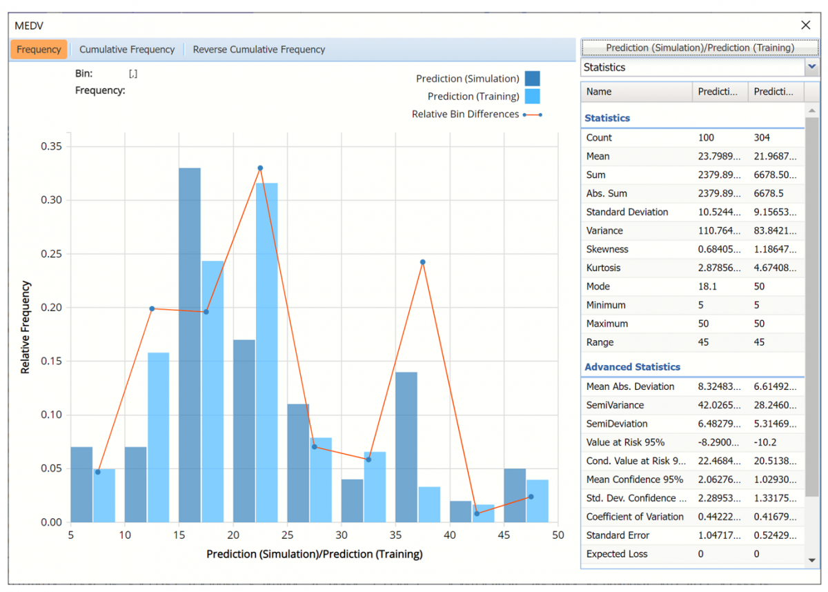
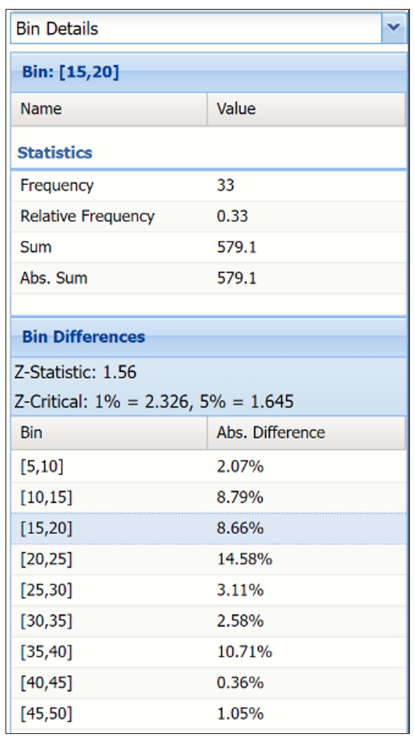
The Relative Bin Differences curve charts the absolute differences between the data in each bin. Click the down arrow next to Statistics to view the Bin Details pane to display the calculations.
Bin Details Pane
Click the down arrow next to Frequency to change the chart view to Relative Frequency or to change the look by clicking Chart Options. Statistics on the right of the chart dialog are discussed earlier in this section. For more information on the generated synthetic data, see the Generate Data chapter that appears earlier in this guide.
For information on RT_Stored, please see the Scoring New Data.