Find Best Model Classification Example
This example illustrates how to utilize the Find Best Model method for Classification, included in Analytic Solver Data Science for Desktop Excel or Excel Online, by using the Heart Failure Clinical Dataset. This dataset contains thirteen variables describing 299 patients experiencing heart failure. Find Best Model fits a model to all selected supervised learning (classification) methods in order to observe which method provides the best fit to the data. The goal of this example is to fit the best model to the dataset, then use this fitted model to determine if a new patient is at risk of perishing due to heart failure.
A description of each variable contained in the dataset appears below.
- AGE - Age of patient
- ANAEMIA - Decrease of red blood cells or hemoglobin (boolean)
- CREATINE_PHOSPHOKINASE - Level of the CPK enzyme in the blood (mcg/L)
- DIABETES - If the patient has diabetes (boolean)
- EJECTION_FRACTION - Percentage of blood leaving the heart at each contraction (percentage)
- HIGH_BLOOD_PRESSURE - If the patient has hypertension (boolean)
- PLATELETS - Platelets in the blood (kiloplatelets/mL)
- SERUM_CREATININE - Level of serum creatinine in the blood (mg/dL)
- SERUM_SODIUM - Level of serum sodium in the blood (mEq/L)
- SEX - Woman (0) or man (1)
- SMOKING - If the patient smokes or not (boolean)
- TIME - Follow-up period (days)
- DEATH_EVENT - If the patient deceased during the follow-up period (boolean)
All supervised algorithms in V2023 include a new Simulation tab. This tab uses the functionality from the Generate Data feature (described in the What’s New section of this guide and then more in depth in the Analytic Solver Data Science Reference Guide) to generate synthetic data based on the training partition, and uses the fitted model to produce predictions for the synthetic data. The resulting report, CFBM_Simulation, will contain the synthetic data, the predicted values and the Excel-calculated Expression column, if present. In addition, frequency charts containing the Predicted, Training, and Expression (if present) sources or a combination of any pair may be viewed, if the charts are of the same type. Since this new functionality does not support categorical variables, these types of variables will not be present in the model, only continuous variables.
Opening the Dataset
Open the Heart_failure_clinical_records_dataset.xlsx by clicking Help - Examples Models - Forecasting/Data Science Examples.
Partitioning the Dataset
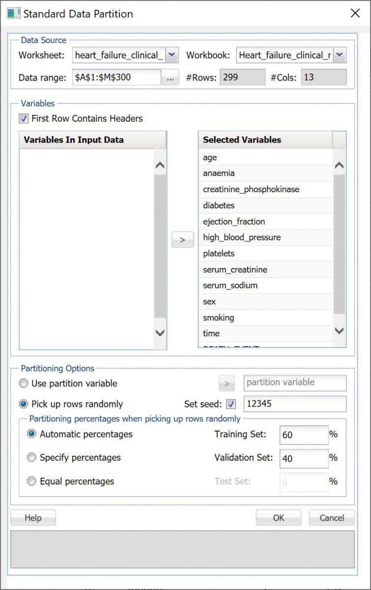
Partition the dataset by clicking Partition - Standard Partition.
- Move all features under Variables In Input Data to Selected Variables.
- Click OK to accept the partitioning defaults and create the partitions.
Standard Data Partition dialog
A new worksheet, STDPartition, is inserted directly to the right of the dataset. Click the new tab to open the worksheet. Find Best Model will be performed on both the Training and Validation partitions. For more information on partitioning a dataset, see the Partitioning chapter within the Analytic Solver Reference Guide.
Running Find Best Model
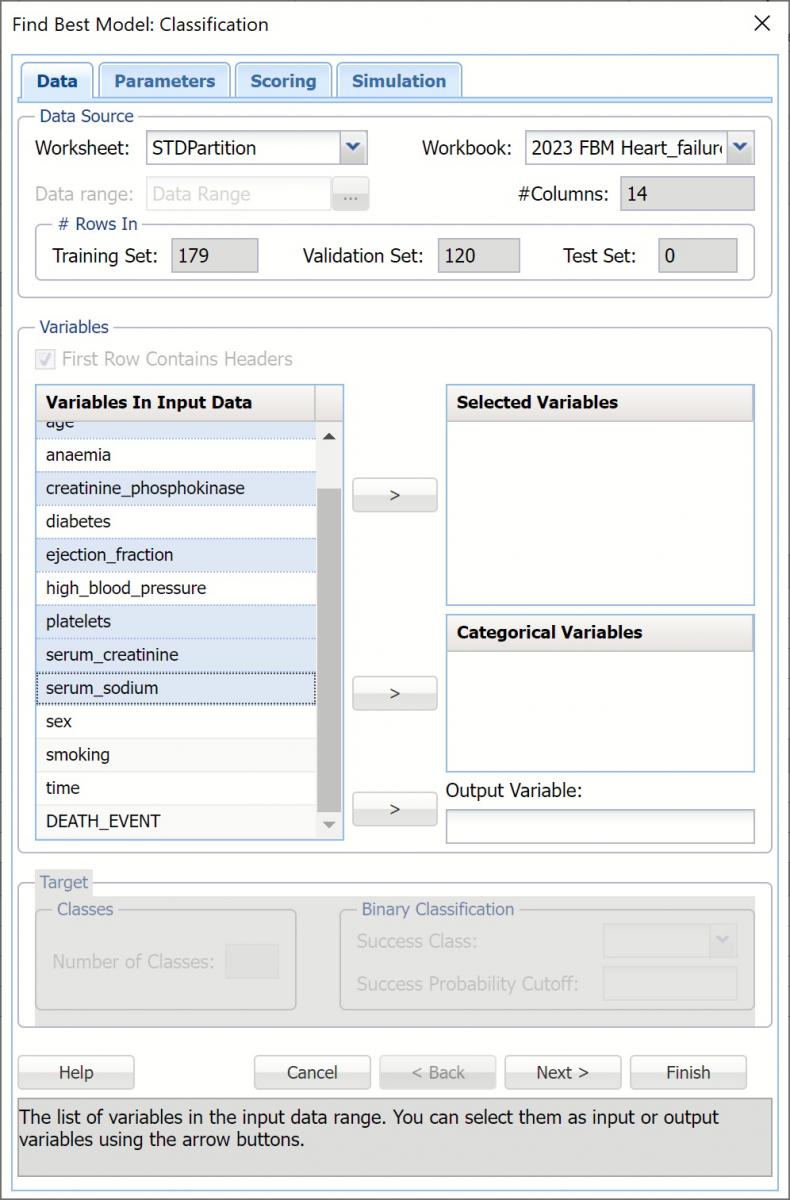
With STDPartition worksheet selected, click Classify - Find Best Model to open the Find Best Model Data dialog.
Data Dialog
The continuous variables are selected on the Data dialog.
- Select age, creatinine_phosphokinase, ejection_fraction, platelets, serum_creatinine and serum_sodium for Selected Variables.
- Select DEATH_EVENT as the Output Variable.
- Leave Success Class and Success Probability Cutoff at their defaults.
- Click Next to move to the Parameters dialog.
Find Best Model: Classification Data dialog
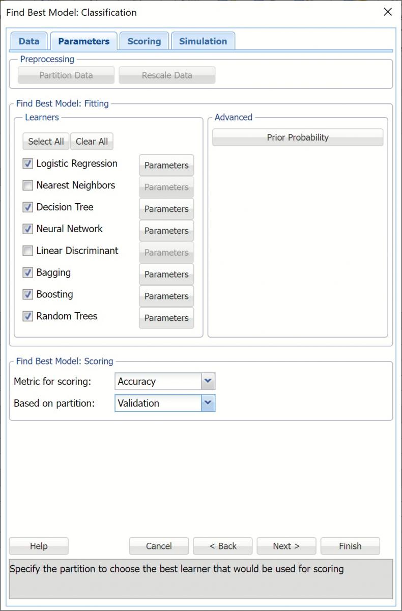
Parameters Dialog
By default, all eligible supervised learners are automatically enabled based on the presence of categorical features or binary/multiclass classification. Optionally, all possible parameters for each algorithm may be defined using the Parameters button to the right of each learner.
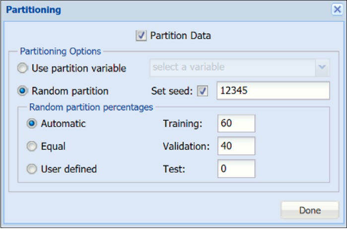
Partition Data
The Partition Data button is disabled because the original dataset has already been partitioned. Optionally, partitioning may be controlled from the Parameters dialog, if desired.
"On-the-fly" Partitioning dialog
Rescale Data
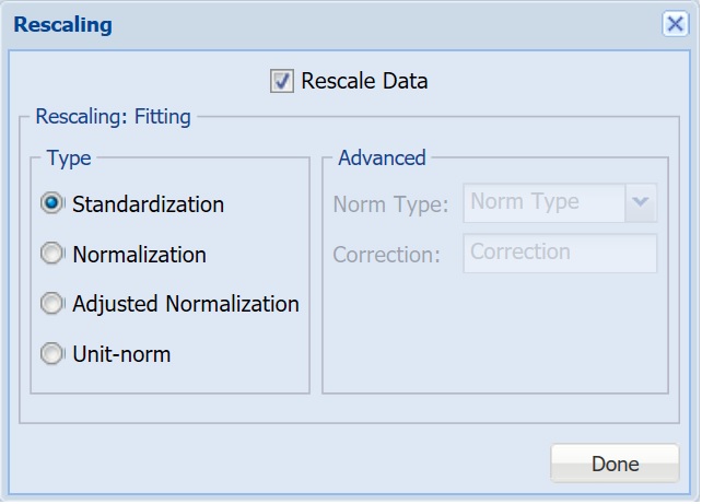
To rescale the data, click Rescale Data and select the Rescale Data option at the top of the Rescaling dialog.
Use Rescaling to normalize one or more features in your data during the data preprocessing stage. Analytic Solver Data Science provides the following methods for feature scaling: Standardization, Normalization, Adjusted Normalization and Unit-norm. For more information on this feature, see the Rescale Continuous Data section within the Transform Continuous Data chapter that occurs in the Analytic Solver Reference Guide.
- This example does not use rescaling to rescale the dataset data. Uncheck the Rescale Data option at the top of the dialog and click Done.
"On-the-fly" Rescaling dialog
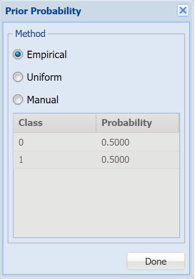
Prior Probability
Click Prior Probability. Three options appear in the Prior Probability Dialog: Empirical, Uniform and Manual.
If the first option is selected, Empirical, Analytic Solver Data Science will assume that the probability of encountering a particular class in the dataset is the same as the frequency with which it occurs in the training data. If the second option is selected, Uniform, Analytic Solver Data Science will assume that all classes occur with equal probability. Select the third option, Manual, to manually enter the desired class and probability value.
- Leave the default setting, Empirical, selected and click Done to close the dialog.
Prior Probability dialog
Find Best Model: Fitting
To set a parameter for each selected learner, click the Parameters button to the right. The following chart gives a brief description of the parameters for each learner.
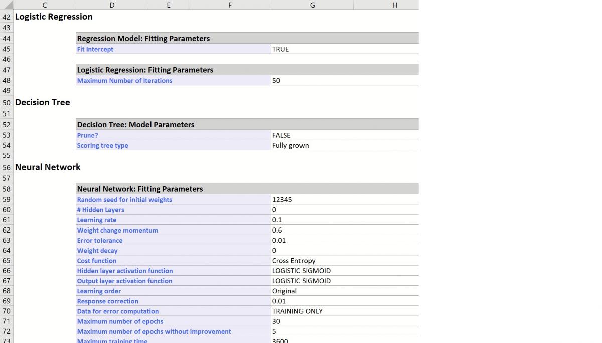
Logistic Regression Parameter
For more information on each parameter, see the Logistic Regression Classification chapter within the Analytic Solver Reference Guide.
Logistic Regression Option dialog
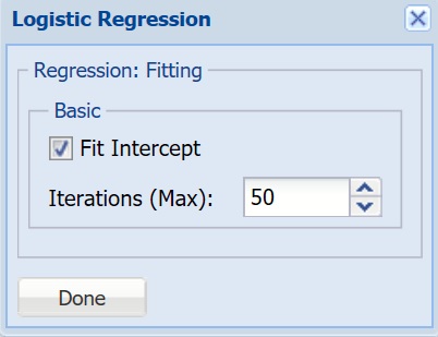
Fit Intercept - When this option is selected, the default setting, Analytic Solver Data Science will fit the Logistic Regression intercept. If this option is not selected, Analytic Solver Data Science will force the intercept term to 0.
Iterations (Max) - Estimating the coefficients in the Logistic Regression algorithm requires an iterative non-linear maximization procedure. You can specify a maximum number of iterations to prevent the program from getting lost in very lengthy iterative loops. This value must be an integer greater than 0 or less than or equal to 100 (1< value <= 100).
K-Nearest Neighbors Parameter
For more information on each parameter, see the K-Nearest Neighbors Classification chapter within the Analytic Solver Reference Guide.
k-Nearest Neighbors Option dialog
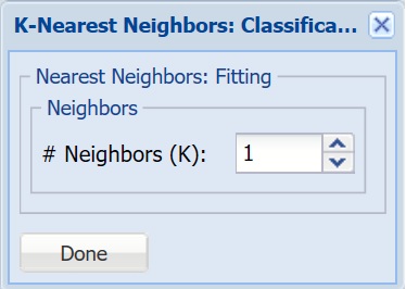
# Neighbors (K) - Enter a value for the parameter K in the Nearest Neighbor algorithm.
Classification Tree Parameter
For more information on each parameter, see the Classification Tree chapter within the Analytic Solver Reference Guide.
Classification Tree Option dialog
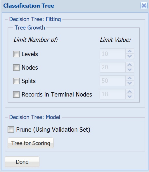
Tree Growth Levels, Nodes, Splits, Tree Records in Terminal Nodes - In the Tree Growth section, select Levels, Nodes, Splits, and Records in Terminal Nodes. Values entered for these options limit tree growth, i.e. if 10 is entered for Levels, the tree will be limited to 10 levels.
Prune - If a validation partition exists, this option is enabled. When this option is selected, Analytic Solver Data Science will prune the tree using the validation set. Pruning the tree using the validation set reduces the error from over-fitting the tree to the training data. Click Tree for Scoring to click the Tree type used for scoring: Fully Grown, Best Pruned, Minimum Error, User Specified or Number of Decision Nodes.
Neural Network Parameter
For more information on each parameter, see the Neural Network Classification chapter within the Analytic Solver Reference Guide.
Neural Networks Option dialog
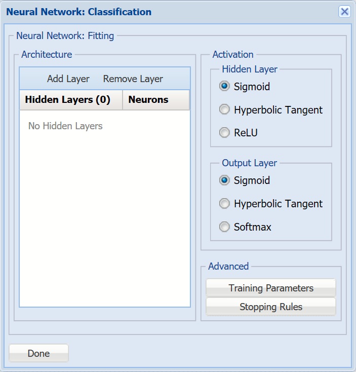
- Architecture - Click Add Layer to add a hidden layer. To delete a layer, click Remove Layer. Once the layer is added, enter the desired Neurons.
- Hidden Layer - Nodes in the hidden layer receive input from the input layer. The output of the hidden nodes is a weighted sum of the input values. This weighted sum is computed with weights that are initially set at random values. As the network “learns”, these weights are adjusted. This weighted sum is used to compute the hidden node's output using a transfer function. The default selection is Sigmoid.
- Output Layer - As in the hidden layer output calculation (explained in the above paragraph), the output layer is also computed using the same transfer function as described for Activation: Hidden Layer. The default selection is Sigmoid.
- Training Parameters - Click Training Parameters to open the Training Parameters dialog to specify parameters related to the training of the Neural Network algorithm.
- Stopping Rules - Click Stopping Rules to open the Stopping Rules dialog. Here users can specify a comprehensive set of rules for stopping the algorithm early plus cross-validation on the training error.
Bagging Ensemble Method Parameter
For more information on each parameter, see the Ensemble Methods Classification chapter within the Analytic Solver Reference Guide.
Bagging Option dialog
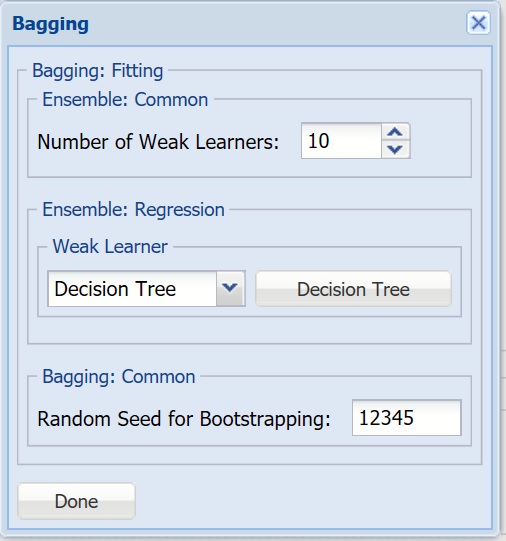
- Number of Weak Learners - This option controls the number of “weak” classification models that will be created. The ensemble method will stop when the number or classification models created reaches the value set for this option. The algorithm will then compute the weighted sum of votes for each class and assign the “winning” classification to each record.
- Weak Learner - Under Ensemble: Classification click the down arrow beneath Weak Leaner to select one of the six featured classifiers: Discriminant Analysis, Logistic Regression, k-NN, Naïve Bayes, Neural Networks, or Decision Trees. The command button to the right will be enabled. Click this command button to control various option settings for the weak leaner.
- Random Seed for Bootstrapping - Enter an integer value to specify the seed for random resampling of the training data for each weak learner. Setting the random number seed to a nonzero value (any positive number of your choice is OK) ensures that the same sequence of random numbers is used each time the dataset is chosen for the classifier. The default value is “12345”. If left blank, the random number generator is initialized from the system clock, so the sequence of random numbers will be different in each calculation. If you need the results from successive runs of the algorithm to another to be strictly comparable, you should set the seed. To do this, type the desired number you want into the box. This option accepts positive integers with up to 9 digits.
Boosting Ensemble Method Parameter
For more information on each parameter, see the Ensemble Methods Classification chapter within the Analytic Solver Reference Guide.
Boosting Option dialog
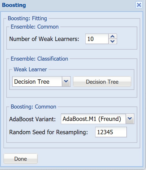
- Number of Weak Learners, Weak Learner - See descriptions above.
- Adaboost Variant - In AdaBoost.M1 (Freund), the constant is calculated as: ln((1-eb)/eb). In AdaBoost.M1 (Breiman), the constant is calculated as: 1/2ln((1-eb)/eb). In SAMME, the constant is calculated as: 1/2ln((1-eb)/eb + ln(k-1) where k is the number of classes.
- Random Seed for Resampling - Enter an integer value to specify the seed for random resampling of the training data for each weak learner. Setting the random number seed to a nonzero value (any positive number of your choice is OK) ensures that the same sequence of random numbers is used each time the dataset is chosen for the classifier. The default value is “12345”.
Random Trees Ensemble Method Parameter
For more information on each parameter, see the Ensemble Methods Classification chapter within the Analytic Solver Reference Guide.
Random Trees Option dialog
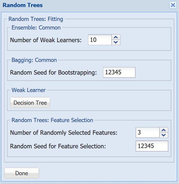
- Number of Weak Learners, Random Seed for Bootstrapping, Weak Learner - See descriptions above.
- Number of Randomly Selected Features - The Random Trees ensemble method works by training multiple “weak” classification trees using a fixed number of randomly selected features then taking the mode of each class to create a “strong” classifier. The option Number of randomly selected features controls the fixed number of randomly selected features in the algorithm. The default setting is 3.
- Feature Selection Random Seed - If an integer value appears for Feature Selection Random seed, Analytic Solver Data Science will use this value to set the feature selection random number seed. Setting the random number seed to a nonzero value (any number of your choice is OK) ensures that the same sequence of random numbers is used each time the dataset is chosen for the classifier. The default value is “12345”. If left blank, the random number generator is initialized from the system clock, so the sequence of random numbers will be different in each calculation. If you need the results from successive runs of the algorithm to another to be strictly comparable, you should set the seed. To do this, type the desired number you want into the box. This option accepts positive integers with up to 9 digits.
Find Best Model: Scoring
The two parameters at the bottom of the dialog under Find Best Model: Scoring, determine how well each classification method fits the data. The Metric for Scoring may be changed to Accuracy, Specificity, Sensitivity, Precision or F1. See the table below for a brief description of each statistic.
- For this example, leave Accuracy selected.
Accuracy - Accuracy refers to the ability of the classifier to predict a class label correctly.
Specificity - Specificity is defined as the proportion of negative classifications that were actually negative.
Sensitivity - Sensitivity is defined as the proportion of positive cases there were classified correctly as positive.
Precision - Precision is defined as the proportion of positive results that are truly positive.
F1 - Calculated as 0.743 -2 x (Precision * Sensitivity)/(Precision + Sensitivity) - The F-1 Score provides a statistic to balance between Precision and Sensitivity, especially if an uneven class distribution exists. The closer the F-1 score is to 1 (the upper bound) the better the precision and recall.
The options for Based on Partition depend on the number of partitions present. In this example, the original dataset was partitioned into training and validation partitions so those will be the options present in the drop down menu.
- For this example select Validation.
Find Best Model: Classification Parameters dialog
Click Next to advance to the Scoring dialog.
Scoring Dialog
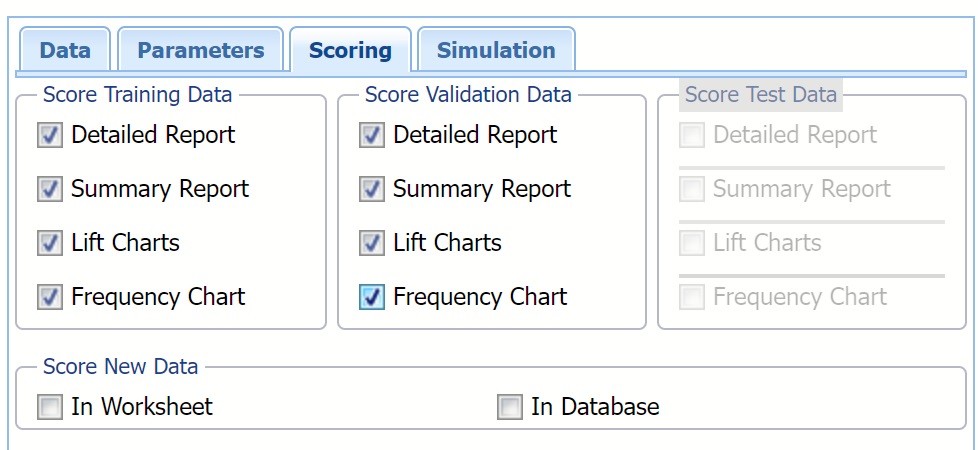
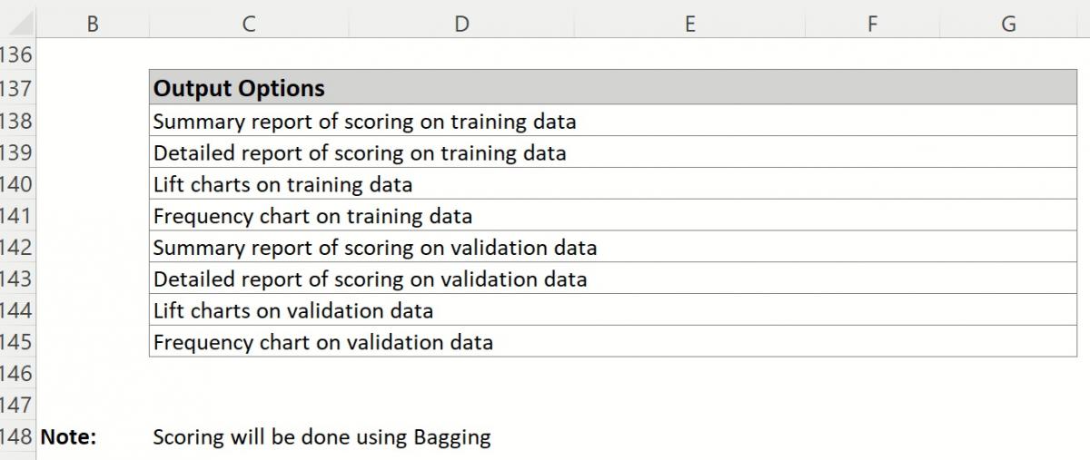
Output options are selected on the Scoring tab. By default, CFBM_Output and CFBM_Stored are generated and inserted directly to the right of the STDPartition.
- CFBM_Output contains a listing of all model inputs such a input/output variables and parameter settings for all Learners, as well as Model Performance tables containing evaluations for every available metric, every learner on all available partitions. The Learner identified internally as performing the best, is highlighted in red. (Recall that the statistic used for determining which Learner performs best on the dataset was selected on the Parameters dialog.
- CFBM_Stored contains the PMML (Predictive Model Markup Language) model which can be utilized to score new data. For more information on scoring, see the Scoring chapter that appears later in this guide.
Selecting Detailed Report produces CFBM_TrainingScore and CFBM_ValidationScore.
- Both reports contain detailed scoring information on both the Training and Validation partitions using the "best" learner.
- Misclassified records are highlighted in red.
Summary Report is selected by default. This option produces a summary report at the top of both CFBM_TrainingScore and CFBM_ValidationScore worksheets.
Summary Reports contains a Confusion Matrix, Error Report and various metrics. The chart to the left displays how each metric is calculated.
Selecting Lift Charts generates Lift Charts, ROC Curves and Decil-Wise Lift Charts.
New in V2023: When Frequency Chart is selected, a frequency chart will be displayed when the CFBM_TrainingScore and CFBM_ValidationScore worksheets are selected. This chart will display an interactive application similar to the Analyze Data feature, explained in detail in the Analyze Data chapter that appears earlier in this guide. This chart will include frequency distributions of the actual and predicted responses individually, or side-by-side, depending on the user’s preference, as well as basic and advanced statistics for variables, percentiles, six sigma indices.
In this example select all four options: Detailed Report, Summary Report, Lift Charts and Frequency under both Score Training Data and Score Validation Data. Then click Finish to run Find Best Model.
Find Best Model: Classification Scoring dialog
See the Scoring chapter that appears later in this guide for more information on the Score New Data section of the Scoring dialog.
All worksheets containing results from Find Best Model are inserted to the right of the STDPartition worksheet.
Click Next to advance to the Simulation dialog.
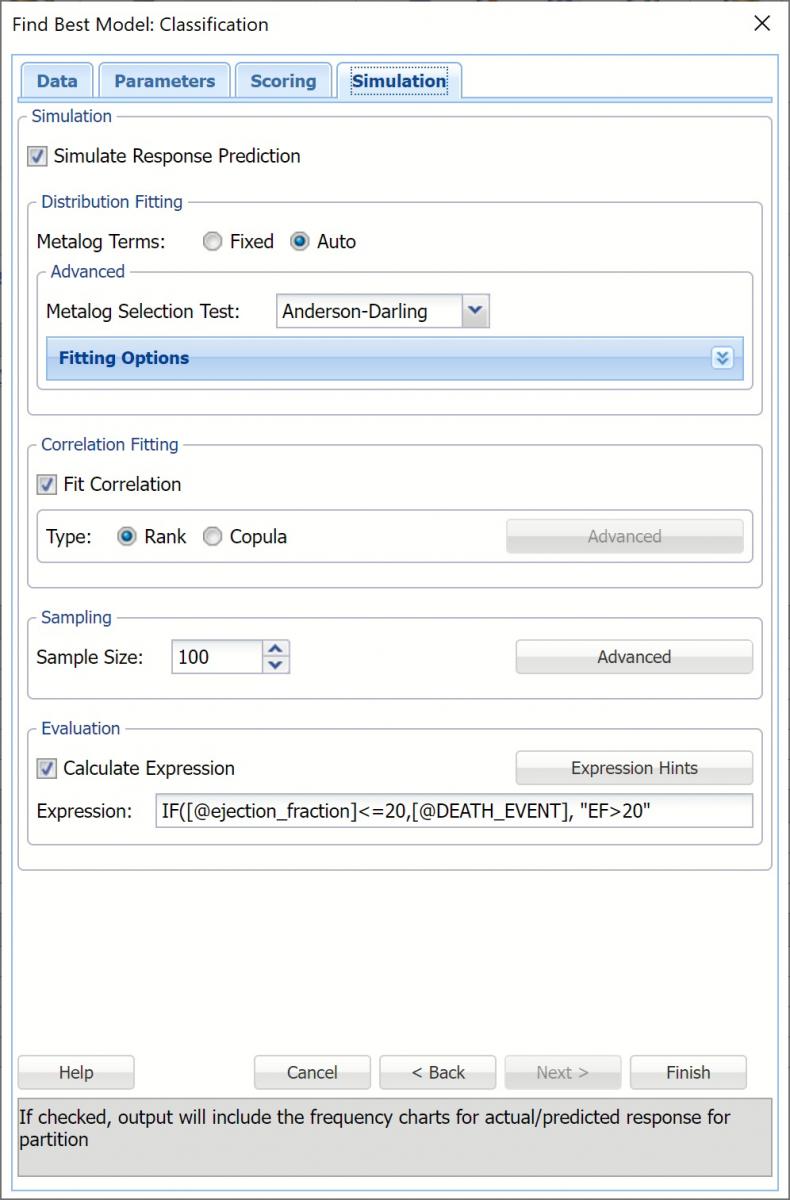
Simulation Dialog
Select Simulation Response Prediction to enable all options on the Simulation tab of the Find Best Model Classification dialog.
Simulation tab: All supervised algorithms in V2023 include a new Simulation tab. This tab uses the functionality from the Generate Data feature (described earlier in this guide) to generate synthetic data based on the training partition, and uses the fitted model to produce predictions for the synthetic data. The resulting report, CFMB_Simulation, will contain the synthetic data, the predicted values and the Excel-calculated Expression column, if present. In addition, frequency charts containing the Predicted, Training, and Expression (if present) sources or a combination of any pair may be viewed, if the charts are of the same type.
Evaluation: Select Calculate Expression to amend an Expression column onto the frequency chart displayed on the CFBM_Simulation output tab. Expression can be any valid Excel formula that references a variable and the response as [@COLUMN_NAME]. Click the Expression Hints button for more information on entering an expression.
For the purposes of this example, leave all options at their defaults in the Distribution Fitting, Correlation Fitting and Sampling sections of the dialog. For Expression, enter the following formula to display if the patient suffered catastrophic heart failure (@DEATH_EVENT) when his/her Ejection_Fraction was less than or equal to 20.
IF([@ejection_fraction]<=20, [@DEATH_EVENT], “EF>20”)
Note that variable names are case sensitive.
Evaluation section on the Find Best Model dialog, Simulation tab
For more information on the remaining options shown on this dialog in the Distribution Fitting, Correlation Fitting and Sampling sections, see the Generate Data chapter that appears earlier in this guide.
Find Best Model: Classification Simulation dialog
Click Finish to run Find Best Model on the example dataset.
Interpreting the Results
All worksheets containing results from Find Best Model are inserted to the right of the STDPartition worksheet.
CFBM_Output Result Worksheet
The CFBM_Output worksheet is inserted directly to the right of the STDPartition worksheet. This report lists all input variables and all parameter settings for each learner, along with the Model Performance of each Learner on all partitions. This example utilizes two partitions, training and validation.
The Output Navigator appears at the very top of this worksheet. Click the links to easily move between each section of the output. The Output Navigator is listed at the top of each worksheet included in the output.
Output Navigator

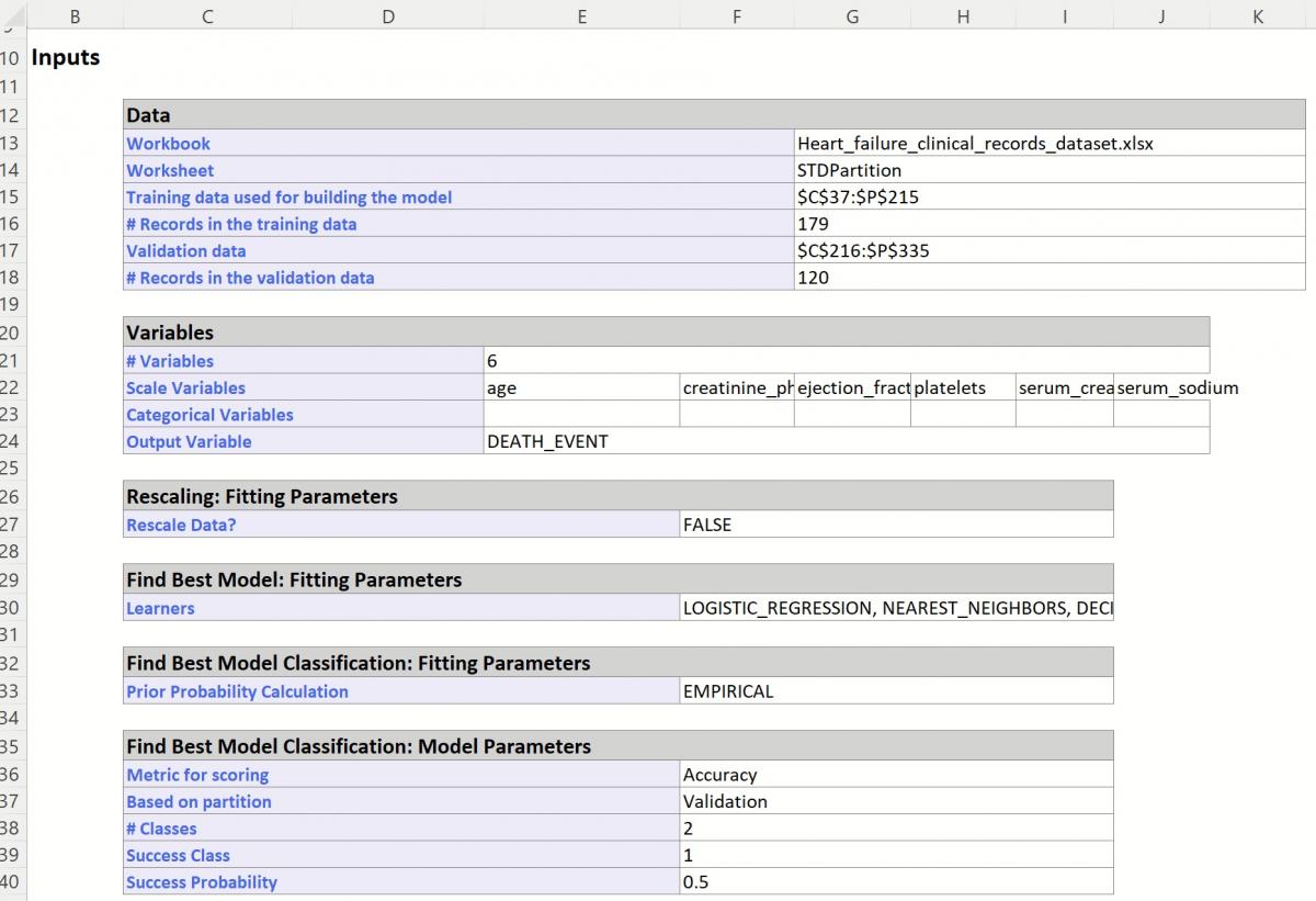
The Inputs section includes information pertaining to the dataset, the input variables and parameter settings.
Find Best Model Classification Inputs
Further down within Inputs, the parameter selections for each Learner are listed.
Find Best Model Classification Learner Inputs
Scroll down to view Simulation tab option settings and any generated messages from the Find Best Model feature.
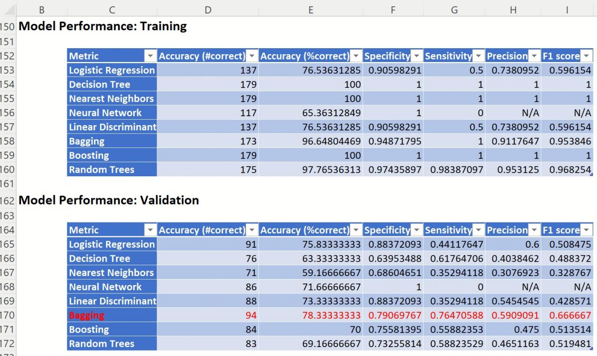
Further down, the Model Performance tables display how each classification method performed on the dataset.
Find Best Model Classification Output Options
The Messages portion of the report indicates that Scoring will be performed using the Bagging Ensemble Method, the Learner selected as the "best" choice according to the selection for Find Best Model: Scoring parameters on the Parameters dialog: Validation Partition Accuracy Metric.
Since the Bagging Accuracy metric for the Validation Partition has the highest score, that is the Learner that will be used for scoring.
Find Best Model Classification: Model Performance Reports
CFBM_TrainingScore and CFBM_ValidationScore
CFBM_TrainingScore contains the Classification Summary and the Classification Details reports. Both reports have been generated using the Bagging Learner, as discussed above.
CFBM_TrainingScore
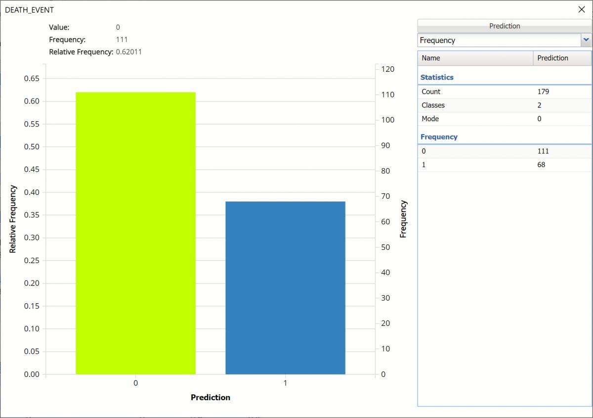
Click the CFBM_TrainingScore tab to view the newly added Output Variable frequency chart, the Training: Classification Summary and the Training: Classification Details report. All calculations, charts and predictions on this worksheet apply to the Training data.
Note: To view charts in the Cloud app, click the Charts icon on the Ribbon, select a worksheet under Worksheet and a chart under Chart.Frequency Charts: The output variable frequency chart opens automatically once the CFBM_TrainingScore worksheet is selected. To close this chart, click the “x” in the upper right hand corner of the chart. To reopen, click onto another tab and then click back to the CFBM_TrainingScore tab. To move the chart, grab the dialog’s title bar and drag the chart to the desired location on the screen.
Frequency: This chart shows the frequency for both the predicted and actual values of the output variable, along with various statistics such as count, number of classes and the mode.
Frequency Chart on CFBM_TrainingScore output sheet
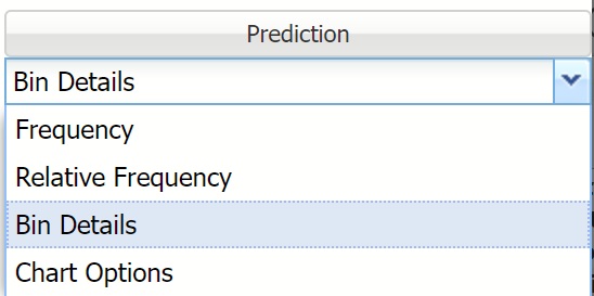
Click the down arrow next to Frequency to switch to Relative Frequency, Bin Details or Chart Options view.
Frequency Chart, Frequency View
Relative Frequency: Displays the relative frequency chart.
Relative Frequency Chart
Bin Details: Use this view to find metrics related to each bin in the chart.
Bin Details Chart
Chart Options: Use this view to change the color of the bars in the chart.
Chart Options View
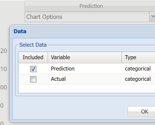
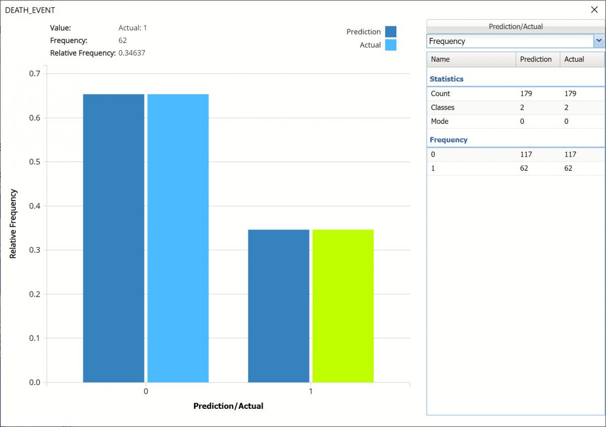
To see both the predicted and actual values for the output variable in the training partition, click Prediction and select Actual. This change will be reflected on all charts.
Click Prediction to change view
Frequency Chart displaying both Prediction and Actual data
Classification Summary: In the Classification Summary report, a Confusion Matrix is used to evaluate the performance of the classification method.
Confusion Matrix
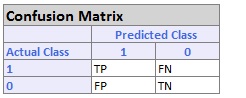
TP stands for True Positive. These are the number of cases classified as belonging to the Success class that actually were members of the Success class.
FN stands for False Negative. These are the number of cases that were classified as belonging to the Failure class when they were actually members of the Success class
FP stands for False Positive. These cases were assigned to the Success class but were actually members of the Failure group
TN stands for True Negative. These cases were correctly assigned to the Failure group.
Confusion Matrix for Training Partition
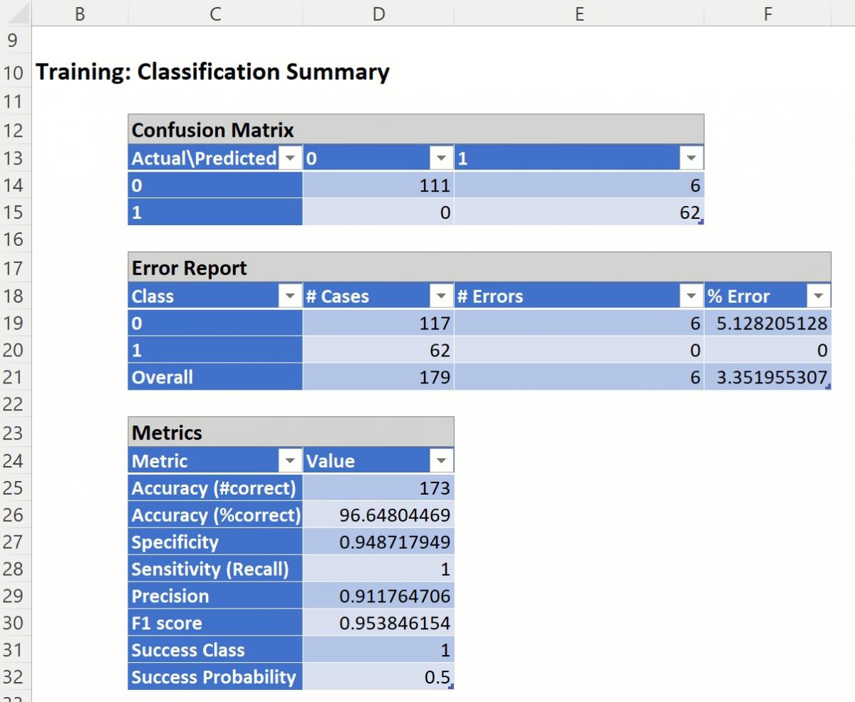
The Confusion Matrix for the Training Partition indicates:
True Negative = 117 – These records are truly negative records. All 111 patients are survivors
True Positive = 62 – These records are truly positive. All 62 patients are deceased.
False Positive = 6 – These negative records were misclassified as positive. In other words, 6 surviving patients were misclassified as non-survivors.
False Negative = 0 – No positive records were misclassified as negative, or there were no deceased patients that were misclassified as survivors.
The %Error for the training partition was 3.35%. All of the error is due to False Positives. The Bagging Ensemble misclassified 3.35% (6/179) of surviving patients as non-survivors.
The Metrics indicate:
Accuracy: The number of records classified correctly by the Bagging Ensemble is 173 (111 + 62).
%Accuracy: The percentage of records classified correctly is 96.1% (173/179).
Specificity: (True Negative)/(True Negative + False Positives)
111/(111 + 6) = 0.949
Specificity is defined as the proportion of negative classifications that were actually negative, or the fraction of survivors that actually survived. In this model, 111 actual surviving patients were classified correctly as survivors. There were 6 false positives or 6 actual surviving patients that were classified as deceased.
Sensitivity or Recall: (True Positive)/(True Positive + False Negative)
62/(62 + 0) = 1.0
Sensitivity is defined as the proportion of positive cases there were classified correctly as positive, or the proportion of actually deceased patients there were classified as deceased. In this model, 62 actual deceased patients were correctly classified as deceased. There were no false negatives or no actual deceased patients were incorrectly classified as a survivor.
Note: Since the object of this model is to correctly classify which patients will succumb to heart failure, this is an important statistic as it is very important for a physician to be able to accurately predict which patients require mitigation.
Precision: (True Positives)/(True Positives + False Positives)
62/(62 + 6) = 0.912
Precision is defined as the proportion of positive results that are true positive. In this model, 62 actual deceased patients were classified correctly as deceased. There were 6 false positives or 6 actual survivors classified incorrectly as deceased.
F-1 Score: 2 x (Precision * Sensitivity)/(Precision + Sensitivity)
2 x (0.912 * 0.949) / (0.12 + 0.949) = 0.954
The F-1 Score provides a statistic to balance between Precision and Sensitivity, especially if an uneven class distribution exists, as in this example, (117 survivors vs 62 deceased). The closer the F-1 score is to 1 (the upper bound) the better the precision and recall.
Success Class and Success Probability simply reports the settings for these two values as input on the Find Best Model: Classification Data dialog.
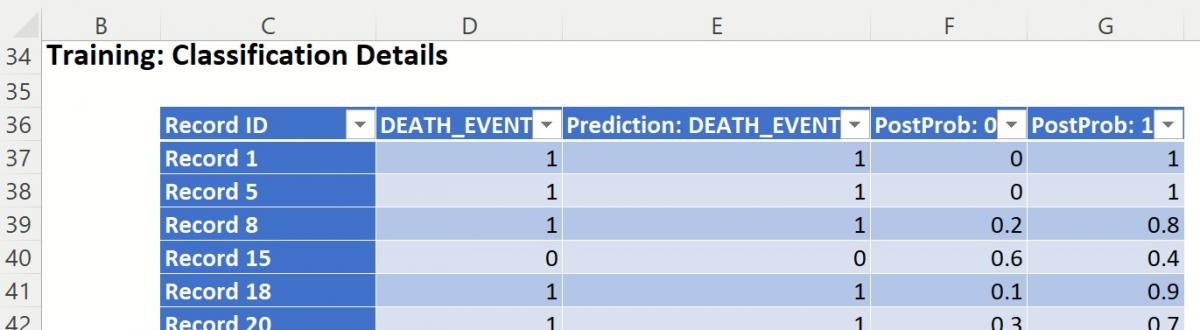
Classification Details: Individual records and their classifications are shown beneath Training: Classification Details. Any misclassified records are highlighted in red.
Training: Classification Details
CFBM_ValidationScore
Click the CFBM_ValidationScore tab to view the newly added Output Variable frequency chart, the Validation: Classification Summary and the Validation: Classification Details report. All calculations, charts and predictions on this worksheet apply to the Validation data.
Frequency Charts: The output variable frequency chart opens automatically once the CFBM_ValidationScore worksheet is selected. To close this chart, click the “x” in the upper right hand corner. To reopen, click onto another tab and then click back to the CFBM_ValidationScore tab.
Click the Frequency chart to display the frequency for both the predicted and actual values of the output variable, along with various statistics such as count, number of classes and the mode. Selective Relative Frequency from the drop down menu, on the right, to see the relative frequencies of the output variable for both actual and predicted. See above for more information on this chart.
CFBM_ValidationScore Frequency Chart
Classification Summary: The Confusion Matrix for the Training Partition indicates:
True Negative = 68 – These records are truly negative records. All 68 patients are survivors
True Positive = 26 – These records are truly positive. All 26 patients are deceased.
False Positive = 18 – These negative records were misclassified as positive. In other words, 18 surviving patients were misclassified as non-survivors.
False Negative = 8 – These positive records were misclassified as negative, or these 8 deceased patients were misclassified as survivors.
Validation Partition Classification Summary
The %Error for the training partition was 21.67%. Most of the error is due to False Positives. The Bagging Ensemble misclassified 15% (18/120) of surviving patients as non-survivors and 6.7% of non-surviving patients as surviving (8/120).
The Metrics indicate:
Accuracy: The number of records classified correctly by the Bagging Ensemble is 94 (66 + 27).
%Accuracy: The percentage of records classified correctly is 78.33% (94/120).
Specificity: (True Negative)/(True Negative + False Positives)
68/(68 + 18) = 0.791
Specificity is defined as the proportion of negative classifications that were actually negative, or the fraction of survivors that actually survived. In this model, 68 actual surviving patients were classified correctly as survivors. There were 18 false positives or 18 actual surviving patients were classified as deceased.
Sensitivity or Recall: (True Positive)/(True Positive + False Negative)
26/(26 + 8) = 0.765
Sensitivity is defined as the proportion of positive cases there were classified correctly as positive, or the proportion of actually deceased patients there were classified as deceased. In this model, 26 actual deceased patients were correctly classified as deceased. There were 8 false negatives or 8 actual deceased patients were incorrectly classified as survivors.
Precision: (True Positives)/(True Positives + False Positives)
26/(26 + 18) = 0.591
Precision is defined as the proportion of positive results that are true positive. In this model, 26 actual deceased patients were classified correctly as deceased. There were 18 false positives or 18 actual survivors classified incorrectly as deceased.
F-1 Score: 2 x (Precision * Sensitivity)/(Precision + Sensitivity)
2 x (0.591 * 0.765) / (0.591 + 0.765) = 0.667
The F-1 Score provides a statistic to balance between Precision and Sensitivity, especially if an uneven class distribution exists, as in this example, (86 survivors vs 34 deceased). The closer the F-1 score is to 1 (the upper bound) the better the precision and recall.
Success Class and Success Probability simply reports the settings for these two values as input on the Find Best Model: Classification Data dialog.
Classification Details: Individual records and their classifications are shown beneath Validation: Classification Details. Any misclassified records are highlighted in red.
Validation: Classification Details
CFBM_TrainingLiftChart and CFBM_ValidationLifeChart
Lift Charts and ROC Curves are visual aids that help users evaluate the performance of their fitted models. Charts found on the CFBM_TrainingLiftChart tab were calculated using the Training Data Partition. Charts found on the CFBM_ValidationLiftChart tab were calculated using the Validation Data Partition. Since it is good practice to look at both sets of charts to assess model performance, this example will look at the lift charts generated from both partitions.
Note: To view these charts in the Cloud app, click the Charts icon on the Ribbon, select CFBM_TrainingLiftChart or CFBM_ValidationLiftChart.
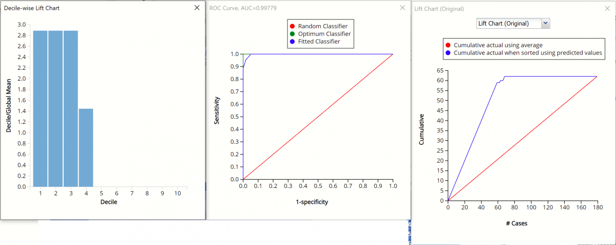
Decile-wise Lift Chart, ROC Curve, and Lift Charts for Training Partition
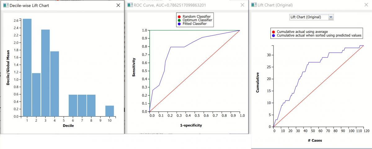
Decile-wise Lift Chart, ROC Curve, and Lift Charts for Valid. Partition
Original Lift Chart
After the model is built using the training data set, the model is used to score on the training data set and the validation data set (if one exists). Afterwards, the data set(s) are sorted in decreasing order using the predicted output variable value. After sorting, the actual outcome values of the output variable are cumulated and the lift curve is drawn as the cumulative number of cases in decreasing probability (on the x-axis) vs the cumulative number of true positives on the y-axis. The baseline (red line connecting the origin to the end point of the blue line) is a reference line. For a given number of cases on the x-axis, this line represents the expected number of successes if no model existed, and instead cases were selected at random. This line can be used as a benchmark to measure the performance of the fitted model. The greater the area between the lift curve and the baseline, the better the model.
- In the Training Lift chart, if 100 records were selected as belonging to the success class and the fitted model was used to pick the members most likely to be successes, the lift curve indicates that 60 of them would be correct. Conversely, if 100 random records were selected and the fitted model was not used to identify the members most likely to be successes, the baseline indicates that about 30 would be correct.
- In the Validation Lift chart, if 100 records were selected as belonging to the success class and the fitted model was used to pick the members most likely to be successes, the lift curve indicates that about 40 classifications would be correct. Conversely, if 100 random records were selected and the fitted model was not used to identify the members most likely to be successes, the baseline indicates that about 25 would be correct.
Decile-wise Lift Chart
The decilewise lift curve is drawn as the decile number versus the cumulative actual output variable value divided by the decile's mean output variable value. This bars in this chart indicate the factor by which the model outperforms a random assignment, one decile at a time.
- Refer to the decile-wise lift chart for the training dataset. In the first decile, the predictive performance of the model is almost 3 times better than simply assigning a random predicted value.
- Refer to the validation graph above. In the first decile, the predictive performance of the model is a little over 2.6 times better than simply assigning a random predicted value.
ROC Curve
The Regression ROC curve was updated in V2017. This new chart compares the performance of the regressor (Fitted Predictor) with an Optimum Predictor Curve and a Random Classifier curve. The Optimum Predictor Curve plots a hypothetical model that would provide perfect classification results. The best possible classification performance is denoted by a point at the top left of the graph at the intersection of the x and y axis. This point is sometimes referred to as the “perfect classification”. The closer the AUC is to 1, the better the performance of the model.
- In the Training partition, AUC = .998 which suggests that this fitted model is a good fit to the data.
- In the Validation partition, AUC = .803 which suggests that this fitted model is also a good fit to the data.
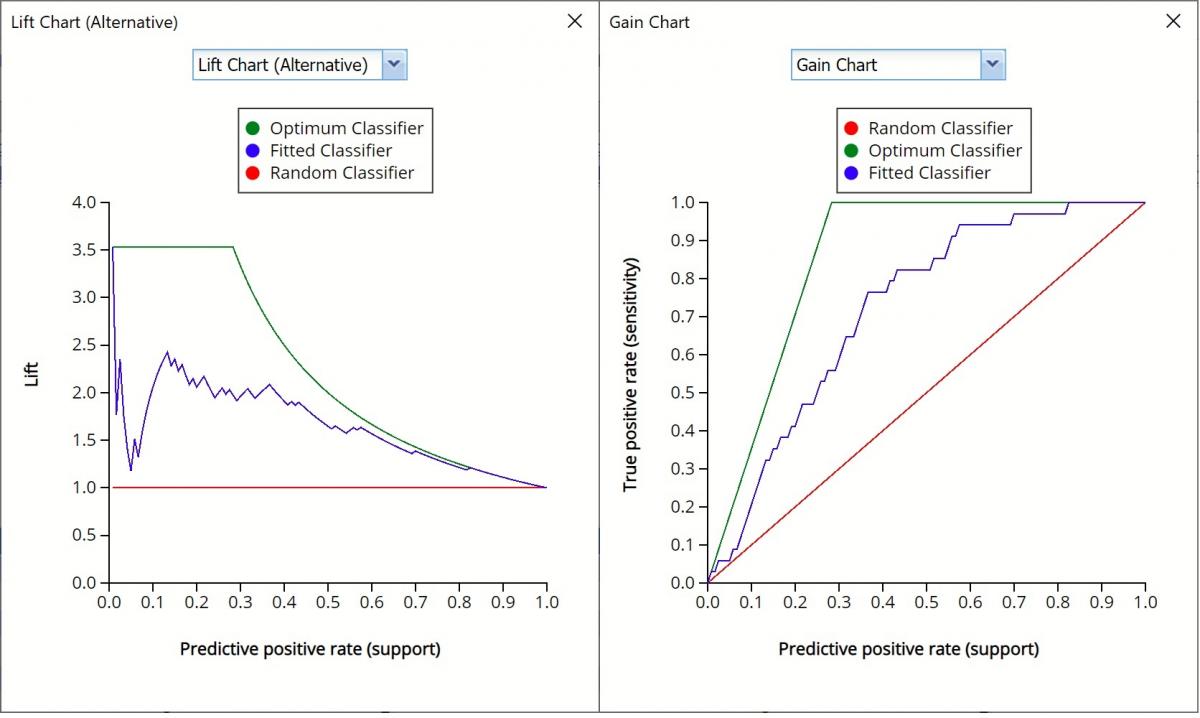
Alternative Lift Chart and Gain Chart
In V2017, two new charts were introduced: a new Lift Chart and the Gain Chart. To display these new charts, click the down arrow next to Lift Chart (Original), in the Original Lift Chart, then select the desired chart.
Select Lift Chart (Alternative) to display Analytic Solver Data Science's alternative Lift Chart. Each of these charts consists of an Optimum Predictor curve, a Fitted Predictor curve, and a Random Predictor curve.
The Optimum Predictor curve plots a hypothetical model that would provide perfect classification for our data. The Fitted Predictor curve plots the fitted model and the Random Predictor curve plots the results from using no model or by using a random guess (i.e. for x% of selected observations, x% of the total number of positive observations are expected to be correctly classified).
The Alternative Lift Chart plots Lift against the Predictive Positive Rate or Support.
Click the down arrow and select Gain Chart from the menu. In this chart, the True Positive Rate or Sensitivity is plotted against the Predictive Positive Rate or Support.
Gain Charts for Training and Validation Partitions
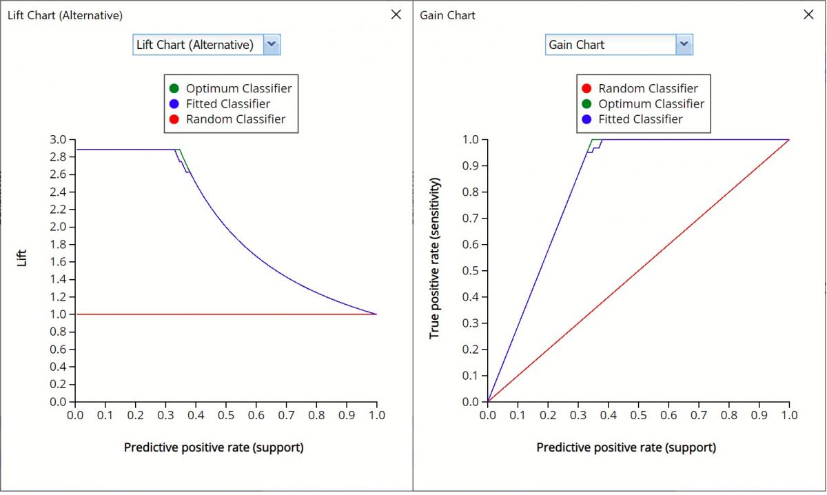
Gain Charts for Training and Validation Partitions
CFBM_Simulation
As discussed above, Analytic Solver Data Science V2023 generates a new output worksheet, CFBM_Simulation, when Simulate Response Prediction is selected on the Simulation tab of the Find Best Model dialog.
This report contains the synthetic data, the predicted values for the training partition (using the fitted model) and the Excel – calculated Expression column, if populated, in the dialog. Users can switch between charts displaying the Predicted synthetic data, the Predicted training data or the Expression, or a combination of two, as long as they are of the same type.
Synthetic Data
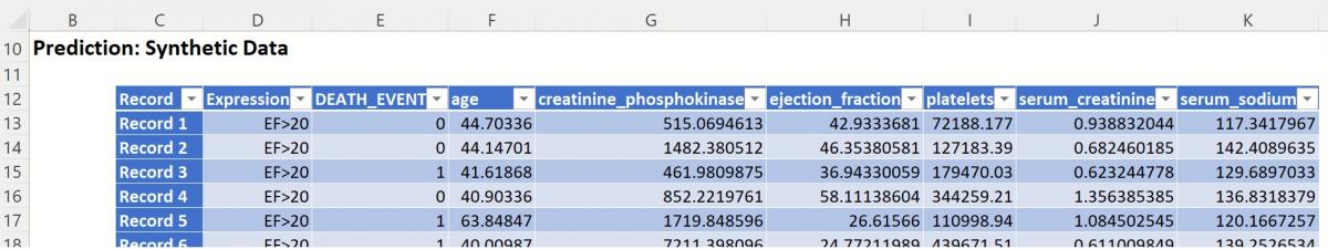
Note the first column in the output, Expression. This column was inserted into the Synthetic Data results because Calculate Expression was selected and an Excel function was entered into the Expression field, on the Simulation tab of the Find Best Model dialog.
IF([@ejection_fraction]<=20, [@DEATH_EVENT], “EF > 20”)
The results in this column are either 0, 1, or EF > 20.
DEATH_EVENT = 0 indicates that the patient has an ejection fraction <= 20 but did not suffer catastrophic heart failure.
DEATH_EVENT = 1 in this column indicates that the patient has an ejection fraction <= 20 and did suffer catastrophic heart failure.
EF > 20 indicates that the patient’s ejection fraction was over 20.
The remainder of the data in this report is synthetic data, generated using the Generate Data feature described in the chapter with the same name, that appears earlier in this guide.
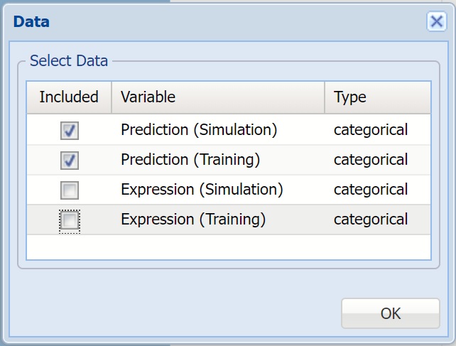
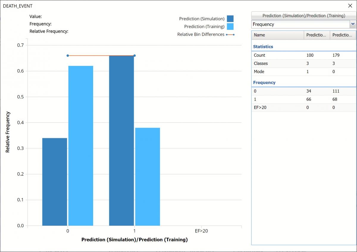
Click Prediction (Simulation), in the upper right hand corner of the chart, and select Prediction (Training) in the Data dialog to add the predicted data for the training partition into the chart.
Simulation Frequency Chart Data Dialog
The chart that is displayed once this tab is selected, contains frequency information pertaining to the output variable’s predicted values in the synthetic data (darker shaded columns) and the training partition (lighter shaded columns) In the synthetic data, 34 patients are predicted to survive and 66 are not. In the training data, 111 patients were predicted to survive and 68 were not.
Note the flat Relative Bin Differences curve indicates the Absolute Difference in the bins is equal. (Click the down arrow next to Frequency and select Bin Details to find the bin metrics.)
Frequency Chart for CFBM_Simulation output
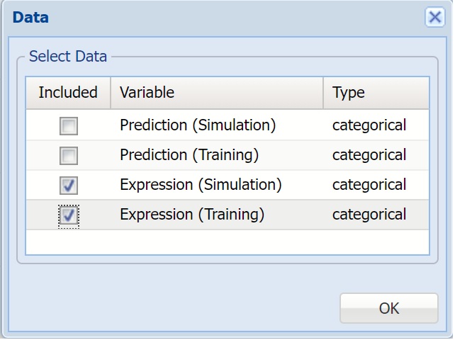
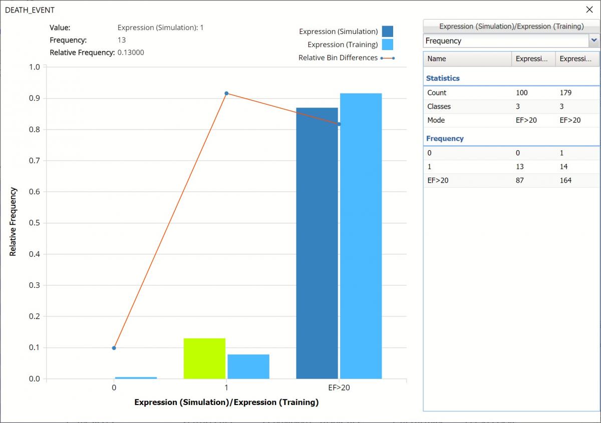
Click Prediction(Simulation)/ Prediction (Training) to change the chart view to Expression (Simulation)/Expression (Training) by selecting Expression (Simulation) and Expression (Training) in the Data dialog.
Data dialog
The chart below shows that in the synthetic, or simulated data, no “patients” with an ejection fraction <= 20 are expected to survive. However, in the training data, 1 patient with an ejection fraction <= 20 was predicted to survive. The 3rd column, EF>20 displays the remaining predictions for patients with ejection fraction > 20 in both the simulation and training data.
Frequency Chart for Expression
Click the down arrow next to Frequency and select Bin Details to see the Absolute Difference for each bin.
Frequency Chart for Expression, Bin Details view
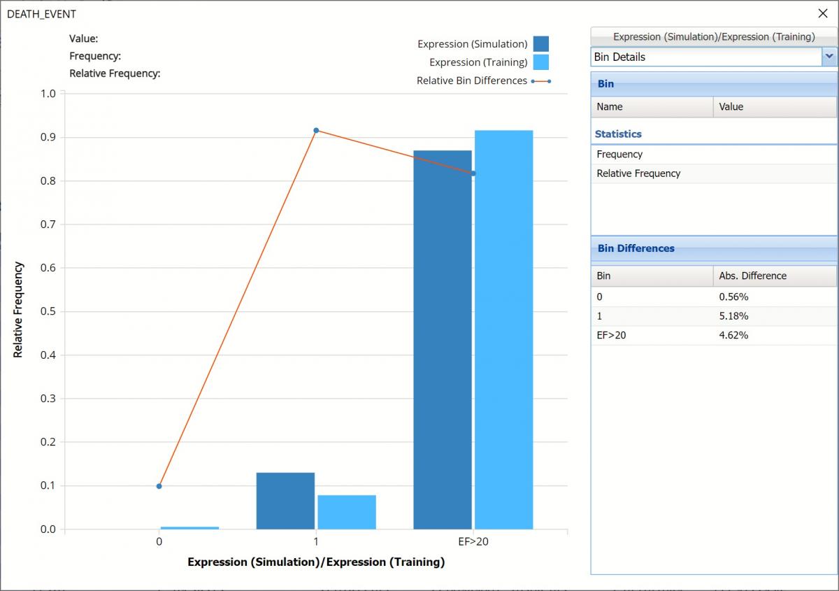
Notice that red lines which connect the relative Bin Differences for each bin. Bin Differences are computed based on the frequencies of records which predictions fall into each bin. For example, consider the highlighted bin in the screenshot above [Expression]. There are 87 Simulation records and 164 Training records in this bin. The relative frequency of the Simulation data is 87/100 = 87% and the relative frequency of the Training data is 164/179 = 91.6%. Hence the Absolute Difference (in frequencies) is = 91.6 – 87 = 4.6%
Click the down arrow next to Frequency to change the chart view to Relative Frequency or to change the look by clicking Chart Options. Statistics on the right of the chart dialog are discussed earlier in this section. For more information on the generated synthetic data, see the Generate Data chapter that appears earlier in this guide.
For information on Stored Model Sheets, in this example CFBM_Stored, please refer to the “Scoring New Data” chapter within the Analytic Solver Data Science User Guide.
Scoring New Data
Now that the model has been fit to the data, this fitted model will be used to score new patient data, found below.
New Data

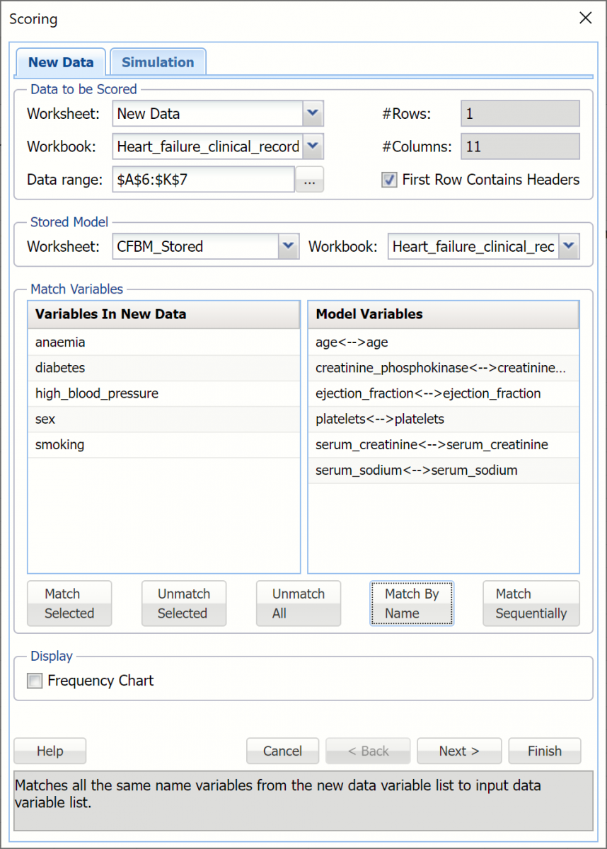
To score new data, click the New Data tab and then click the Score icon on the Analytic Solver Data Science ribbon.
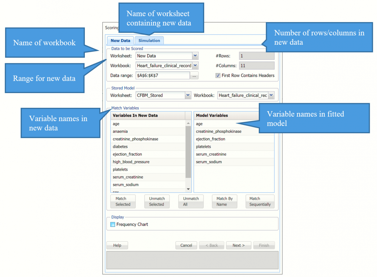
Click "Match By Name" to match each variable in the new data with the same variable in the fitted model, i.e. age with age, anaemia with anaemia, etc.
Scoring dialog
Click OK to score the new data record and determine if mitigation measures are needed to keep the patient healthy.
A new worksheet, Scoring_Bagging is inserted to the right.
Scoring Results
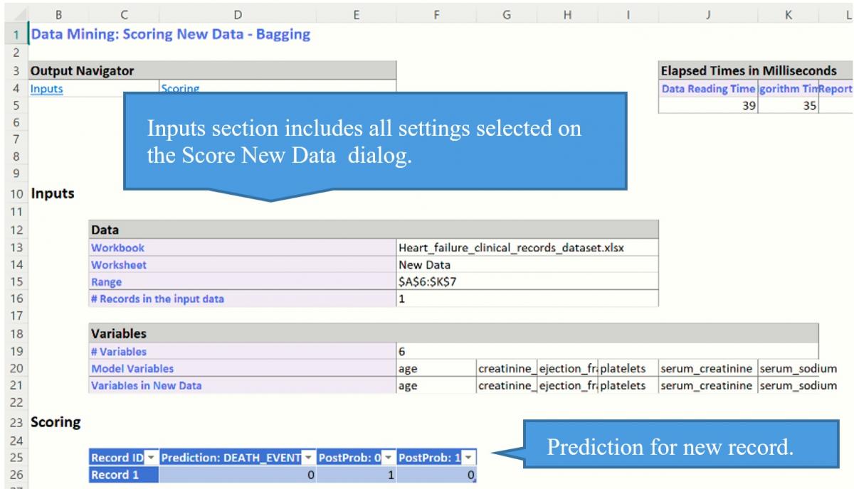
Notice that the predicted Death_Event is 0, or that this patient will survive without any further mitigations at this point in time. Scoring should be repeated when changes in the patient's data is observed.
Please see the “Scoring New Data” chapter within the Analytic Solver Data Science User Guide for information on scoring new data.