This example focuses on creating a Neural Network using the bagging ensemble method. See the previous help topic for an example on creating a Neural Network using the boosting ensemble method. This example reuses the standard data partition created in the Boosting example above.
Input
Click Predict – Ensemble– Bagging on the Data Science ribbon. The Bagging – Data tab appears.
As in the example above, select MEDV as the Output variable and the remaining variables as Selected Variables (except the CAT.MEDV, CHAS and Record ID variables). (See screenshot of Boosting Regression dialog, data tab in the previous help topic.)
Click Next to advance to the next tab.
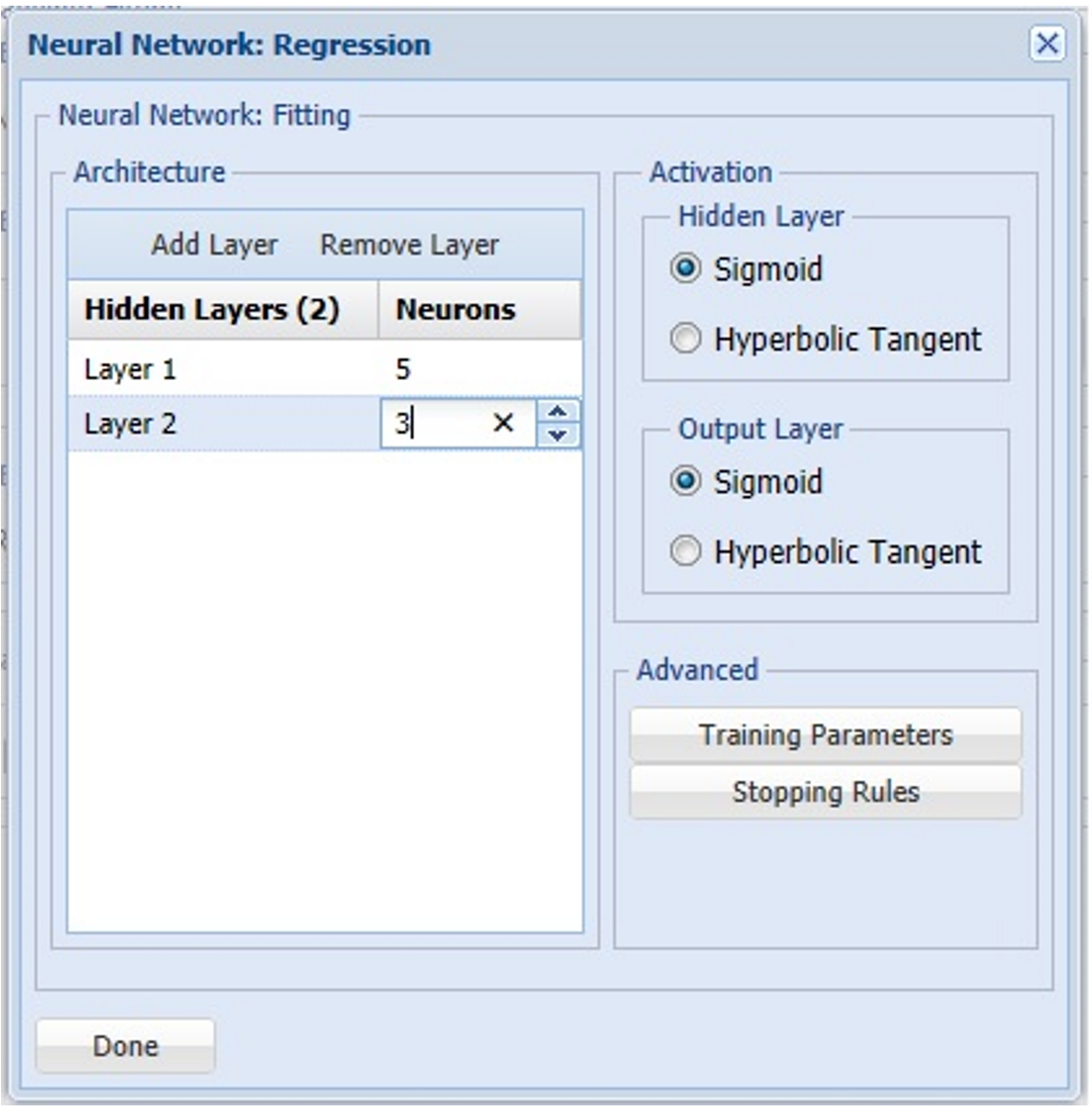
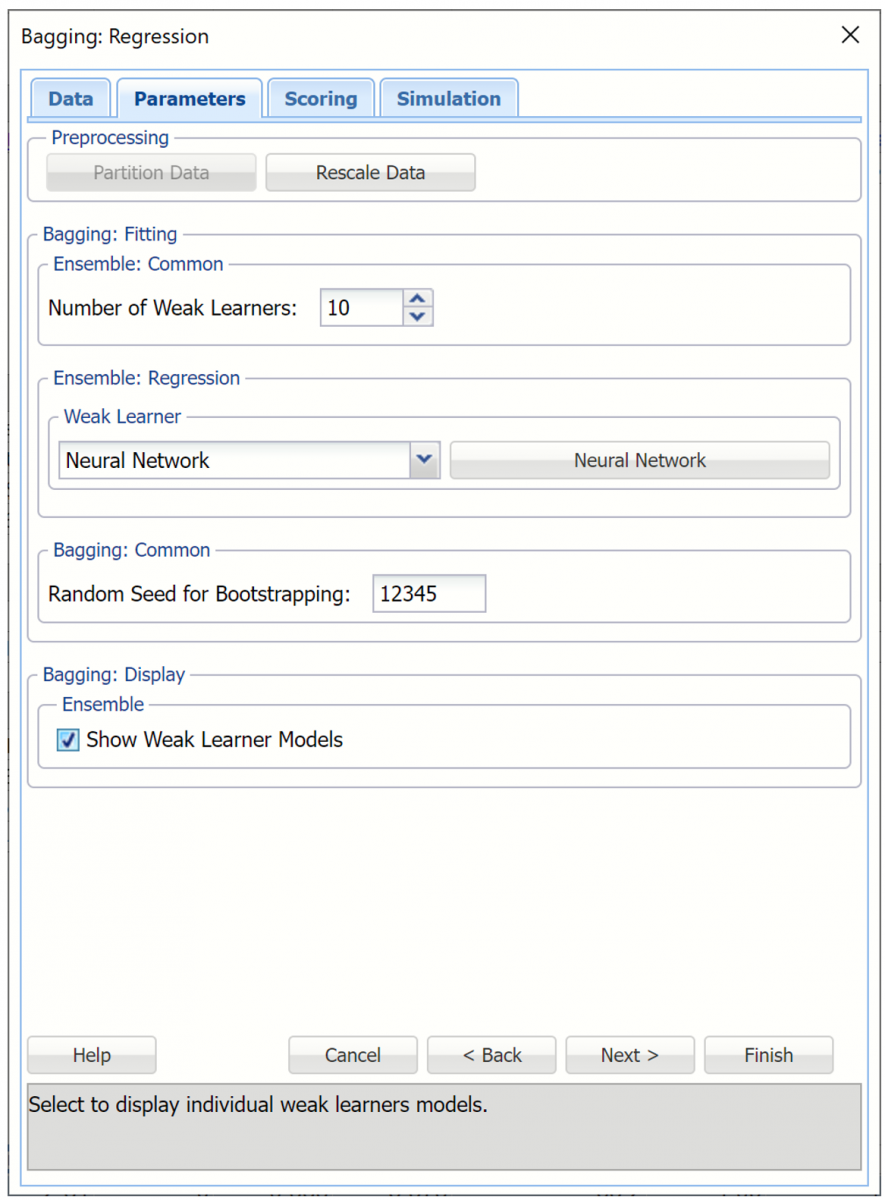
Select the down arrow beneath Weak Learner and select Neural Network from the menu. A command button will appear to the right of the Weak Learner menu labeled Neural Network. Click this button and then Add Layer twice to add two layers with 5 and 3 neurons, respectively. For more information on any of these options, see Neural Network. Click Done to return to the Parameters tab.
Bagging Weak Learner
Select Show Weak Learner Models to include this information in the output.
Bagging Regression dialog, Parameters tab
Next to advance to the Bagging – Scoring tab.
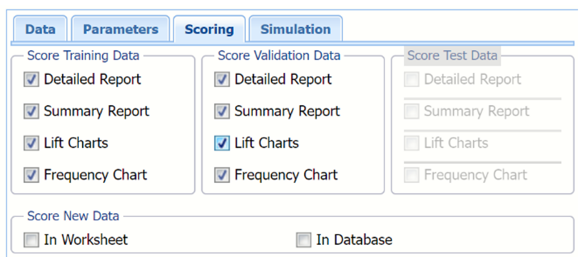
Select all four options for Score Training/Validation data.
When Detailed report is selected, Analytic Solver Data Science will create a detailed report of the Regression Trees output.
When Summary report is selected, Analytic Solver Data Science will create a report summarizing the Regression Trees output.
When Lift Charts is selected, Analytic Solver Data Science will include Lift Chart and ROC Curve plots in the output.
When Frequency Chart is selected, a frequency chart will be displayed when the RBagging_TrainingScore and RBagging_ValidationScore worksheets are selected. This chart will display an interactive application similar to the Analyze Data feature, explained in detail in the Analyze Data chapter that appears earlier in this guide. This chart will include frequency distributions of the actual and predicted responses individually, or side-by-side, depending on the user’s preference, as well as basic and advanced statistics for variables, percentiles, six sigma indices.
Since we did not create a test partition, the options for Score test data are disabled. See Partitioning for information on how to create a test partition.
See Scoring New Data for more information on Score New Data in options.
Bagging Regression dialog, Scoring tab
Click Next to advance to the Simulation tab.
Select Simulation Response Prediction to enable all options on the Simulation tab of the Regression Tree dialog.
Simulation tab: All supervised algorithms include a new Simulation tab. This tab uses the functionality from the Generate Data feature (described earlier in this guide) to generate synthetic data based on the training partition, and uses the fitted model to produce predictions for the synthetic data. The resulting report, RBagging_Simulation, will contain the synthetic data, the predicted values and the Excel-calculated Expression column, if present. In addition, frequency charts containing the Predicted, Training, and Expression (if present) sources or a combination of any pair may be viewed, if the charts are of the same type.
Bagging Regression dialog, Simulation tab
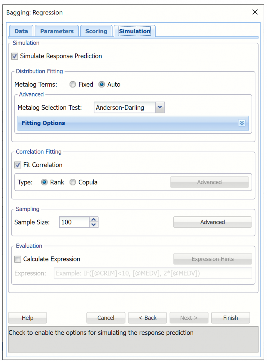
Evaluation: Select Calculate Expression to amend an Expression column onto the frequency chart displayed on the RBagging_Simulation output tab. Expression can be any valid Excel formula that references a variable and the response as [@COLUMN_NAME]. Click the Expression Hints button for more information on entering an expression. Note that variable names are case sensitive. See any of the previous prediction methods to see the Expression field in use.
For more information on the remaining options shown on this dialog in the Distribution Fitting, Correlation Fitting and Sampling sections, see Generate Data.
Click Finish to run Bagging Ensemble Method on the example dataset.
Output
Output sheets containing the results of the Bagging Prediction method will be inserted into the active workbook, to the right of the STDPartition worksheet.
RBagging_Output
This result worksheet includes 3 segments: Output Navigator, Inputs and Bagging Model.
Output Navigator: The Output Navigator appears at the top of all result worksheets. Use this feature to quickly navigate to all reports included in the output.
RBagging_Output: Output Navigator

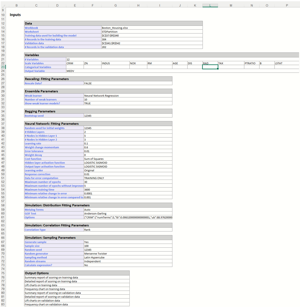
Inputs: Scroll down to the Inputs section to find all inputs entered or selected on all tabs of the Bagging Regression dialog.
RBagging_Output, Inputs Report
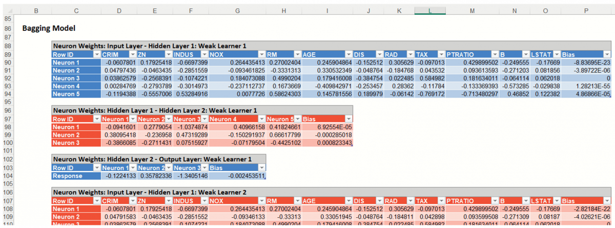
Boosting Model: Click the Boosting Model link on the Output Naviagator to view the Boosting model for each weak learner. Recall that the default is "10" on the Parameters tab.
RBagging_TrainingScore
Click the RBagging_TrainingScore tab to view the newly added Output Variable frequency chart, the Training: Prediction Summary and the Training: Prediction Details report. All calculations, charts and predictions on this worksheet apply to the Training data.
Note: To view charts in the Cloud app, click the Charts icon on the Ribbon, select a worksheet under Worksheet and a chart under Chart.
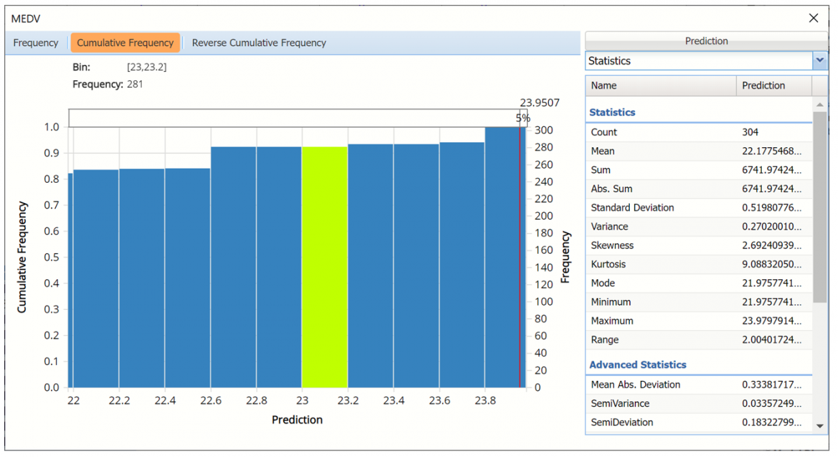
Frequency Charts: The output variable frequency chart opens automatically once the RBoosting_TrainingScore worksheet is selected. For more information on this dialog, see the Boosting example in the previous help topic.
Frequency chart displaying prediction data
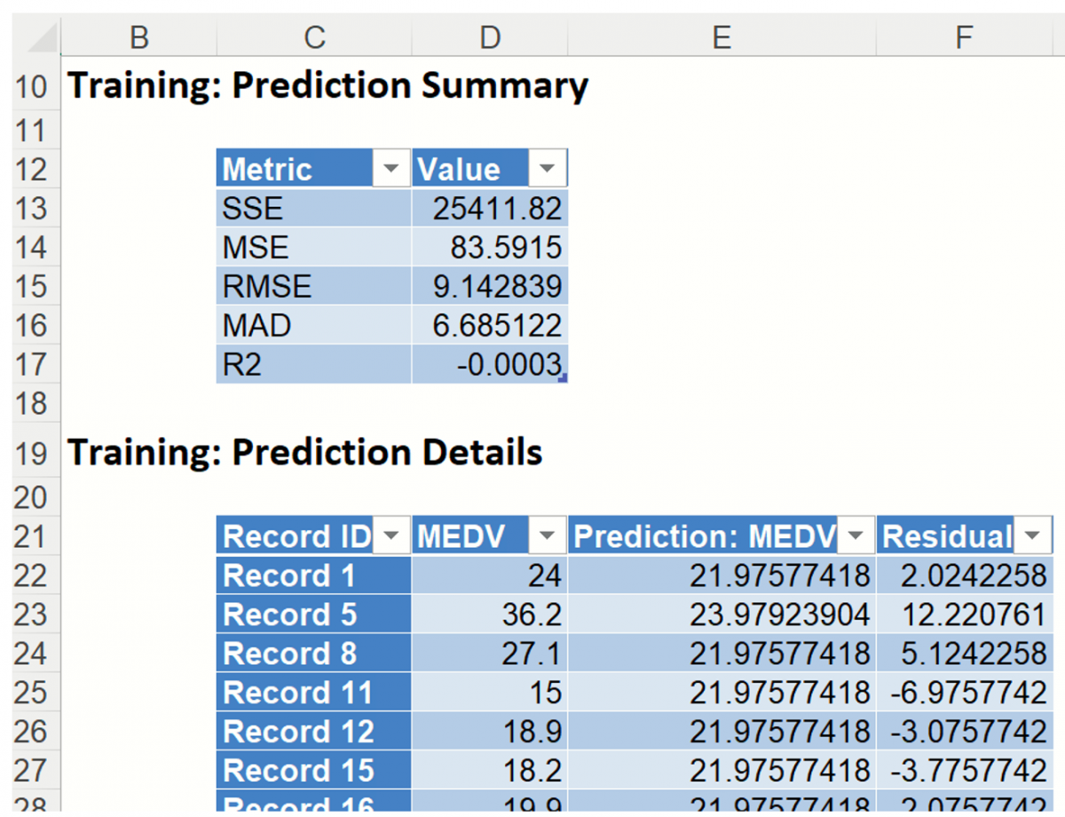
Training: Prediction Summary: Click the Training: Prediction Summary link on the Output Navigator to open the Training Summary. This data table displays various statistics to measure the performance of the trained network: Sum of Squared Error (SSE), Mean Squared Error (MSE), Root Mean Squared Error (RMSE), the Median Absolute Deviation (MAD) and the Coefficient of Determination (R2).
Training: Prediction Details: Scroll down to view the Prediction Details data table. This table displays the Actual versus Predicted values, along with the Residuals, for the training dataset.
RBagging_ValidationScore
RBagging_ValidationScore displays the newly added Output Variable frequency chart, the Validation: Prediction Summary and the Validation: Prediction Details report. All calculations, charts and predictions on the RBagging_ValidationScore output sheet apply to the Validation partition.
Frequency Charts: The output variable frequency chart for the validation partition opens automatically once the RBagging_ValidationScore worksheet is selected. This chart displays a detailed, interactive frequency chart for the Actual variable data and the Predicted data, for the validation partition. For more information on this chart, see the RBagging_TrainingScore explanation above.
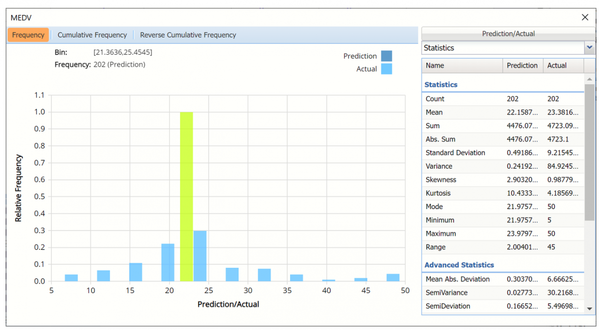
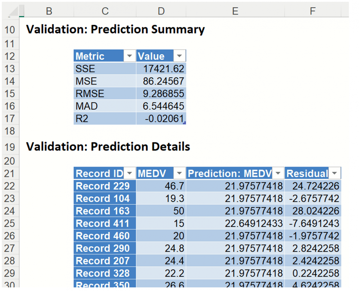
Prediction Summary: In the Prediction Summary report, Analytic Solver Data Science displays the total sum of squared errors summaries for the Validation partition.
Prediction Details: Scroll down to the Validation: Prediction Details report to find the Prediction value for the MEDV variable for each record in the Validation partition, as well as the Residual value.
RBagging_TrainingLiftChart & RBagging_ValidationLiftChart
Click the RBagging_TrainLiftChart and RBagging_ValidLiftChart tabs to navigate to the Lift Charts and Regression RROC curves for both the training and validation datasets. For more information on how to interpret these charts, see the Neural Network help topic.
Note: To view these charts in the Cloud app, click the Charts icon on the Ribbon, select RBagging_TrainingLiftChart or RBagging_ValidationLiftChart for Worksheet and Decile Chart, ROC Chart or Gain Chart for Chart.

RBagging_Simulation
As discussed above, Analytic Solver Data Science generates a new output worksheet, RBagging_Simulation, when Simulate Response Prediction is selected on the Simulation tab of the Bagging Regression dialog.
This report contains the synthetic data, the predicted values for the training data (using the fitted model) and the Excel – calculated Expression column, if populated in the dialog. Users can switch between the Predicted, Training, and Expression sources or a combination of two, as long as they are of the same type.
Synthetic Data
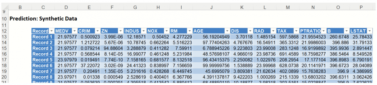
The data contained in the Synthetic Data report is synthetic data, generated using the Generate Data feature described in the chapter with the same name, that appears earlier in this guide.
The chart that is displayed once this tab is selected, contains frequency information pertaining to the output variable in the training data, the synthetic data and the expression, if it exists. (Recall that no expression was entered in this example.)
Frequency Chart for Prediction (Simulation) data
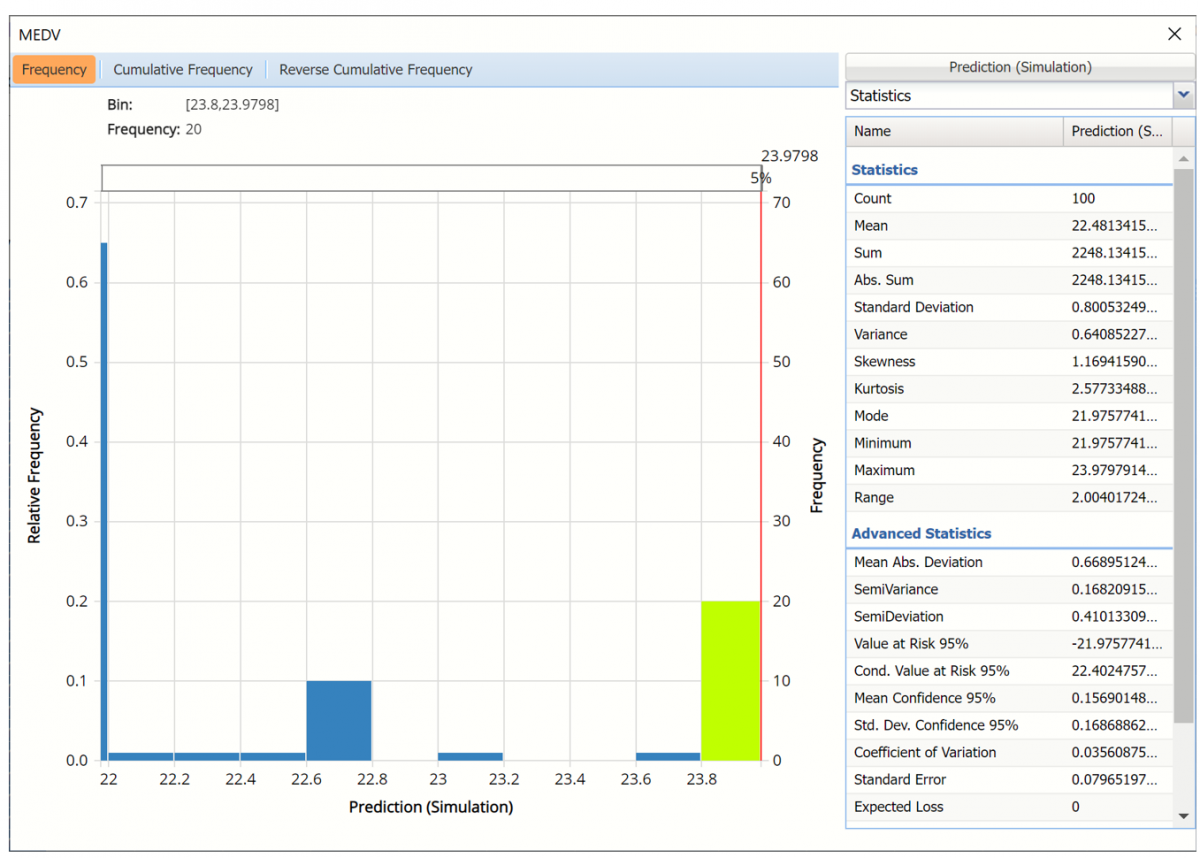
Click Prediction (Simulation) to add the training data to the chart.
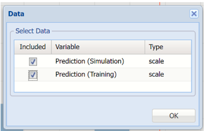
Click Prediction(Simulation) and Prediction (Training) to change the Data view.
Data Dialog
In the chart below, the dark blue bars display the frequencies for the synthetic data and the light blue bars display the frequencies for the predicted values in the Training partition.
Prediction (Simulation) and Prediction (Training) Frequency chart for MEDV variable
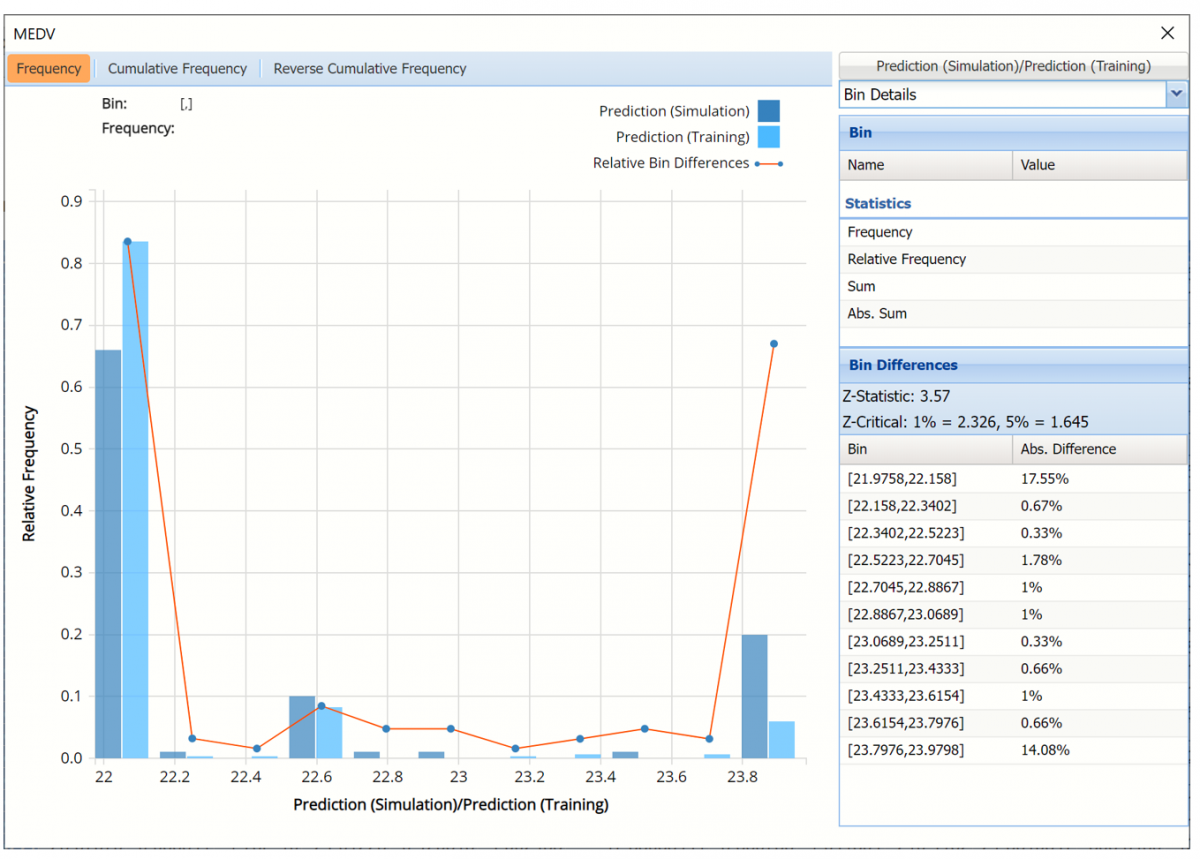
The Relative Bin Differences curve charts the absolute differences between the data in each bin. Click the down arrow next to Statistics to view the Bin Details pane to display the calculations.
Click the down arrow next to Frequency to change the chart view to Relative Frequency or to change the look by clicking Chart Options. Statistics on the right of the chart dialog are discussed earlier in this section. For more information on the generated synthetic data, see Generate Data.
See Scoring New Data for information on the Stored Model Sheet, RBoosting_Stored.
Continue on with the Random Trees Neural Network Regression Example in the next section to compare the results between the two ensemble methods.