Find Best Model Prediction Model
This example illustrates how to utilize the Find Best Model for Regression included in Analytic Solver Data Science for Desktop Excel or Excel Online by using the Wine dataset[1]. This dataset contains 13 different features describing three wine varieties obtained from three different vineyards, all located in the same vicinity.
Note: [1] This data set can be found in the UCI Machine Learning Repository (http://www.ics.uci.edu/~mlearn/MLSummary.html or ftp://ftp.ics.uci.edu/pub/machine-learning-databases/wine/)
Find Best Model fits a model to all selected regression methods in order to observe which method provides the best fit to the data. The goal of this example is to fit the best model to the dataset, then use this fitted model to determine the alcohol content in a new sample of wine.
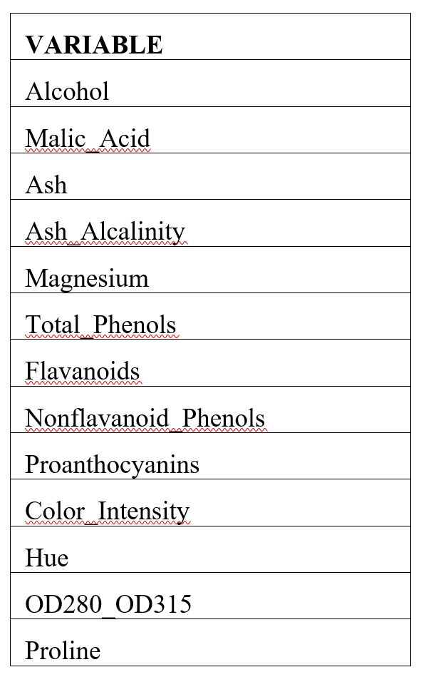
A list of each variable contained in the dataset appears in the table below.
Wine dataset variables
All supervised algorithms include a new Simulation tab. This tab uses the functionality from the Generate Data feature (described in the What’s New section of this guide and then more in depth in the Analytic Solver Data Science Reference Guide) to generate synthetic data based on the training partition, and uses the fitted model to produce predictions for the synthetic data. The resulting report, PFBM_Simulation, will contain the synthetic data, the predicted values and the Excel-calculated Expression column, if present. In addition, frequency charts containing the Predicted, Training, and Expression (if present) sources or a combination of any pair may be viewed, if the charts are of the same type. Since this new functionality does not support categorical variables, these types of variables will not be present in the model, only continuous variables.
Opening the Dataset
Open wine.xlsx by clicking Help – Example Models – Forecasting/Data Science Examples.
Partitioning the Dataset
Partition the dataset by clicking Partition – Standard Partition.
- Move all features under Variables In Input Data to Selected Variables.
- Click OK to accept the partitioning defaults and create the partitions.
Standard Data Partition Dialog
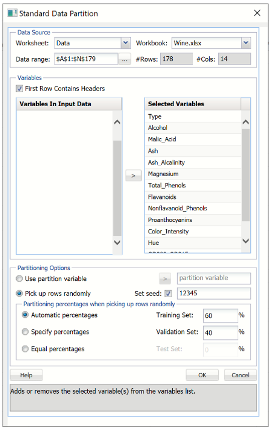
A new worksheet, STDPartition, is inserted directly to the right of the dataset. Click the new tab to open the worksheet. Find Best Model will be performed on both the Training and Validation partitions.
For more information on partitioning a dataset, see the Partitioning chapter within the Data Science Reference Guide.
Running Find Best Model
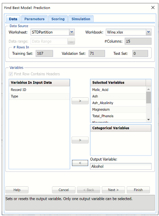
With STDPartition worksheet selected, click Predict – Find Best Model to open the Find Best Model Data tab.
Data Tab
The continuous variables are selected on the Data tab.
- Select Malic_Acid, Ash, Ash_Alcalinity, Magnesium, Total_Phenols, Flavanoids, Nonflavanoid_Phenols, Proanthocyanins, Color_Intensity, Hue, OD280_OD315, Proline for Selected Variables.
- Select Alcohol for the Output Variable.
- Click Next to move to the Parameters tab.
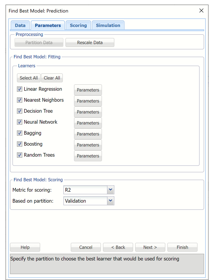
Parameters tab
By default all eligible regression learners are automatically enabled based on the presence of categorical features or binary/multiclass classification. Optionally, all possible parameters for each algorithm may be defined using the Parameters button to the right of each learner.
The Partition Data button is disabled because the original dataset was partitioned before Find Best Model was initiated.
Rescale Data
To rescale the data, click Rescale Data and select the Rescale Data option at the top of the Rescaling dialog.
Rescaling dialog
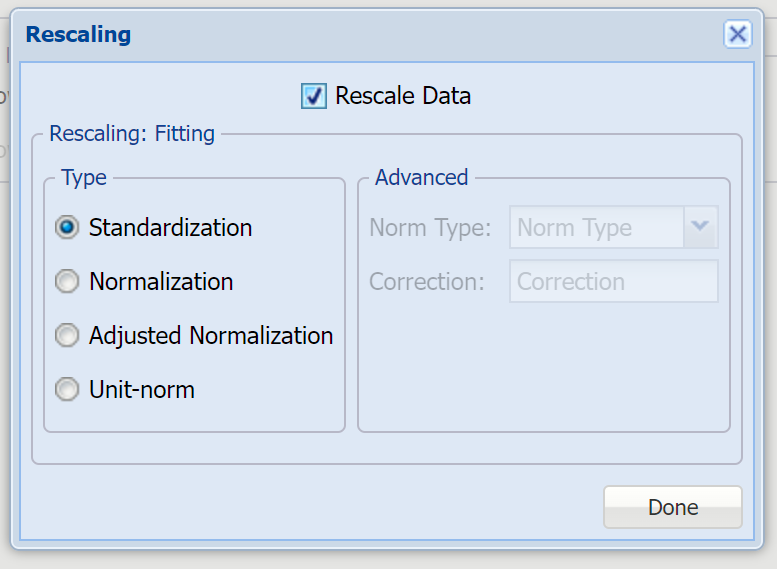
Use Rescaling to normalize one or more features in your data during the data preprocessing stage. Analytic Solver Data Science provides the following methods for feature scaling: Standardization, Normalization, Adjusted Normalization and Unit-norm.
This example does not use rescaling to rescale the dataset data. Uncheck the Rescale Data option at the top of the dialog and click Done.
Find Best Model: Fitting
To set a parameter for each selected learner, click the Parameters button to the right.
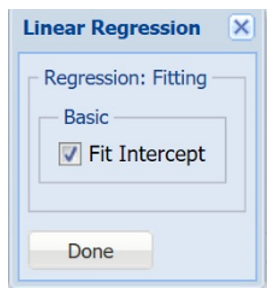
| Fit Intercept | If this option is selected, a constant term will be included in the model. Otherwise, a constant term will not be included in the equation. This option is selected by default. |
Find Best Model Predict Linear Regression Option Dialog
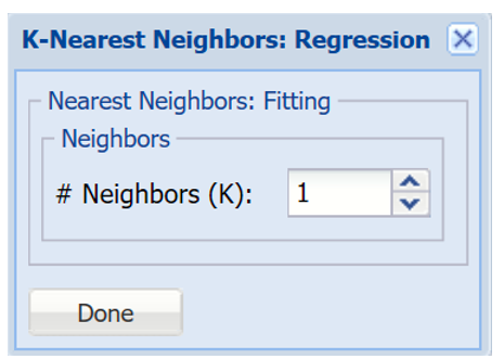
| # Neighbors (k) | Enter a value for the parameter k in the Nearest Neighbor algorithm |
Find Best Model Predict k-Nearest Neighbors Option Dialog
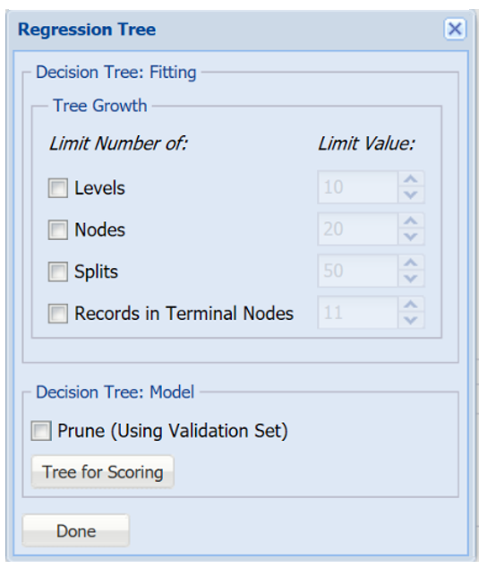
| Tree Growth Levels, Nodes, Splits, Tree Records in Terminal Nodes | In the Tree Growth section, select Levels, Nodes, Splits and Records in Terminal Nodes. Values entered for these options limit tree growth, i.e. if 10 is entered for Levels, the tree will be limited to 10 levels. |
| Prune |
If the validation partition exists, this option is enabled. When this option is selected, Analytic Solver Data Science will prune the tree using the validation set. Pruning the tree using the validation set reduces the error from over-fitting the tree to the training data. Click Tree for Scoring to click the Tree type used for scoring: Fully Grown, Best Pruned, Minimum Error, User Specified or Number of Decision Nodes. |
Find Best Model Predict Regression Tree Option Dialog
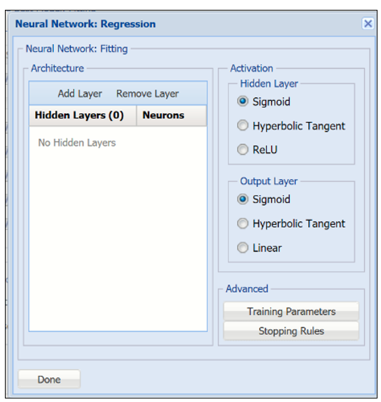
| Architecture | Click Add Layer to add a hidden layer. To delete a layer, click Remove Layer. Once the layer is added, enter the desired Neurons. |
| Hidden Layer | Nodes in the hidden layer receive input from the input layer. The output of the hidden nodes is a weighted sum of the input values. This weighted sum is computed with weights that are initially set at random values. As the network "learns", these weights are adjusted. This weighted sum is used to compute the hidden node's output using a transfer function. The default selection is Sigmoid. |
| Output Layer | As in the hidden layer output calculation (explained in the above paragraph), the output layer is also computed using the same transfer function as described for Activation: Hidden Layer. The default selection is Sigmoid. |
| Training Parameters | Click training Parameters to open the Training Parameters dialog to specify parameters related to the training of the Neural Network algorithm. |
| Stopping Rules | Click Stopping Rules to open the Stopping Rules dialog. Here users can specify a comprehensive set of rules for stopping the algorithm early plus cross-validation on the training error. |
Find Best Model Predict Neural Network Option Dialog
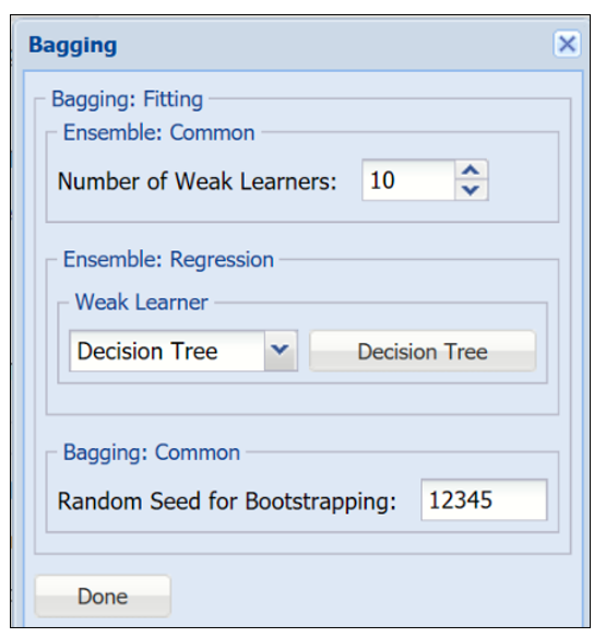
| Number of Weak Learners | This option controls the number of "weak" regression models that will be created. The ensemble method will stop when the number of regression models created reaches the value set for this option. The algorithm will then compute the weighted sum of votes for each class and assign the “winning” value to each record. |
| Weak Learner | Under Ensemble: Common click the down arrow beneath Weak Leaner to select one of the four featured classifiers: Linear Regression, k-NN, Neural Networks or Decision Tree. The command button to the right will be enabled. Click this command button to control various option settings for the weak leaner. |
| Random Seed for Bootstrapping | Enter an integer value to specify the seed for random resampling of the training data for each weak learner. Setting the random number seed to a nonzero value (any number of your choice is OK) ensures that the same sequence of random numbers is used each time the dataset is chosen for the classifier. The default value is “12345”. If left blank, the random number generator is initialized from the system clock, so the sequence of random numbers will be different in each calculation. If you need the results from successive runs of the algorithm to another to be strictly comparable, you should set the seed. To do this, type the desired number you want into the box. This option accepts positive integers with up to 9 digits. |
Find Best Model Predict Bagging Ensemble Method Option Dialog
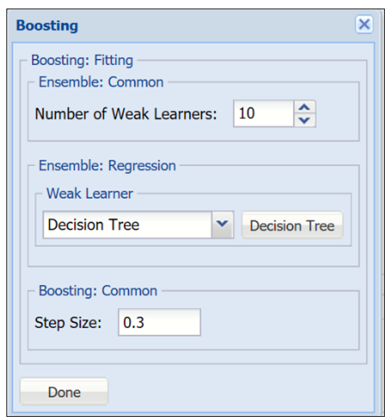
| Number of Weak Learners | See description above. |
| Weak Learner | See description above. |
| Step Size | The Adaboost algorithm minimizes a loss function using the gradient descent method. The Step size option is used to ensure that the algorithm does not descend too far when moving to the next step. It is recommended to leave this option at the default of 0.3, but any number between 0 and 1 is acceptable. A Step size setting closer to 0 results in the algorithm taking smaller steps to the next point, while a setting closer to 1 results in the algorithm taking larger steps towards the next point. |
Find Best Model Predict Boosting Ensemble Method Option Dialog
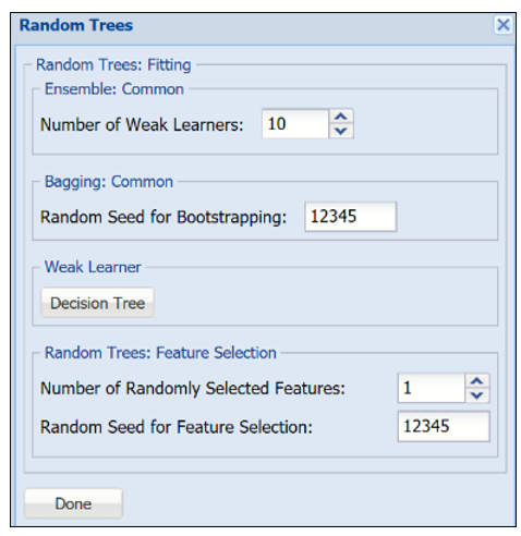
| Number of Weak Learners | See description above. |
| Random Seed for Bootstrapping | See description above. |
| Weak Learner | See description above. |
| Number of Randomly Selected Features | The Random Trees ensemble method works by training multiple “weak” classification trees using a fixed number of randomly selected features then taking the mode of each class to create a “strong” classifier. The option Number of randomly selected features controls the fixed number of randomly selected features in the algorithm. The default setting is 3. |
| Feature Selection Random Seed | If an integer value appears for Feature Selection Random seed, Analytic Solver Data Science will use this value to set the feature selection random number seed. Setting the random number seed to a nonzero value (any number of your choice is OK) ensures that the same sequence of random numbers is used each time the dataset is chosen for the classifier. The default value is “12345”. If left blank, the random number generator is initialized from the system clock, so the sequence of random numbers will be different in each calculation. If you need the results from successive runs of the algorithm to another to be strictly comparable, you should set the seed. To do this, type the desired number you want into the box. This option accepts positive integers with up to 9 digits. |
Find Best Model Predict Random Trees Ensemble Method Option Dialog
Find Best Model: Scoring
The two parameters at the bottom of the dialog under Find Best Model: Scoring, determine how well each regression method fits the data.
The Metric for Scoring may be changed to R2, SSE, MSE, RMSE or MAD. See the table below for a brief description of each statistic.
- For this example, leave R2 selected.
- Select Validation for Based on partition.
| Statistic | Description |
| R2 |
Coefficient of Determination - Examines how differences in one variable can be explained by the difference in a second variable, when predicting the outcome of a given event. |
| SSE |
Sum of Squared Error – The sum of the squares of the differences between the actual and predicted values. |
| MSE |
Mean Squared Error – The average of the squared differences between the actual and predicted values. |
| RMSE |
Root Mean Squared Error – The standard deviation of the residuals. |
| MAD |
Mean Absolute Deviation - Average distance between each data value and the sample mean; describes variation in a data set. |
Find Best Model Predict Parameters Tab
Scoring tab
Output options are selected on the Scoring tab. By default, the PFBM_Output worksheet will be inserted directly to the right of the STDPartition worksheet.
In this example select all four options: Detailed Report, Summary Report, Lift Charts and Frequency Chart under both Score Training Data and Score Validation Data. Then click Finish to run Find Best Model.
- PFBM_Output contains a listing of all model inputs such a input/output variables and parameter settings for all Learners, as well as Model Performance tables containing evaluations for every available metric, every learner on all available partitions. The Learner identified internally as performing the best, is highlighted in red. (Recall that the statistic used for determining which Learner performs best on the dataset was selected on the Parameters tab.)
- PFBM_Stored contains the PMML (Predictive Model Markup Language) model which can be utilized to score new data. For more information on scoring, see the Scoring chapter that appears later in this guide.
Selecting Detailed Report produces PFBM_TrainingScore and PFBM_ValidationScore.
- Both reports contain detailed scoring information on both the Training and Validation partitions using the "best" learner.
Summary Report is selected by default. This option produces a summary report at the top of both PFBM_TrainingScore and PFBM_ValidationScore worksheets.
- Summary Report contains a listing of 5 metrics: SSE, MSE, RMSE, MAD and R2.
Selecting Frequency Chart produces a frequency graph of the records in the partitions.
- When Frequency Chart is selected, a frequency chart will be displayed when the PFBM_TrainingScore and PFBM_ValidationScore worksheets are selected. This chart will display an interactive application similar to the Analyze Data feature, explained in detail in the Analyze Data chapter that appears earlier in this guide. This chart will include frequency distributions of the actual and predicted responses individually, or side-by-side, depending on the user’s preference, as well as basic and advanced statistics for variables, percentiles, six sigma indices.
Selecting Lift Charts generates Lift Charts, RROC Curves and Decil-Wise Lift Charts.
See the Scoring chapter that appears later in this guide for more information on the Score New Data section of the Scoring tab.
Simulation Tab
Click Next to advance to the Simulation tab.
Select Simulation Response Prediction to enable all options on the Simulation tab of the Find Best Model Prediction dialog.
Simulation tab: All supervised algorithms include a new Simulation tab. This tab uses the functionality from the Generate Data feature (described earlier in this guide) to generate synthetic data based on the training partition, and uses the fitted model to produce predictions for the synthetic data. The resulting report, PFBM_Simulation, will contain the synthetic data, the predicted values and the Excel-calculated Expression column, if present. In addition, frequency charts containing the Predicted, Training, and Expression (if present) sources or a combination of any pair may be viewed, if the charts are of the same type.
Evaluation: If Calculate Expression is selected, Analytic Solver amends an Expression column onto the frequency chart displayed on the PFBM_Simulation output tab. Expression can be any valid Excel formula that references a variable and the response as [@COLUMN_NAME]. Click the Expression Hints button for more information on entering an expression.
For the purposes of this example, leave this checkbox unchecked. See the Find Best Model classification example above to see an example of this option in use.
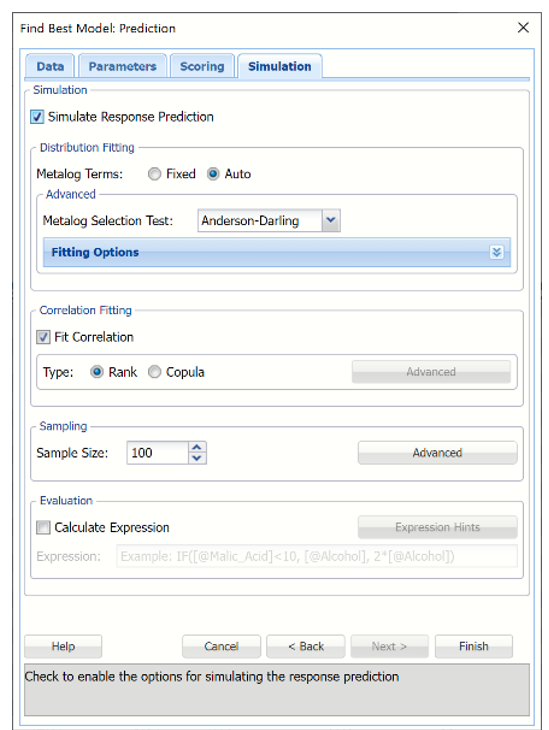
For more information on the remaining options shown on this dialog in the Distribution Fitting, Correlation Fitting and Sampling sections, see the Generate Data chapter that appears earlier in this guide.
Click Finish to run Find Best Model on the example dataset.
Interpreting the Results
All output sheets are inserted to the right of STDPartition.
PFBM_Output
The PFBM_Output worksheet is inserted directly to the right of the STDPartition worksheet. This report lists all input variables and all parameter settings for each learner, along with the Model Performance of each Learner on all partitions. This example utilizes two partitions, training and validation.
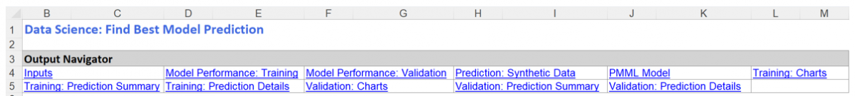
The Output Navigator appears at the very top of all output worksheets. Click the links to easily move between each section of the output. The Output Navigator is listed at the top of each worksheet included in the output.
The Inputs section includes information pertaining to the dataset, the input variables and parameter settings.
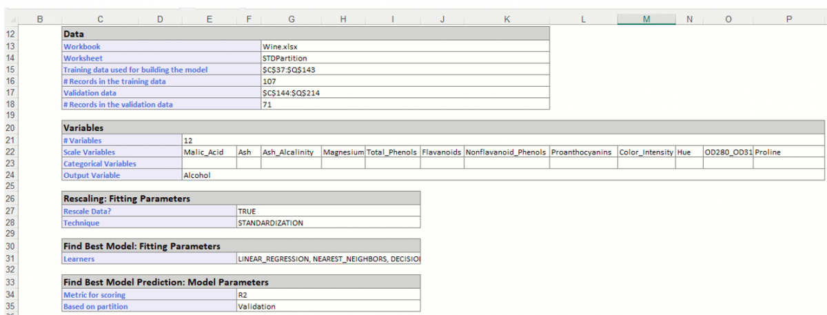
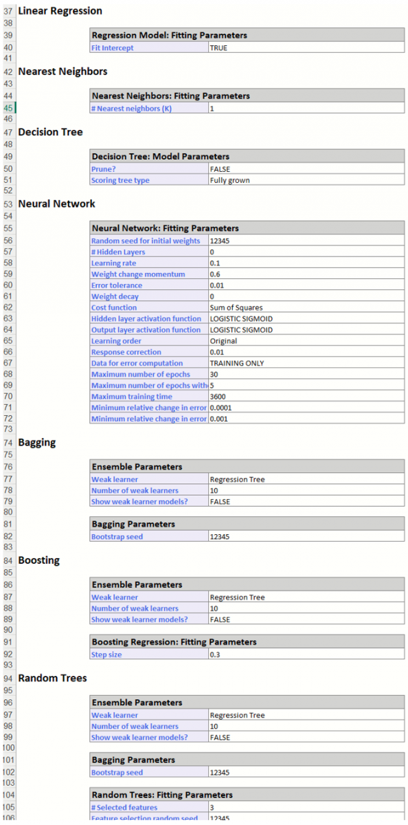
Further down within Inputs, the parameter selections for each Learner are listed.
Scroll down to view Simulation tab option settings and any generated messages from the Find Best Model feature.
Further down, the Model Performance tables display how each prediction method performed on the dataset.
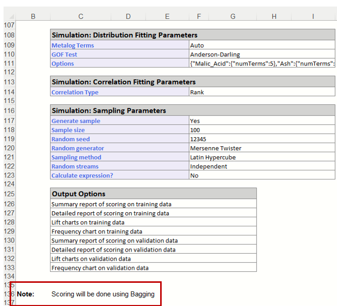
The Messages portion of the report indicates that Scoring will be performed using the Bagging Ensemble Method the Learner selected as the "best" choice according to the selection for Find Best Model: Scoring parameters on the Parameters tab: Validation Partition R2 Metric.
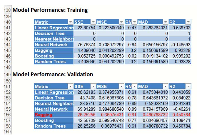
Since the Bagging Ensemble R2 metric for the Validation Partition has the highest score, that is the Learner that will be used for scoring.
PFBM_TrainingScore and PFBM_ValidationScore
PFBM_TrainingScore contains the Prediction Summary and the Prediction Details reports for the training partition. PFBM_Validation contains the same reports for the validation partition. Both reports have been generated using the Bagging Ensemble Method, as discussed above.
PFBM_TrainingScore
Click the PFBM_TrainingScore tab to view the newly added Output Variable frequency chart, the Training: Prediction Summary and the Training: Prediction Details report. All calculations, charts and predictions on this worksheet apply to the Training data.
Note: To view charts in the Cloud app, click the Charts icon on the Ribbon, select a worksheet under Worksheet and a chart under Chart.
Tabs: The Analyze Data dialog contains three tabs: Frequency, Cumulative Frequency, and Reverse Cumulative Frequency. Each tab displays different information about the distribution of variable values.
Analyze Data dialog
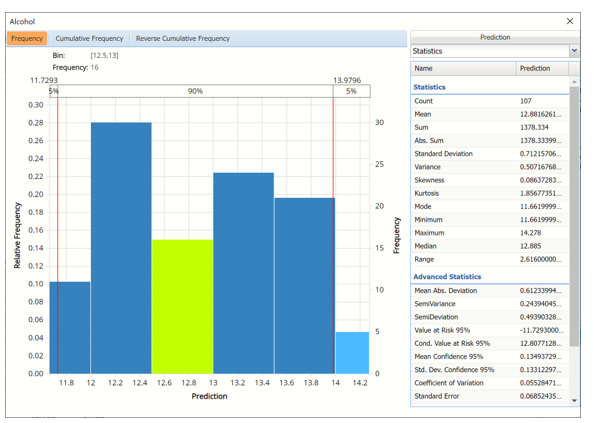
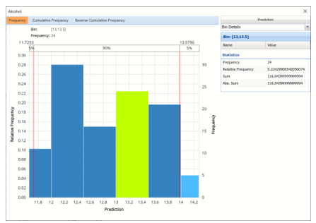
Hovering over a bar in either of the three charts will populate the Bin and Frequency headings at the top of the chart. In the Frequency chart above, the bar for the [12.5, 13] Bin is selected. This bar has a frequency of 16 and a relative frequency of about 15%.
By default, red vertical lines will appear at the 5% and 95% percentile values in all three charts, effectively displaying the 90th confidence interval. The middle percentage is the percentage of all the variable values that lie within the ‘included’ area, i.e. the darker shaded area. The two percentages on each end are the percentage of all variable values that lie outside of the ‘included’ area or the “tails”. i.e. the lighter shaded area. Percentile values can be altered by moving either red vertical line to the left or right.
Click the “X” in the upper right corner of the detailed chart dialog to close the dialog. To re-open the chart, click a new tab, say the Data tab in this example, and then click PFBM_TrainingScore.
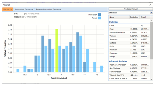
Frequency Tab: When the Analyze Data dialog is first displayed, the Frequency tab is selected by default. This tab displays a histogram of the variable’s values.
Bins containing the range of values for the variable appear on the horizontal axis, the relative frequency of occurrence of the bin values appears on the left vertical axis while the actual frequency of the bin values appear on the right vertical axis.
Cumulative Frequency / Reverse Cumulative Frequency
The Cumulative Frequency tab displays a chart of the cumulative form of the frequency chart, as shown below. Hover over each bar to populate the Bin and Frequency headings at the top of the chart. In this screenshot below, the bar for the [12.5, 13.0] Bin is selected in the Cumulative Frequency Chart. This bar has a frequency of 57 and a relative frequency of about 52%.
Cumulative Frequency Chart Reverse Cumulative Frequency Chart
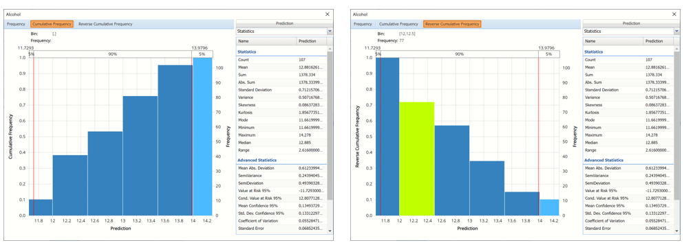
Cumulative Frequency Chart: Bins containing the range of values for the variable appear on the horizontal axis, the cumulative frequency of occurrence of the bin values appear on the left vertical axis while the actual cumulative frequency of the bin values appear on the right vertical axis.
Reverse Cumulative Frequency Chart: Bins containing the range of values for the variable appear on the horizontal axis, similar to the Cumulative Frequency Chart. The reverse cumulative frequency of occurrence of the bin values appear on the left vertical axis while the actual reverse cumulative frequency of the bin values appear on the right vertical axis.
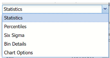
Click the drop down menu on the upper right of the dialog to display additional panes: Statistics, Six Sigma and Percentiles.
Drop down menu
Statistics View
The Statistics tab displays numeric values for several summary statistics, computed from all values for the specified variable. The statistics shown on the pane below were computed for the predicted variable, in this case Alcohol.
Statistics Pane
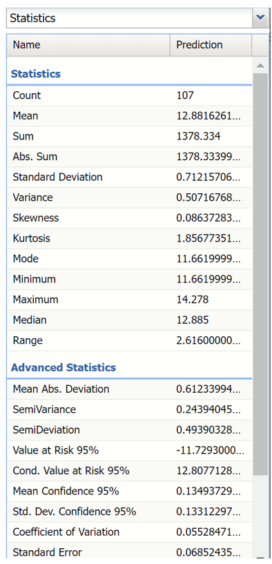
All statistics appearing on the Statistics pane are briefly described below.
Statistics
- Count, the total number of records included in the data.
- Mean, the average of all the values.
- Sum, the sum of all the values.
- Abs. Sum, the absolute sum of all the values.
- Standard Deviation, the square root of variance.
- Variance, describes the spread of the distribution of values.
- Skewness, which describes the asymmetry of the distribution of values.
- Kurtosis, which describes the peakedness of the distribution of values.
- Mode, the most frequently occurring single value.
- Minimum, the minimum value attained.
- Maximum, the maximum value attained.
- Median, the median value.
- Range, the difference between the maximum and minimum values.
Advanced Statistics
- Mean Abs. Deviation, returns the average of the absolute deviations.
- SemiVariance, measure of the dispersion of values.
- SemiDeviation, one-sided measure of dispersion of values.
- Value at Risk 95%, the maximum loss that can occur at a given confidence level.
- Cond. Value at Risk, is defined as the expected value of a loss given that a loss at the specified percentile occurs.
- Mean Confidence 95%, returns the confidence “half-interval” for the estimated mean value (returned by the PsiMean() function).
- Std. Dev. Confidence 95%, returns the confidence ‘half-interval’ for the estimated standard deviation of the simulation trials (returned by the PsiStdDev() function).
- Coefficient of Variation, is defined as the ratio of the standard deviation to the mean.
- Standard Error, defined as the standard deviation of the sample mean.
- Expected Loss, returns the average of all negative data multiplied by the percentrank of 0 among all data.
- Expected Loss Ratio, returns the expected loss ratio.
- Expected Gain returns the average of all positive data multiplied by 1 - percentrank of 0 among all data.
- Expected Gain Ratio, returns the expected gain ratio.
- Expected Value Margin, returns the expected value margin.
Percentiles View
Selecting Percentiles from the menu displays numeric percentile values (from 1% to 99%) computed using all values for the variable. The percentiles shown below were computed using the values for the Alcohol variable.
Percentiles Pane
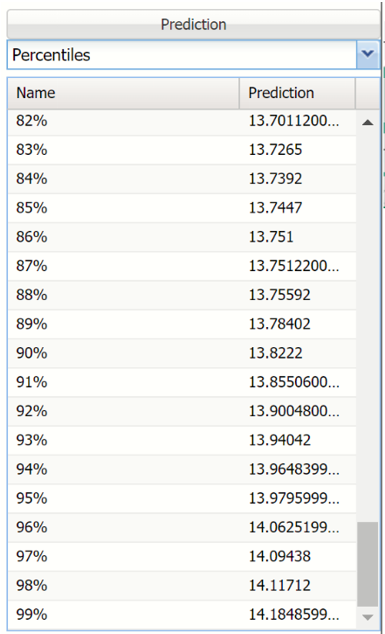
The values displayed here represent 99 equally spaced points on the Cumulative Frequency chart: In the Percentile column, the numbers rise smoothly on the vertical axis, from 0 to 1.0, and in the Value column, the corresponding values from the horizontal axis are shown. For example, the 75th Percentile value is a number such that three-quarters of the values occurring in the last simulation are less than or equal to this value.
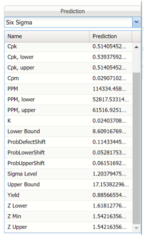
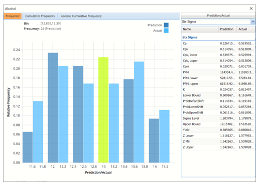
Six Sigma View
Selecting Six Sigma from the menu displays various computed Six Sigma measures. In this display, the red vertical lines on the chart are the Lower Specification Limit (LSL) and the Upper Specification Limit (USL) which are initially set equal to the 5th and 95th percentile values, respectively.
These functions compute values related to the Six Sigma indices used in manufacturing and process control. For more information on these functions, see the Appendix located at the end of the Data Science Reference Guide.
- SigmaCP calculates the Process Capability.
- SigmaCPK calculates the Process Capability Index.
- SigmaCPKLower calculates the one-sided Process Capability Index based on the Lower Specification Limit.
- SigmaCPKUpper calculates the one-sided Process Capability Index based on the Upper Specification Limit.
- SigmaCPM calculates the Taguchi Capability Index.
- SigmaDefectPPM calculates the Defect Parts per Million statistic.
- SigmaDefectShiftPPM calculates the Defective Parts per Million statistic with a Shift.
- SigmaDefectShiftPPMLower calculates the Defective Parts per Million statistic with a Shift below the Lower Specification Limit.
- SigmaDefectShiftPPMUpper calculates the Defective Parts per Million statistic with a Shift above the Upper Specification Limit.
- SigmaK calculates the Measure of Process Center.
- SigmaLowerBound calculates the Lower Bound as a specific number of standard deviations below the mean.
- SigmaProbDefectShift calculates the Probability of Defect with a Shift outside the limits.
- SigmaProbDefectShiftLower calculates the Probability of Defect with a Shift below the lower limit.
- SigmaProbDefectShiftUpper calculates the Probability of Defect with a Shift above the upper limit.
- SigmaSigmaLevel calculates the Process Sigma Level with a Shift.
- SigmaUpperBound calculates the Upper Bound as a specific number of standard deviations above the mean.
- SigmaYield calculates the Six Sigma Yield with a shift, i.e. the fraction of the process that is free of defects.
- SigmaZLower calculates the number of standard deviations of the process that the lower limit is below the mean of the process.
- SigmaZMin calculates the minimum of ZLower and ZUpper.
- SigmaZUpper calculates the number of standard deviations of the process that the upper limit is above the mean of the process.
Six Sigma Pane
Bin Details View
Click the down arrow next to Statistics to view Bin Details for each bin in the chart.
Bin: If viewing the chart with only the Predicted or simulate data, only one grid will be displayed on the Bin Details pane. This grid displays important bin statistics such as frequency, relative frequency, sum and absolute sum.
Bin Details View with continuous (scale) variables
- Frequency is the number of observations assigned to the bin.
- Relative Frequency is the number of observations assigned to the bin divided by the total number of observations.
- Sum is the sum of all observations assigned to the bin.
- Absolute Sum is the sum of the absolute value of all observations assigned to the bin, i.e. |observation 1| + |observation 2| + |observation 3| + …
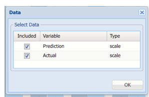
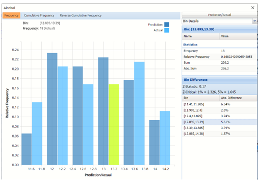
Bin Differences: Click Prediction to open the Data dialog. Select both Prediction and Actual to add the predicted values for the training partition to the chart.
Analyze Data, Data Dialog
Two grids are displayed, Bin and Bin Differences. Bin Differences displays the differences between the relative frequencies of each bin for the two histograms, sorted in the same order as the bins listed in the chart. The computed Z-Statistic as well as the critical values, are displayed in the title of the grid.
For more information on Bin Details, see the Generate Data chapter within the Data Science Reference Guide.
Chart Settings View
The Chart Options view contains controls that allow you to customize the appearance of the charts that appear in the dialog. When you change option selections or type numerical values in these controls, the chart area is instantly updated.
Chart Options Pane
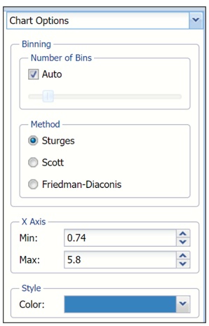
The controls are divided into three groups: Binning, Method and Style.
- Binning: Applies to the number of bins in the chart.
- Auto: Select Auto to allow Analytic Solver to automatically select the appropriate number of bins to be included in the frequency charts. See Method below for information on how to change the bin generator used by Analytic Solver when this option is selected.
- Manually select # of Bins: To manually select the number of bins used in the frequency charts, uncheck “Auto” and drag the slider to the right to increase the number of bins or to the left to decrease the number of bins.
- Method: Three generators are included in the Analyze Data application to generate the “optimal” number of bins displayed in the chart. All three generators implicitly assume a normal distribution. Sturges is the default setting. The Scott generator should be used with random samples of normally distributed data. The Freedman-Diaconis’ generator is less sensitive than the standard deviation to outliers in the data.
- X Axis: Analytic Solver allows users to manually set the Min and Max values for the X Axis. Simply type the desired value into the appropriate text box.
- Style:
- Color: Select a color, to apply to the entire variable graph, by clicking the down arrow next to Color and then selecting the desired hue.
Notice in the screenshot below that both the Prediction and Actual data appear in the chart together, and statistics, percentiles or Six Sigma indices for both data appear on the right.
To remove either the Predicted or the Actual data from the chart, click Prediction/Actual in the top right and then uncheck the data type to be removed.
Frequency Chart shown with Prediction and Training data, Six Sigma displayed.
Click the down arrow next to Statistics to view Percentiles or Six Sigma indices for each type of data.
Training: Prediction Summary and Prediction Details
The Prediction Summary for the Training Partition lists the following metrics: SSE, MSE, RMSE, MAD and R2. See definitions above.
Prediction Summary and Details for Training Partition
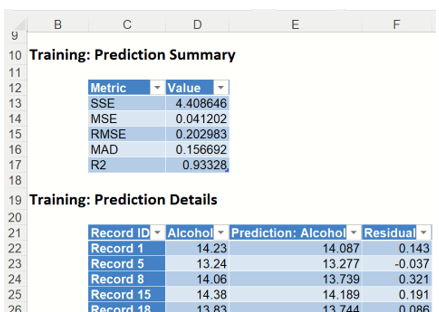
Individual records and their predictions are shown beneath Training: Prediction Details.
PFBM_ValidationScore
Frequency Chart: PFBM_ValidationScore also displays a frequency chart once the tab is selected. See above for an explanation of this chart.
Frequency Chart for Validation Partition
The Prediction Summary for the Validation Partition is shown below.
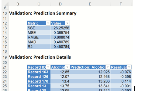
Individual records and their predictions are shown beneath Validation: Prediction Details.
PFBM_TrainingLiftChart and PFBM_ValidationLiftChart
Lift charts and Regression ROC Curves (RROC) are visual aids for measuring model performance. Lift Charts consist of a lift curve and a baseline. The greater the area between the lift curve and the baseline, the better the model. R\] (regression receiver operating characteristic) curves plot the performance of regressors by graphing over-estimations (or predicted values that are too high) versus underestimations (or predicted values that are too low.) The closer the curve is to the top left corner of the graph (in other words, the smaller the area above the curve), the better the performance of the model.
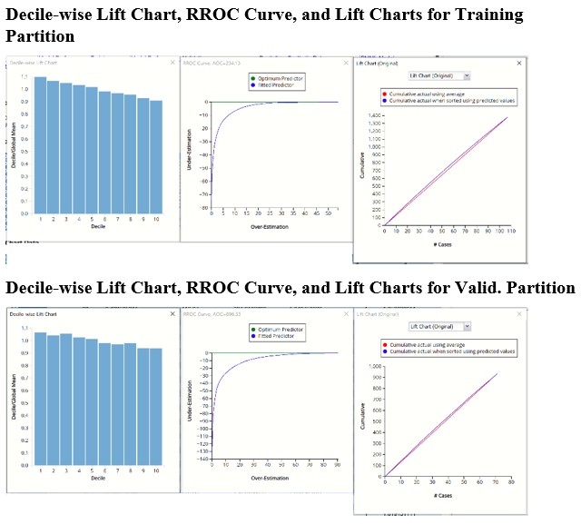
Original Lift Chart
After the model is built using the training data set, the model is used to score on the training data set and the validation data set (if one exists). Then the data set(s) are sorted using the predicted output variable value. After sorting, the actual outcome values of the output variable are cumulated and the lift curve is drawn as the number of cases versus the cumulated value. The baseline (red line connecting the origin to the end point of the blue line) is drawn as the number of cases versus the average of actual output variable values multiplied by the number of cases.
Decile-Wise Lift Chart
The decile-wise lift curve is drawn as the decile number versus the cumulative actual output variable value divided by the decile's mean output variable value. This bars in this chart indicate the factor by which the Linear Regression model outperforms a random assignment, one decile at a time. Typically, this graph will have a "stairstep" appearance - the bars will descend in order from left to right as shown in the decile-wise charts for both partitions.
RRoc Curve
The Regression ROC curve (RROC) was updated in V2017. This new chart compares the performance of the regressor (Fitted Predictor) with an Optimum Predictor Curve. The Optimum Predictor Curve plots a hypothetical model that would provide perfect prediction results. The best possible prediction performance is denoted by a point at the top left of the graph at the intersection of the x and y axis. Area Over the Curve (AOC) is the space in the graph that appears above the RROC curve and is calculated using the formula: sigma2 * n2/2 where n is the number of records The smaller the AOC, the better the performance of the model.
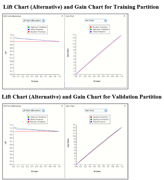
In V2017, two new charts were introduced: a new Lift Chart and the Gain Chart. To display these new charts, click the down arrow next to Lift Chart (Original), in the Original Lift Chart, then select the desired chart.

Lift Chart Alternative and Gain Chart
Select Lift Chart (Alternative) to display Analytic Solver Data Science's alternative Lift Chart. Each of these charts consists of an Optimum Predictor curve, a Fitted Predictor curve, and a Random Predictor curve. The Optimum Predictor curve plots a hypothetical model that would provide perfect classification for our data. The Fitted Predictor curve plots the fitted model and the Random Predictor curve plots the results from using no model or by using a random guess (i.e. for x% of selected observations, x% of the total number of positive observations are expected to be correctly classified).
Click the down arrow and select Gain Chart from the menu. In this chart, the Gain Ratio is plotted against the % Cases.
PFBM_Simulation
As discussed above, Analytic Solver Data Science generates a new output worksheet, PFBM_Simulation, when Simulate Response Prediction is selected on the Simulation tab of the Find Best Model dialog.
This report contains the prediction data for the synthetic data, the training data (using the fitted model) and the Excel – calculated Expression column, if populated in the dialog. Users may switch between between the Predicted, Training, and Expression data or a combination of two, as long as they are of the same type. Recall that Expression was not used in this example. For more information on this chart, see above.
Synthetic Data vs Actual Data
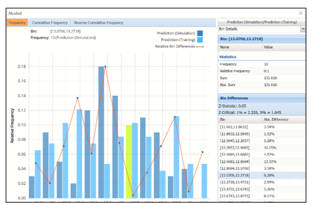
Notice that red lines which connect the relative Bin Differences for each bin. Bin Differences are computed based on the frequencies of records which predictions fall into each bin. For example, consider the highlighted bin in the screenshot above [x0, x1] = [13.0706, 13.2718]. There are 10 Simulation records and 11 Training records in this bin. The relative frequency of the Simulation data is 10/100 = 10% and the relative frequency of the Training data is 11/107 = 10.28%. Hence the Absolute Difference (in frequencies) is = |10 – 10.3| = .28%.
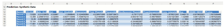
The generated synthetic data is included in the Prediction: Synthetic Data report.
Synthetic Data
Scoring New Data
Now that the model has been fit to the data, this fitted model will be used to score new patient data, found below. Enter the following new data into a new tab in the workbook.

Click the New Data tab and then click the Score icon on the Analytic Solver Data Science ribbon.
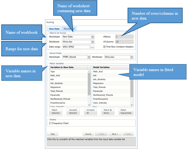
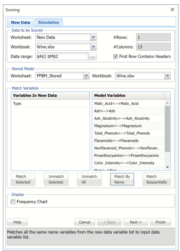
Click "Match By Name" to match each variable in the new data with the same variable in the fitted model, i.e. Malic_Acid with Malic_Acid, Ash with Ash, etc.
Click OK to score the new data record and predict the alcohol content of the new wine sample.
A new worksheet, Scoring_Bagging is inserted to the right.
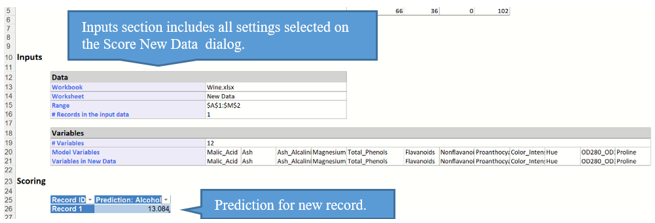
Notice that the predicted alcohol content for this sample is 13.084.
Please see the “Scoring New Data” chapter within the Analytic Solver Data Science User Guide for information on scoring new data.